
How a team of artists adapted the Necron Tomb World, from ominous lighting to foreboding structures.
My name is Lucas Terryn, and I worked as a concept artist/3D Artist on Warhammer 40,000: Mechanicus. The art team here at Bulwark Studios is composed of three other artists and myself, and we were responsible for all the visuals in the game.
Defining the look
Working on a Warhammer 40k game is a big and enjoyable challenge, as it is a vast universe known and beloved by many. As we looked for a direction for the game visuals, we decided we wanted to recreate the feeling of the original content, the miniatures and their terrain. It made a lot of sense because Mechanicus shares similarities with the original game, such as the top view, the distance to the action, the level of detail.
In Mechanicus, we have two major environments: The Necron Tomb World and the Ark Mechanicus Spaceship.
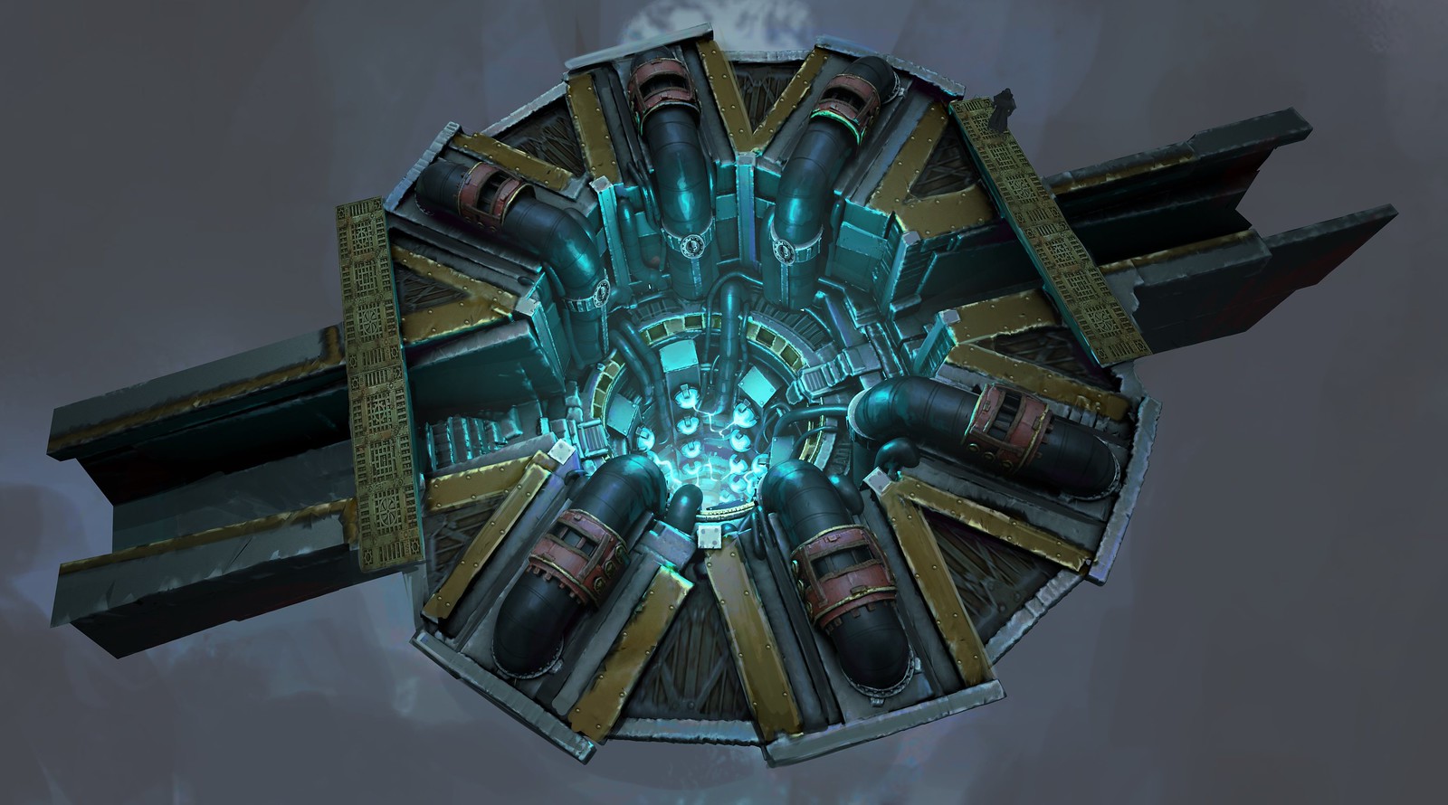
It was a pretty straightforward process for the Ark Mechanicus ship, as there was a lot of existing miniatures terrain we could take inspiration from. Another great source of inspiration was the old artwork done by John Blanche, among the visionaries that defined the look of the Warhammer 40k universe.
The look of the franchise has since evolved with the variety of artists, mediums and projects, but those old artworks were vital in understanding the essence of the Mechanicus aesthetic.
The real challenge of the game was the visuals of the Necron Tomb World. For those not familiar with the Warhammer 40,000 universe, Tomb Worlds are the giant tombs in which the Necrons, a futuristic undead Egyptian robot civilisation, wait asleep for something to wake them up, and then take control of the galaxy.
The majority of the game is traversing the Tomb Worlds below Silva Tenebris. So, they are quite significant, but they are a part of the Warhammer 40k universe that is little known, and rarely represented.
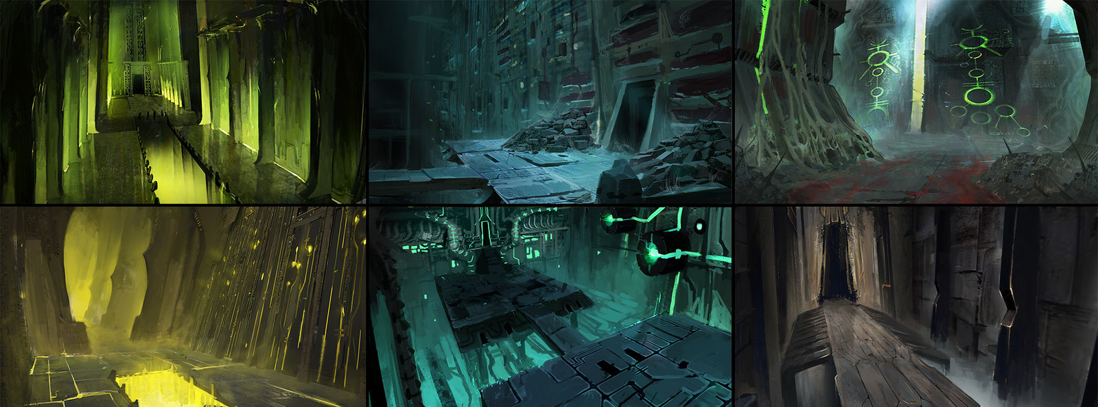
In order to have a variety in the game’s environment, we wanted to create different biomes with various moods and themes. The way we did, it was to extract the different ideas behind the Necron aesthetic, and for each biome, shine a light on a particular aspect of it.
The themes for the six environments we created were: green temple, destroyed tomb, infected, data library, industrial, and royal.
Designing the actual environment
With the different moods defined for the environments, we began to sketch and explore the visuals of all the individual props.
There are quite a lot of different objects needed in order to make each environment work. Because of our small team size, we decided to organize the objects to get the most out of them. There will be a lot of objects that will be used throughout all of the game, then each biome has its exclusive props, wall and ground to create a real visual difference.
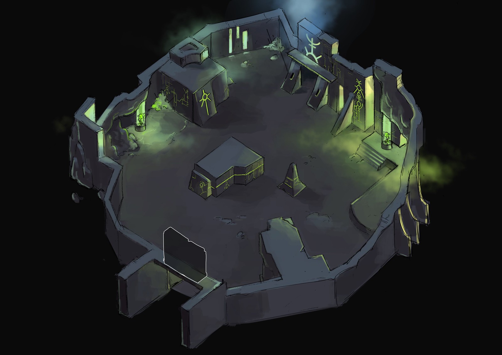
We wanted to have a real sense of depth in our image, so we designed the environment to be very vertical, with holes, rifts and pits. From a top-down view, it helps create an exciting environment.
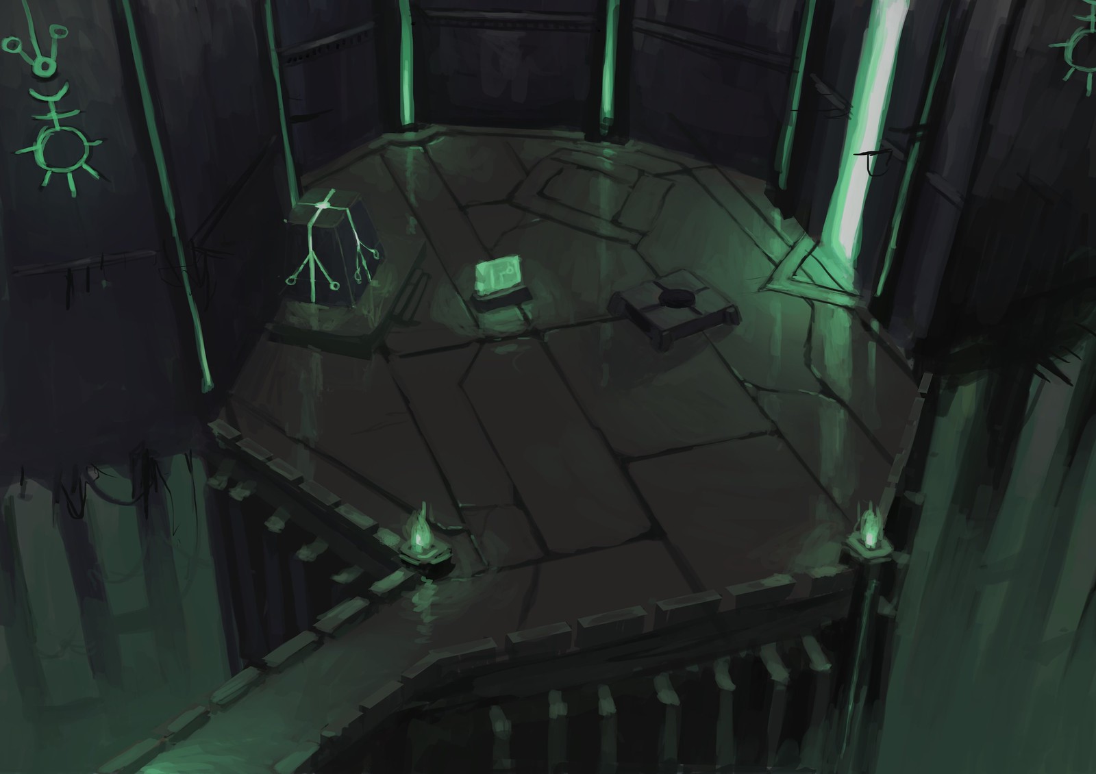
The essential props are the ones linked to the gameplay and story. These received special treatment. We took our time to iterate and make the scenes exciting and readable.
Creating and staging the environment
We created the environment in 3D with a quite standard workflow, using Maya, Zbrush, and Substance Painter. It was an interesting challenge to recreate the stylized style of miniatures in 3D.
The lighting was a crucial part of the game’s look. The Necrons are well known for their green lights and the strange moods it creates. We used several light setups for the different biomes, and we created an extra layer of depth by using fog and smoke.
Each arena in the game was hand designed. First, the level designer defined the gameplay part with ground, wall, obstacles and enemies. Those are represented with just cubes at the beginning, which is the “greybox” phase. Then, the art team replaces the cubes with actual objects and enemies. Then we take the time to light each map differently to create a unique mood and add fog and particles to make the arena more alive.
Et voilà! Here is how we made all of the game’s environment. I hope you found that look into the creative process interesting. The whole team at Bulwark is glad you’ll be able to play Warhammer 40,000: Mechanicus tomorrow on PS4.









Comments are closed.
5 Comments
Loading More Comments