


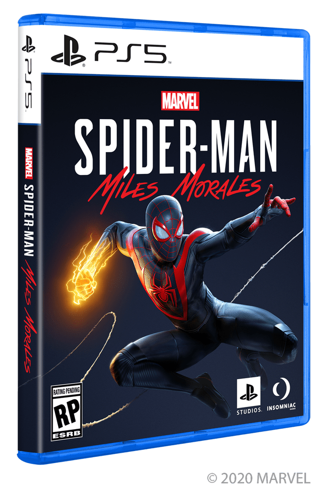
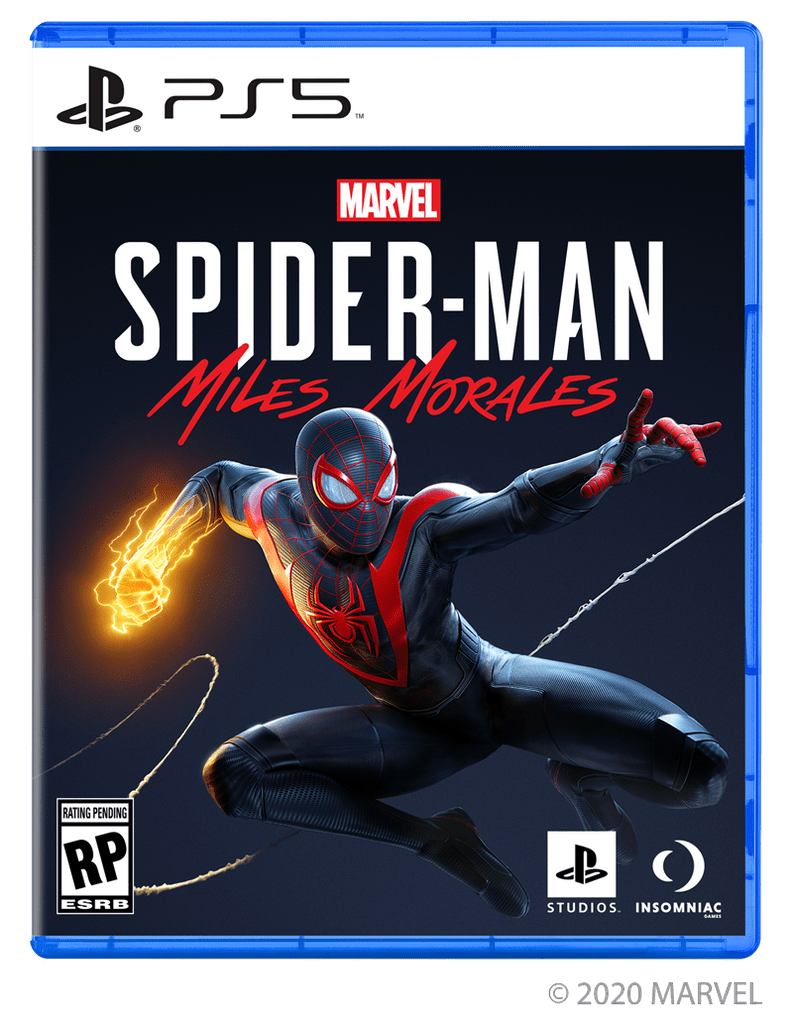
A sneak peek at what PS5 games will look like when you see them on store shelves this holiday.
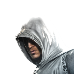
A quick update for our fans — here’s your first look at the box art for PS5 games you’ll be seeing on store shelves this holiday, starring Marvel Super Hero Miles Morales.


Any thoughts on the new look?


I understand the part of keeping the blue since its important but is in my opinion more of a core color to the white and black design, The blue should have been better interpreted in the box art rather than the entire case. The problem i think lies in the fact that people including me feel like it represent the Blu-ray and the Playstation 4 “Era” Which is great but feels out of touch since people want somthing new and refreashing that really represents the next generation as a whole. If you going for a bold console design go all out with the cases aswell.
A black case would have made more sense simply because its the new secondary color of the system and the fact that 4k as a whole have black cases.
Spinewise it’s very ps2 like!
Looks good, can’t wait for November
Good, now make your games run at 4k/60.
Thank you
This box art is decent by being similar but different but really wish, if would be more exciting to look at when it hitting store shelves
Neat looking boxart, can’t wait to buy the game when it drops down to $60.
Looks the same, but more generic. Looks like something I got from a website and printed it out back in the day when I bought a used PS2 game without a case, lol.
Looks like you started a template and just said “finished”.
I only buy digital though, so I don’t really care.
I’d keep the white, but ditch the blue and make the case a clear black to match the console better. Otherwise it just looks like a PS4 case with new art and would blend in too much with the PS4 cases on a shelf. Comes across as cheap imo. A new design across the top would be a welcome addition as well instead of the simple cutout. Maybe even just a subtle PS5 symbol in the corner, allowing more room for the artwork. Just my 2 cents
Would be nicer to have age ratings/studios etc on the back for a cleaner look.
I feel it looks good but its not different enough from the ps4. It will just get confused with the other games.
@PlayStation
I have to agree with some others here who are more tempered in their assessmemt of the new box-art design. The plain white strip is too dull. I understamd the minimalist asthetic is part of PS5’s identity, but it is just too plain and it does look a bit cheap.
My simple fix to remedy this plain-ness would be to use the a gentle white PlayStation “Flow” as used in previous box art. You can use different tones to break up that large empty void giving it some character while still retaining the PlayStation identity and likely making the box-art slightly more appealing all at once.
I have no issue with the blue plastic cases. Blue is a company color and helps the software be easily identified by consumers. If its in the games section and it’s in a blue case everyone immediately knows its a PlayStation game!
Hopefully we’ll see box-art with “Flow” in the banner instead of a plain tone.
I like it a lot, but would have liked it more when the ps5 logo was also blue. But, great job Playstation! Keep going!
Very sublime, indeed. I love how the PlayStation signature blue is being retained for this generation.
❤️ PlayStation!
Personally I really like the look. It shows off something cool about the game that its trying to show off. It really makes people want to get invested into the game. The one and probably only thing I don’t really like about the design is the white line at the top. It seems too out of place to me. I think maybe a shade of blue or a black line would look better, but hey thats my opinion. Still can’t wait too see what it will look like in person. Keep up the awesome work.
I like the box art and blue is my favorite color but I’m wondering what the price tag will say.
Nice! But I think it would look better if the Plasic would be White
Love the design, can’t wait..
Is this a way to encourage players to buy digital games?
The case would look much better if it was black.
Yes that could be it