


A sneak peek at what PS5 games will look like when you see them on store shelves this holiday.
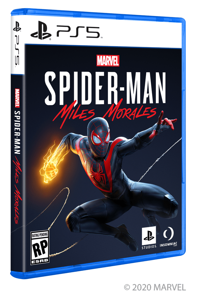
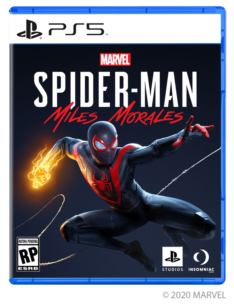
A quick update for our fans — here’s your first look at the box art for PS5 games you’ll be seeing on store shelves this holiday, starring Marvel Super Hero Miles Morales.


Any thoughts on the new look?


I like it, kind of pops
Spectacular. I knew it wasn’t going to be purple that would of not been a good option.
I really thought with the white label we could get a matte black case instead of the blue but this is fine.
Like others have said, change the cases to white or black. White and blue clash horribly.
White or black case and it’s set.
Or the “PS5” in blue.
The design looks great! It is tough to choose between shiny, shiny boxes and the peace of mind of digital with kids in the house.
It’s ugly.
1. White and blue doesn’t fit, and the stripes…the box art needed s redesign to make it different from PS4 and more elegant.
2. Only on PS logo is missing, what does that mean? This games will be no longer exclusives? I remind you that no exclusives means that the console doesn’t have sense if I can play exclusives on a PC, which is more powerful and versatile.
And that’s my opinion. You asked for it, don’t you?
Is it, or is it not, only on Playstation?
When the top of the front cover art gets worn, it won’t show. 👍
I have no issues with the box art so now I know what to look out for when the ps5 comes
I hope we get a Miles Morales limited Edition Console, too!