


A sneak peek at what PS5 games will look like when you see them on store shelves this holiday.
A quick update for our fans — here’s your first look at the box art for PS5 games you’ll be seeing on store shelves this holiday, starring Marvel Super Hero Miles Morales.
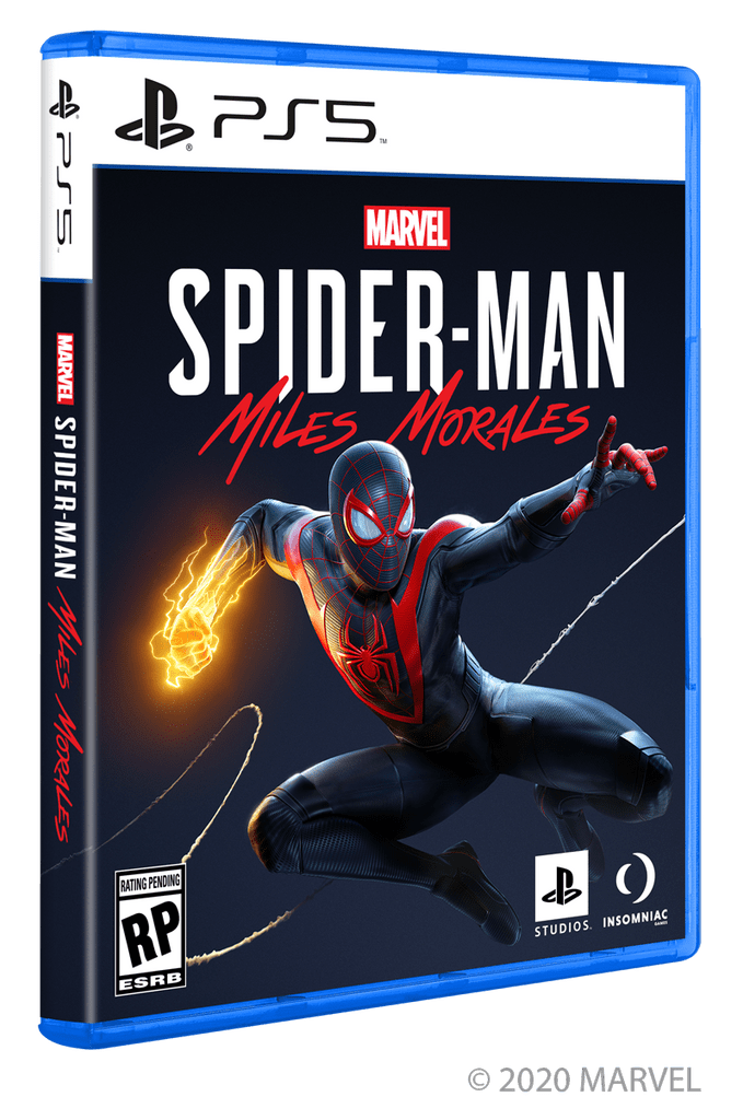

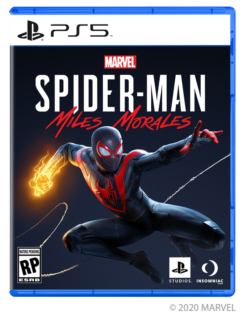

Any thoughts on the new look?


Its nice, but why not black boxes like in the Blu-ray Ultra HD?
Categorically awful. What a huge step backwards.
The only issue is going to be PAL covers or Square Enix covers that do generic white spines and plain, sans-serif fonts. Its not going to look good there at all when it becomes a solid white block. (Which isn’t so much Sony of America’s fault, but the fault of Square Enix and the generic PAL spines that shouldn’t ever be put in place.) Say what you will about the boring Red Switch spines (I think they’re boring), but they’ll have more personality on a shelf than these will.
I’m torn on the blue case, too. I think I’d rather see black, but I think you’d want to not go solid black (like DVDs), maybe a translucent black?
At first I was shocked, but I really really like it!
I actually want to commend you guys. You are taking bold risks but at the same time not changing what works. This box art is the epitome of your strategy.
Was there anything wrong with PS4 boxes? No. Can we be more bold and confident having black on white? Yes!
Keep doing what you guys are doing. I can’t wait to see what the future holds!
It looks so sharp! Great job Sony! Lover is it matches the console!
I don’t like the blue case I think is out of place, I prefer it in Black.
Big Brain thinking if it does not say “only on PlayStation” it will not be just on PlayStation
And the price tag says $69.99
For a dlc?