
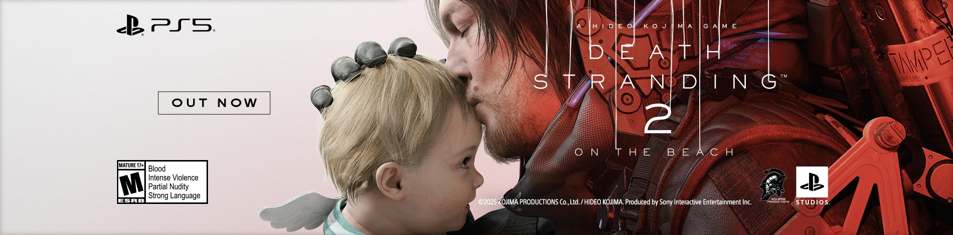
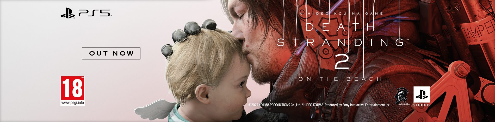

A sneak peek at what PS5 games will look like when you see them on store shelves this holiday.
A quick update for our fans — here’s your first look at the box art for PS5 games you’ll be seeing on store shelves this holiday, starring Marvel Super Hero Miles Morales.
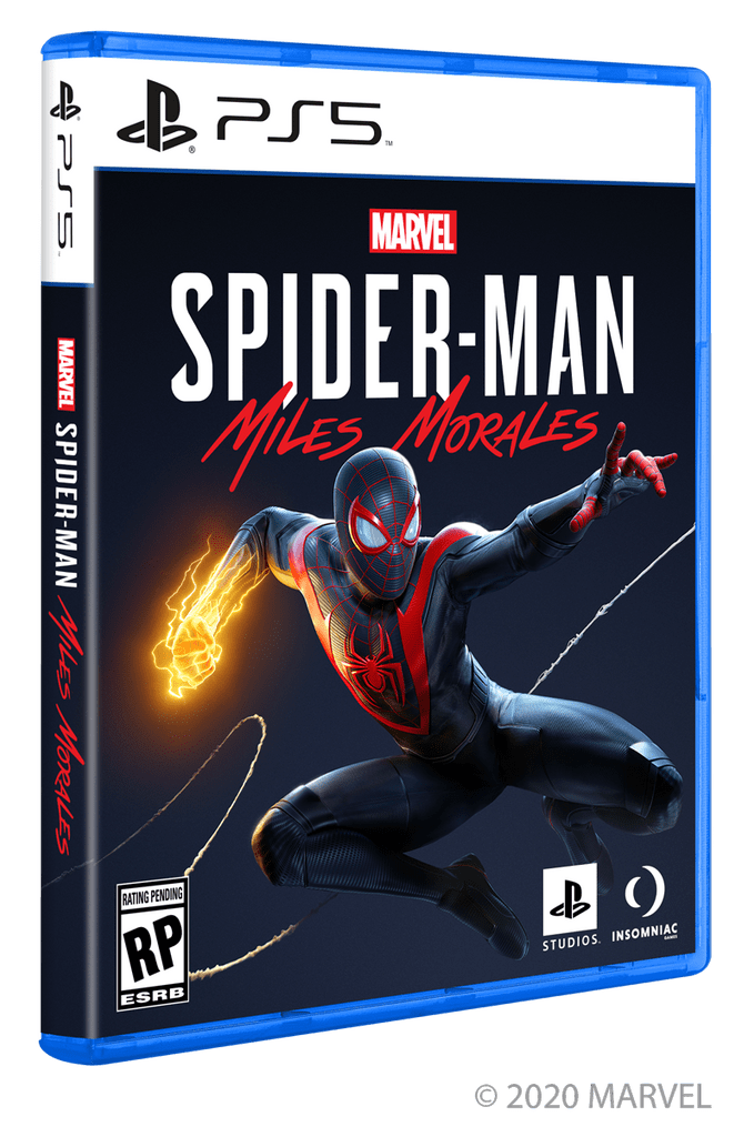

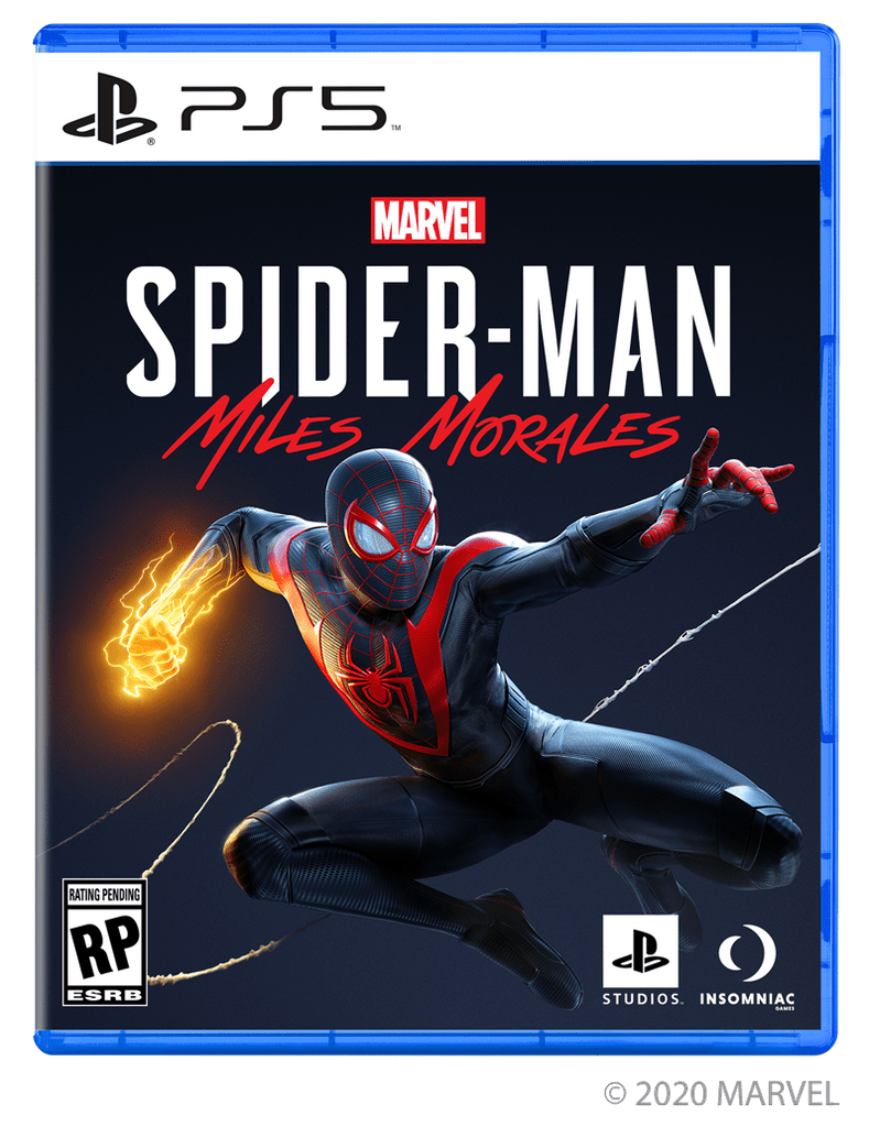

Any thoughts on the new look?


Is that a used game from gamestop? jk
I was kinda hoping it’d have a two tone aesthetic in the top bar of the cover akin to their new top-left corner logo on their youtube channel.
I love playstation games box is so amazing and I can feel it in my life I always buy everything at stores and gamestop thank you for putting games box and make difference design