Being assigned to a Goosebumps game, I was excited to dive back into the world of horror. I was also thrilled when WayForward proposed the game be a first-person point and click, similar to MacVenture classic Shadowgate.
Despite it not being billed as a horror game, Shadowgate was one of the very first games I found scary. There was a thick atmosphere about its world, and things like your torch running out and the way the music transitioned left an impression.
With the Goosebumps license and the first-person point and click gameplay style, it required us to take a different approach from what we have traditionally done at Wayforward. Fortunately, it was an approach that meshed very well with the tenets of horror and the story we are trying to tell.
In designing a platformer (WayForward’s usual stomping ground), the game mechanics are decided upon, implemented in a rough state, and then the level designers can start to experiment and build levels around the player’s abilities. They have themes and goals of course, but many things can be shuffled around and changed based on play testing, shifts in the game structure, or what have you.
Most gaming genres are built in a similar way and an organic trial and error takes place. Often little sequences take shape as building blocks for the overall stage; some learning areas, a few tests of skill, and a plot event or two — all of which get shuffled around throughout development.
First-person point and clicks, however, are made up of a very specific number of rooms (our resources allowed for about 60), so not only do you have to plan the whole game ahead of time, but rooms often have to serve double duty. Most rooms might have an atmosphere component, a puzzle or two, clues for a different puzzle entirely, and some built-in storytelling elements. To complicate it further, we didn’t want to force the player into a linear sequence from point A to point B, but instead allow them to wander. If they got stuck on one puzzle, we wanted several others to occupy their time while their subconscious unraveled the first.
Lastly, we’d chosen to use hand-drawn art for our backgrounds so each room in the game could have the same appearance as the iconic Goosebumps book covers, meaning once we drew items into a room it was very difficult to move them somewhere else if they weren’t working. In a 3D game it’s a matter of just moving the object and repositioning it. For us, however, “repositioning” would mean redrawing from scratch, and I really dislike wasted work.
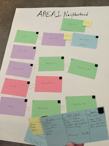
It was clear we’d have to plan out every room ahead of time. So I ran to the office supply store and bought some poster board, notecards, and Velcro strips — this called for some good old fashioned arts and crafts…
Pictured is our first area, the Neighborhood. As you can see from our final model here, it’s color coded: green for plain rooms, blue for rooms with an interaction of some kind, red for rooms with monsters that can kill you, and lastly purple for “special case rooms.”
In early stages every room was white until we’d hammered out a general flow and shape of the area, at which point I placed down adhesive Velcro strips, allowing rooms to be flipped over to reveal the room details written on the back of each card, including any relevant items, sound and visual effects to establish atmosphere, and any special traits for that room. Doing this (with a piece of scratch paper to track an inventory) allowed us to “play” through Goosebumps like a board game.
This process became our “trial and error” phase, right up front before any art was scheduled. If we thought of a better location than the one on the card — cross out the old one. If an item needed to swap rooms, just rewrite it on the new card. If a section needed more threats, swap one of the existing cards for a red one. This process was essential, and let us schedule out the rest of development with confidence in our overall user experience. I’d say the final game only differs 10% from our paper models, at most.
This approach (or a similar one) is something I’ve advocated for years to anyone making a horror title. The whole point of a scary game is to control the atmosphere and the player’s mood so you can effectively stage scare moments. Too many developers build an entire action game and then expect to drape “scary stuff” over the top of it during the polish phase, resulting in a bland atmosphere, failed scares, and an overall rushed feeling. I was glad to finally sidestep the debate entirely by building a horror game in this room-by-room structure. Everything was planned and called out up front; we knew exactly what we needed to build. It was refreshing to watch our “scare” elements come together smoothly.
So planning was done. How did we communicate this all to the artists who had to bring it to life in a functional way?
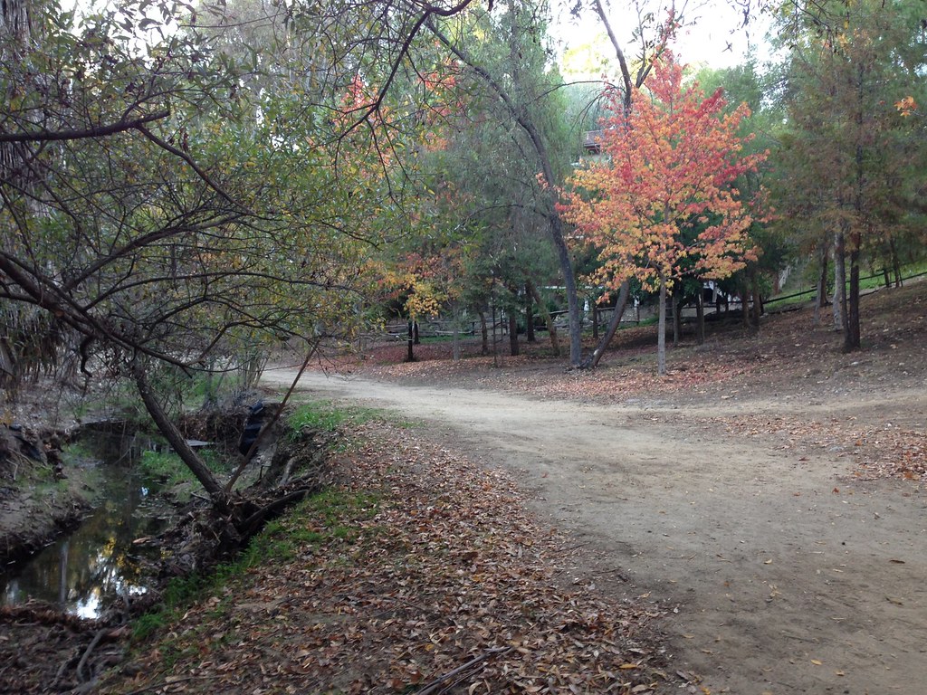
Goosebumps, as a series, leans heavily on youth and childhood as themes. The books are written for children of course, to encourage reading and to empower them: the protagonists are always kids who survive, outsmart, or otherwise overcome the books’ ghosts or monsters. Since we were continuing this theme, I looked to my own childhood to inspiration, and our first area is inspired by my walks home from school which included shortcuts through a small wooded area.
Since I was spending Thanksgiving near my old neighborhood, I drove over and snapped reference photographs to send our artists. So the first area, at least, was simple to communicate: photographs accompanied by detailed text descriptions of the area and required items.
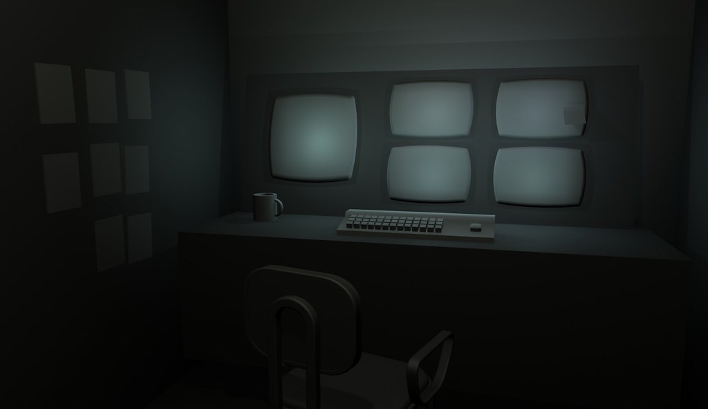
Of course, I didn’t grow up in a haunted house or other creepy location (despite those pesky rumors), so we needed another approach to the rest of the game. After a few rounds of very nitpicky back-and-forth with several artists, our Art Director Dan Burke found a program that allowed for quick and dirty 3D modeling. He swapped our pipeline to begin with his quick 3D setups, allowing us to find the right creepy angles for each room, and a rough placement of important objects, exits, and so on. The artists would then receive these pre-vis rooms and proceed without worrying that I’d ask them to scrap half their work.
So that covers how to create a first-person point and click with effective horror. But where does Goosebumps fit in with all this? Did we just slap a book/movie license on the game at the last second? Of course not! Brand accuracy and fanservice are things I always put at the forefront of my games, dating back to my localizations for Atlus, through Rocket Knight and Contra 4 at Konami, and now at WayForward with franchises like Adventure Time, TMNT, and now Goosebumps.
I’m not satisfied if the game is merely Goosebumps-flavored, or brand-adjacent. I couldn’t sleep if the game felt like anything less than an authentic Goosebumps product with all the hallmarks that entails. It also helped that we were able to visit Sony Pictures to screen the film early on to provide inspiration and insight into the direction of the movie to help set up the prequel story.
Above I mentioned childhood as a theme. We looked for other recurring themes in the books, finding things like big creepy houses, parents who seemed oblivious to what was going on, older siblings, outsmarting adults, distrust of strangers, etc. These helped shape our decisions regarding game flow and the areas you would visit.
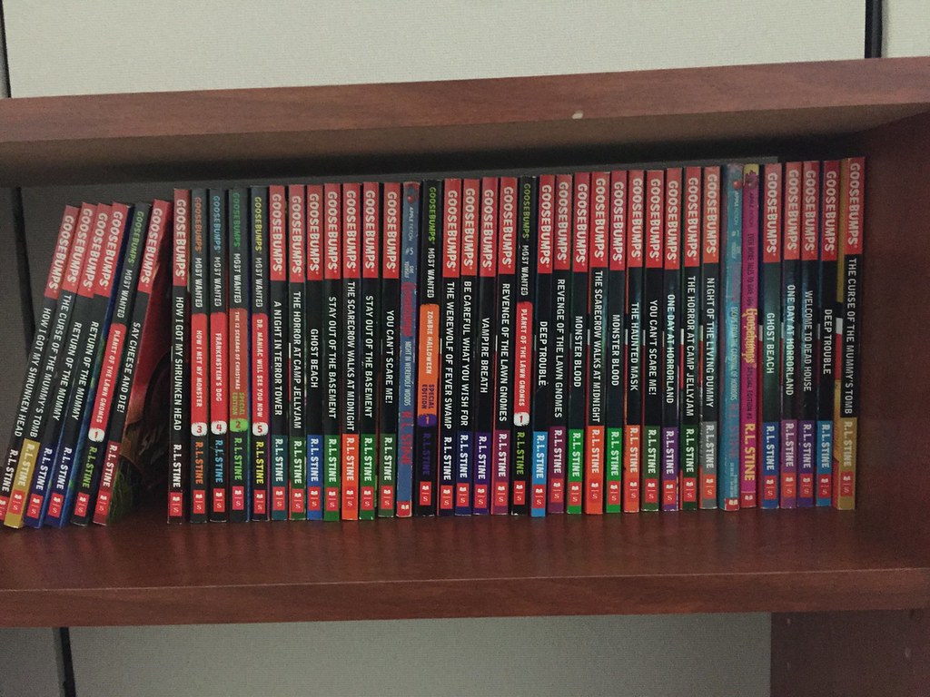
I hadn’t really been into Goosebumps growing up (they were just a year or two after my time), but I didn’t want to just research the series off wikis and Netflix. I went straight to the source, diving into a pile of books and reading like my life depended on it. Scholastic provided us with several, and I bought a few more that sounded interesting.
Our last step before development could finally shift into full gear was deciding on what monsters to use. The film’s plot, which our game leads into, centers around the monsters being released from their books and terrorizing the town. But which monsters should we use? I wanted a good mix of creatures from the film, along with monsters from the books that didn’t get cinematic exposure.
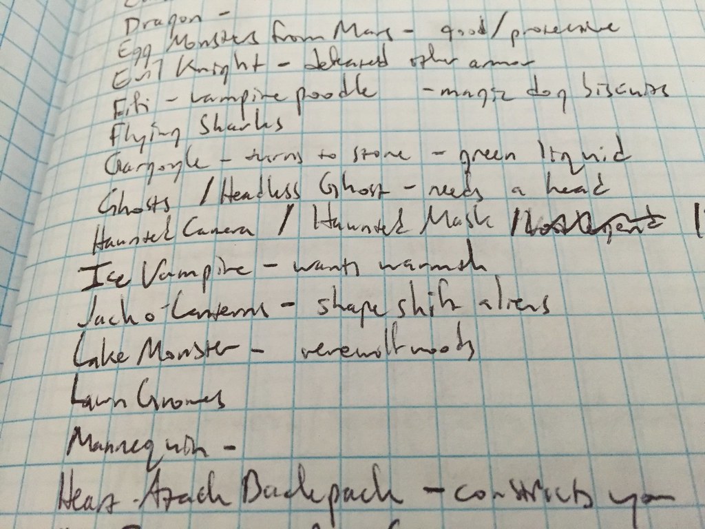
We really tried to make the game feel like its own standalone story, rather than just a retread of the film — this way Goosebumps fans can enjoy both of them individually. I listed out every Goosebumps monster ever, along with some traits I thought would be interesting in a game, or powers they might have, or how they might pose a compelling threat to the player.
From here, we eliminated very similar monsters so each encounter would feel unique. (Sorry slime fans, there wasn’t room for both Monster Blood and The Blob that Ate Everyone.) Then we examined our locations, puzzles we wanted to feature, and so on, circling the monsters that worked best for the game and saying goodbye to the ones that just didn’t fit in. Eventually, this led to our final list of 20+ beasties. Which I won’t spoil for you here. I can share an image of my second or third pass at the overall list, though.
With that detailed planning phase behind us, it was time to start actually making the game! Which for me personally meant writing. A whole lot of writing. Essentially all the writing. This was actually the most important reason for me to cram all those Goosebumps books instead of just doing some google searches — learning the voice of the franchise. All the books are written by R.L. Stine, so they sound a certain way. His word choice and the way the characters think/talk are integral to the stories being told, and I also wanted to get a handle on the level of scariness and (non)violence presented in the books, so the game would sound authentic.
In case you haven’t guessed, this was the last fortunate “win” in our genre choice. Point and clicks are incredibly text heavy, and so are actual books. By its very nature, the game felt like an authentic Goosebumps experience because they’re both all about reading, and allowing the reader/player’s mind to fill in the blanks left by a carefully worded description. This way their own nightmares get cast over the game, and they’re hooked! At least that was the hope as I spent two months writing all the description text, dialogue, and various letter-based wordbits used in the game. At final count, I wrote 50,000 words for our in-game text. That’s equivalent to 2 entire Goosebumps novels! That… seems crazy.
And that’s our story thus far. If you want to know how it ends, please check out the game! We were very lucky that the first choice we made for Goosebumps — its genre — paid off so well throughout development, letting us carefully design the game’s flow and horror beats, creating an efficient pipeline for our artists, and ensuring an authentic Goosebumps experience! I hope even new fans to the franchise (whether they’re 10 or 110) give it a shot and embrace the chilling spookiness of Goosebumps.
Are you a Goosebumps fan? Are there any monsters you’re hoping to come face to face with in the game? Lay bare your fears in the comments!






Comments are closed.
24 Comments
Loading More Comments