

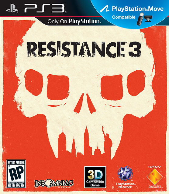
Today we’re proud to reveal the Resistance 3 box art that you can hold in your hands when the game hits store shelves on September 6th. You should recognize right away that this graphic version of the Chimeran Skull with the New York skyline depicted as its teeth, as well as the stylized version of the Resistance franchise logo, isn’t your typical “rendered hero” box art. To create this new look, we partnered with Olly Moss, a talented British artist, to create a bold vision of the Resistance 3 box art for both the North American and European territories.
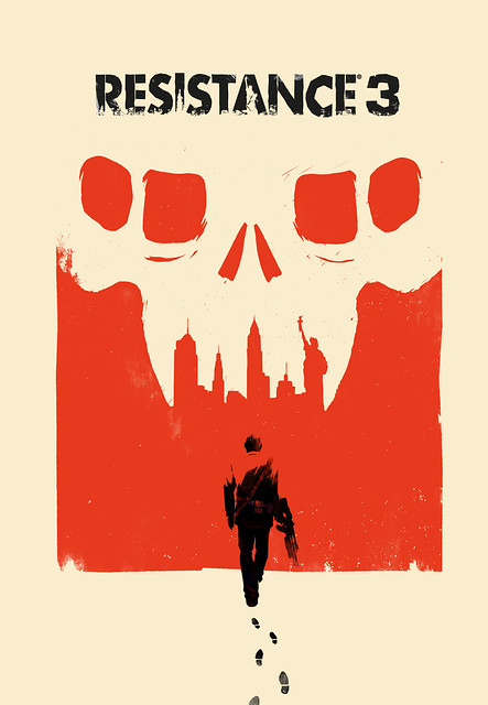
The Resistance team worked closely with Olly to share our vision for the Chimera-occupied 1957, and Joesph Capelli’s journey across the destroyed USA to his destination, New York City. You’ll see this in the alternate version of the art below, which shows Capelli walking towards the NYC skyline.
We wanted Olly’s work to reflect that in Resistance 3, YOU are the Resistance. Resistance 3 isn’t a military shooter, as the United States Army and SRPA have been destroyed. Instead, Resistance 3 is about the remnants of humanity finding any way possible to survive in a brutal world.
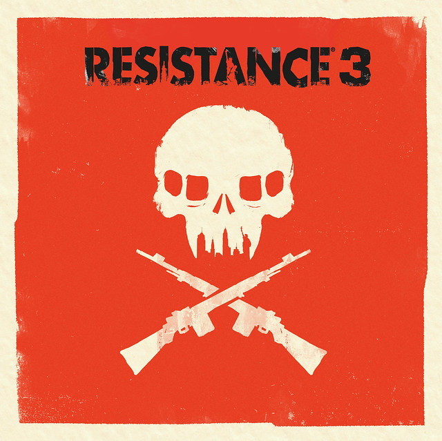
This work coincides with Olly’s first art show in Hollywood at the Gallery 1988 (which runs until May 20th, if you’re in the LA-area). We’re excited about the new look of the box art and expect to see additional Resistance 3 art by Olly throughout the campaign. You can find out more info about Olly, and see more of his fantastic art, by checking out www.ollymoss.com.
You may have also heard that we will be bringing exclusive early access to a nearly half-hour single-player demo straight to your PS3 on June 14th! The demo will be included on specially-marked Blu-Ray copies of the Sony Pictures sci-fi action thriller Battle: Los Angeles (which you may recall from the now memorable Resistance 3 billboard spotted on a Sony film set). The demo level is the entire boat ride sequence of the game, as Joseph Capelli and Dr. Malikov discover a flooded town infested with Chimera. We hope you’ll enjoy the small taste of atmosphere, environmental storytelling and exciting action sequences you’ll see in the final version of Resistance 3 on September 6th.
As we lead up to E3 and the game’s launch, there’s still more news to come, so keep it tuned to our Twitter feed, Facebook and sign up to Join the Resistance for all the latest updates on Resistance 3.

Looks like there wasn’t much creative effort put into it. Looks very plain and blah.
I like it. It’s different from the norm and more artistic than the boxart we’ve become accustomed to.
complain….. complain …..complain………..i just want the game damn it lol.
Umm….okay Insomniac were guys drunk when you made that box cover art. The first two were alot better looking. I hope you guys reconsider and try a different look. I love the series and I’m still getting the game of course but the cover art is just……bleh!
i know it took a while for yall to get everything sorted out but i do thank you
I LOVE it.
Probably the least clichéd boxart for a shooter ever.
i agree
looks amazing and if that black circle logo is the disc than aesome!! this is one of the games im getting hyped for finally a game to look forward to not many now a days
Looks amazing!
Honestly… I think that cover is ugly.
Note: I’m not hating on the game itself, just the cover.
It doesn’t seem to follow the same pattern as the first two. They were darker, death, war-related… this is a bright and vibrant red.
Ill put my two cents in. I really like it. Although I will agree the orange is an interesting color of choice. Also I LOVE the alternate with Capelli walking, please put that cover on the collectors edition! Can’t wait to give R3 a try a E3.
It’s nice but it’s gonna look odd against my copies of Resistance 1 & 2. Hope the spine of the cover isn’t orange.
Gonna look really weird near the “shooters” in my collection lol.
I’VE PLAYED THIS ALREADY. AT A SONY EVENT A WHILE BACK : ) : ) : ) : ) : ) : ) THATS ALL THAT COME TO MIND… I JUST WISH IT WAS IN 3D WHEN I PLAYED IT..OMG
@diablo103
Totally disagree, sir. Love the art. Great design!
How about you hold off on the sleezy commercial plugs for new products until you get the old ones functional?
I swear there’s nothing but children here.
This is horrible. I don’t think anyone who hasnt heard of Resistance will be interested.
Love the box art…
but Sony listen to me when i say this…
CHANGE THE MOVE BANNER….
that thing takes away from this, and all box art. It’s too intrusive. I don’t pay as much attention to the cover art as i should. I’m to busy staring at the horrible PS Move banner,
hahaha not what i was expecting but i love it
Horrible Cover, Please change the idea. You need it to be way better than this… A lot people just go to the store, see a sick cover for a video game, and buy it not knowing what it is… That’s what I did with Resistance 2 and I loved it. You must make a better cover.
I like it…simple but eye catchy…looking forward to it
Not feelin the boxart vibe. Just not feelin it…
black ops disc won’t work
I gotta say that boxart is pretty terrible. In fact it’s probably the worst boxart I’ve ever seen (and I’ve seen some choice DS shovel ware game covers). All those logos don’t help either.
It wouldn’t be as bad if they used the one with the guy walking on it.
love it! jus a few changes on the color and they got it.
congrats
the move banner is horrible
I think it looks really cool.
i like it. it will stand out from the rest of the games too
This box art is not good at all. Looks effortless. Try making it more attractive plz.
The box art is kinda ugly. It could have had an epic cover like SOCOM 4 or Killzone 3.
lol people complaining about the box art screw the box art i want whats in it LOL
lol. i havent played the first two
That’s the box art??? Gee, that is terrible…
love the box art! Im sure its gonna be better than the second one (resistance 2 disappointed me a little) but this one looks awesome
Not exactly mind blowing or really that interesting, but it will definitely grab the attention of people staring at a wall of games in retail stores. Can’t wait for R3 though, I have always enjoyed the resistance series, I just hope the MP is better this time around.
are we gonna see multiple box arts for the game? will we be able to “pick our own cover” so to speak, or deciding on one?
it should have been brown and black, or black and white. Why the hell orange though?
well im looking forward to the early trial of it to decide if i want it don’t get me wrong been with the series since the start & more likely to get it because of insomniac making it because im a big follower of what games they make, ever since i first played rachet & clank new for the ps2. that being said more likely to try a random game i’ve never considered if i know y’all have a part in it because i love what y’all do
Now I want to eat a box of Wheaties from the 80’s.
LOOK OUT Ebay!
J/K. I do like it though. its simple and fresh. I dont feel like they tried too hard. And I like that. Plus the skyline teeth are a real nice touch.
I cannot wait till this game is released its gonna be awesome!
At first, I was put off by it, but looking at it again, it’s simplicity is sort of avant-garde in its regressive style. The orange still feels off. I’d think a faded brown would work better with the series’ graphical backdrops.
It’s sick, trust me you got to have a creative eye for this ( or a gaming eye, which ever one you prefer), but people sure are mean.
I like the box art but we have to figure out a way to minimize the logos
@113 blakseed,
lol so true, it just that the PSN outage has caused a lot of kids to come to the blog or a lot of people that don’t know what the blog’s about, i mean half the time there are developers talking about their game, not Sony.
Too much Orange. Could be better
alriighhtt move compatible! cant wait 2 use it :D wonder if its sharpshooter compatable thoough :/
love the artwork, looks neat and simple.R3 will be a hell of an adventure.
Excellent cover by a terrific artist in Olly Moss. I hope that the grunting of the masses doesn’t force Insomniac/Sony into changing what I think is legitimately artistic box art — a rarity nowadays, especially in the US where everything is dumbed down.
Sure, why not?
Hmm its alright, the orange doesnt fit very well with the atmosphere of resistance. But hey, its the gameplay that matters right?