

Notice anything different?
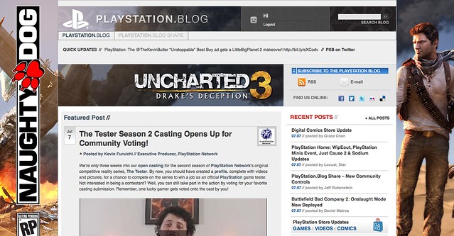
Today, we’re quite ecstatic to unveil the new look of the PlayStation.Blog. As the site marches towards its 4th anniversary in June, the patchwork, add-on look of these pages began to resemble the Weasley house. Also, we were tired of being unfavorably compared to our more attractive, cosmopolitan European sister site.
Unlike commercial sites, we didn’t redesign to serve you more ads, or because we have an in-house art staff that we have to justify. We redesigned the PlayStation.Blog with your requests in mind. How do we know what you’re looking for? You’ve been voting with your clicks.
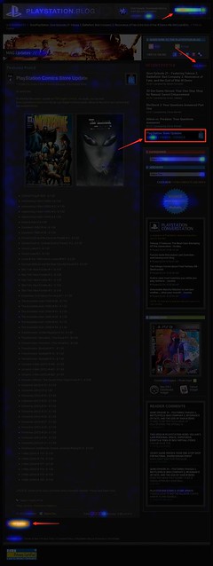
Over the past year, we’ve been analyzing where readers click on the site and, as you can see, items like PlayStation Store update posts and recent stories light up like a Christmas tree. If you only decorate your tree with white lights, that is. When we coupled this info with traffic patterns, Google searches, and other data, it was pretty clear what types of things Blog readers like yourself are looking for when you visit. This redesign addresses these needs.
So we’ve added prominent, permanent links to PlayStation Plus and PlayStation Home content. We’ve overhauled the search box with autocomplete. Our biggest recent releases now “live” at the top right of the site. And huge news won’t get pushed down the page nearly as quickly as it used to.
Conversely, with the old design many things weren’t as easy to find as they should have been. You’ll now find it easier to give feedback on posts via Twitter and Facebook (both of which had a fraction of their current userbase when we first launched the site). Related content will appear at the bottom of a post, and a string of features can be found in a scrolling “red box” belt right in the middle of the homepage.
We also know that the average reader owns a wider, higher-resolution monitor than when we first launched in 2007, and so we’re taking advantage of that additional real estate, and you can expect more and better takeovers of the site, like we did with UNCHARTED 3’s launch.
Now, we realize that this new design will take some getting used to, and some of you will probably hate it outright – at least at first. Many of you said as much when we inverted the color palette from black to white last year, though those complaints died out very quickly as we all adjusted.
Still, for those who really loved the old site, if you look closely, you’ll notice the things that *didn’t* change. The font, colors, and sizes are all the same. Comment replies remain an attention-grabbing red. Of course, the PlayStation news content you visit us to view will all still be here – you just won’t have to look as hard.
Over the course of the redesign process, we began to compare the new site to [lady with the hat]. Even if you don’t care for the flashy new hat, the old girl you know and love is still underneath.
Please let us know what you think. As always, we’ll be reading.
Sincerely,
Jeff, Sid, and Rey
Your PlayStation.Blog team
I think the new look is more exciting, but agree that with the current repeating articles it’s easy to get sensory overload. Overall though I think its a move in the right direction!
I enjoy watching the PS services evolve!
(posted on a DC9 while flying back to Detroit from PAX East!)
Wow! I love the new look, it’s almost like a magazine on the main page.
This is one of the best looking gaming websites I’ve seen in a long time. You guys did a fantastic job transforming our comments and suggestions into something realistically innovative….WINNING!
Too much clutter for my taste.
Nice new desing !
*design !
Should just get rid of the PS.Blog.share–SONY already ignores all the useful content in it, so why even bother having it around?
mfw
>wake up
>visit ps blog
>COLOR AND FLASHY STUFF
A plain background would be nice but its obvious from your post that space will be used for advertising ala Uncharted 3. There are some redundancies that should be addressed. In the first column this post, the Ratchet one, and the Singstar one are duplicated in the second column. I think the second column should be for posts below the three newest ones since they’re already covered. You speak about not pushing down older ones so quickly and I believe that would help.
Secondly fonts and images (facebook/twitter icons for example) could stand to be smaller. Lastly aligning the PS logo and search bar at the very top (logo next to language select, search bar next to logout) with the blog & blog share links next to the blog title would save some space (and no longer overlap blog/share links with the top image) but also make it look more cohesive as a whole.
Aside from, imo, needing these small fixer uppers the new design sits well with me. :)
I like it! Good job. it looks alive and interesting. I’m ready to start exploring with it more. lol
I have to say, i don’t care for it. It’s WAY to busy now. It was so nice to come to the blog and have a straight forward vertical view of all the articles from newest to oldest.
I dig it – very clean and fast loading. I’ve been doing site design for 16 years (yow) and for me to give any kudos anymore for nice layouts is something. Looking forward to digging more through the site!
Don’t like, too much clutter.. Can you instead get your web team fixing the trophy issue with the website, many games simply do not display trophies on the website.
Oh and can you get a single sign on cookie or something, so if I login to the main PS site, I don’t have to login here as well…
Where am I? How do I leave comments?? Where are the stories? Why is everything red?? I’m LOST!! ;_;
j/k it’s ok I guess.
I Like it!! it felt to plain jane before.
Good Job!!!
I like the darker feel, it’s easier on the eyes for me.
Nice. Some people won’t like the design but it’ll grow on them. It’s much easier to jump between news posts and the layout looks much better. Good job! The only feature that’s missing is trophy/ps+ info. I think that
What I want :D
– Like I said, the same PSN user menu with trophies and friends from the us.playstation.com site
– A blog app for PS3
– Threaded replies for us to answer people’s questions when you guys are too busy
– Report / mark as spam
– Reply notifications via PSN message or email
– Track comments
– Thumbs up (not down) for comments
– Maybe a separate optional “simple” layout for mobile users or those who prefer the traditional blog layout
– The mouseover colour change – ^ PS3 O PSP X PSN [] NGP – should match the colours of the Dualshock controller, and maybe look a little neon :D
Just a few suggestions… still love the blog and the service you guys are providing
This looks terrible! The old design was much better! You guys should give us the option to switch back to it if we want.
Well, it looks good. By-the-way Jeff. Have you ever counted how many times your name appears in video-game credits? When I finished Killzone 2, I noticed it at the end. Sure its the same for all PS3 Exclusives. Anyway. Site looks good.
Its looks Great But Still needs the PSN Plus Symbols.& Jeff a Quick Question Any Info On Section 8 Prejudice?
Strange new design… It will have to grow on me. The one major complaing I have is the RIGHT COLUMN. It looks horrible the way the Playstation Store and Follow links have a transparrent background. That should be filled in with a solid color and continue the entire way down the page. The width of the page should be conistent and solid with a color. It is very choppy the way the width of the page is one size at the top then thin in the middle and then back to a larger width at the bottom. Just my two cents from a fellow web developer.
I think it looks really nice. Love the PlayStation buttons for PS3 / PSP / PSN / NGP.
I’m fairly new to the blog (been using it for psn updates more than anything). i don’t see much difference in the new design. i like the color scheme though. when is the maintenance going to be over so i can read the previous post????
quick suggestion though, with psn updates, i think it’ll be better to release the list early in the morning (like 10am-12pm est) so people can know what to buy later in the day when the store updates. i love the Sunday post(tease) of what to expect, but when Tuesday hits, i like to know what I’m spending my money on later on. build anticipation when excited for something, and for those that hound the psn store (like me), know not to waste their time with the “disappointing” content.
other suggestion, have a “profile view” so users can see if staff has commented on their post, and allow other users to comment directly to other user’s post. something like what kotaku (and the other gawker sites) does (or maybe ya do and i wouldn’t know)
I like it! looks great guys. just need to get use to finding things. even though the last design was’nt bad either. idk why i felt like i was in the UK blog or something. lol
I wasn’t sure if I was at the right site at first glance, but I got to say, I do like the new look of the site. It will take some time to get used to, but I like it so far.
Congratulations, your redesign is worse than gawker’s. Unless it’s changed so that entries are presented in chronological order by scrolling down I’m not going to bother trying to read this blog again. Also, PS2 news? Seriously? There hasn’t been PS2 news for over a year.
Its kinda cool, but well … i loose the way of a blog.
i mean it look more like a web home page of playstation that a blog of fast info
I like it, quite a bit actually. But as all too many people have already pointed out, it’s too busy now. I liked being able to come here read the first paragraph and get the gist of the article and being able to decide if I wanted to read the rest of it from the main page. As is, I don’t get that option much anymore.
much preferred the old site. it was clean, not cluttered.
Happy I can finally log-in and stay logged in from my Opera browser :D
This is my first PS.Blog from Opera lol, always had to boot up google chrome or firefox to log-in. GG blog team.
can’t you guys just say, “Hey SCEE, can we use your blog code?” and tweek it a bit?
I actually really like the new look. I am reminded of Kotaku’s recent redesign. I think most of the haters are having a knee jerk reaction. Its clear that the blog team is committed to making the site very user friendly by incorporating user feedback.
Thanks. Keep up the good work. One of the best (and my favorite) blogs out there.
Alright, looks good. I especially love how the comment section looks so much better. Cleaner somehow. And I especially appreciate that it’s not pure white anymore. Bottom line, you guys rock.
Change is always good. I like it. Will take some time to get used to but there definitely was a need for an overhaul.
if you don’t like it you’ll just end up getting left behind at the bus stop. Hop on board and enjoy the ride cuz 2011 is going to be amazing for PS.
love the new site
Everything seems a bit too large, how bought slimming it down a bit. Images and comments are a bit too much “in your face”
Will the US iOS apps be available and function fully for those of us up here in Canada? New PS Blog looks nice btw.
i think its great! its much more easy to find what you want and the design is just beautifull. let this day shall rememberd as the day playstation blog us was more pretty than its eu counterpart!
I like the overall redeisgn of the site but I still miss the simplicity of the old design.
I like the top categories for the PS3, PSP, PSN and NGP. I also like the categories under the PlayStation Store section from games to PlayStation Home. The scroll bar with all the stories is pretty neat features. I also dig the picture/video representing each post.
What I missed about the old design was of course the simplicity and the most recent stories were expanded so users could see bulks of the story. I don’t like the horizontal scroll bar with new releases, PS2, What We Read and so on. It just too much for me. Simply is bliss. Just like Google!
I LIKE IT, now i can access to playstation plus news much more easier, thanks! and keep up the good work guys.
Hey Jeff, Sid and Rey
Is it possible for us to have a link put on the PlayStation Store where we can directly donate spare funds from our PSN wallets to the Red Cross “Japan Earthquake and Pacific Tsunami Fund”.
I know there might be some rules about not being able to accept donations or something, but it would be great if SCE would look into it. I know a lot of people have spare pennies in their wallets and would like to donate.
You could even have a banner on the blog that updates live with how much we have donated. Again, I know there may be some rules that stop SCE from being able to do this, but if you can, PSN would be a great way of getting donations.
Sorry to spam. I put this message on another post buy was worried it’d gotten lost after re-design
Love it. I was about to comment about thirty minutes prior that it would take a little getting used to — as you mentioned — but I decided to let it simmer for a while. That “while” turned out to be a whole lot shorter than I anticipated, because I’m already very pleased with the look. Great work, guys.
Option for Classic look maybe? I prefer the simplicity, it was easier on the eyes, and navigation.
the new Blog looks awesome i love it already @ Jeff on the 22 of next tuesday can you please let me know how to put the theme and stuff also how to in Playstation Home to unlock everything when i get my game :D :)
Hey guys! Great redesign. I like the colors and things seem to be easier to access. Will take come getting used to though, but no biggie! With all the kinks worked out and adding plus icons to our avatars would be awesome! Keep up the good work. You will always have my clicks. PS glad to hear we are getting the Playstation app!
The overall layout is pretty cool; but there’s a couple pages where the text blocks get cut off on the bottom, like the overviews for PS2/PS3. This could be due in part to my netbook’s widescreen resolution (800 x 480), however.
Fortunately, I can still get to the articles, it just kinda sucks that the article previews cut out mid-sentence all of a sudden. Other than that, it looks really pro and quite functional! Nice work.
Looks very sleek, but it is very cluttered too
great work i like the new design
This looks good!