

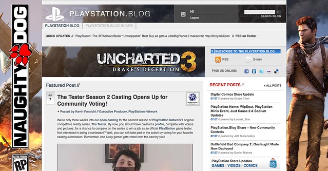
Notice anything different?
Today, we’re quite ecstatic to unveil the new look of the PlayStation.Blog. As the site marches towards its 4th anniversary in June, the patchwork, add-on look of these pages began to resemble the Weasley house. Also, we were tired of being unfavorably compared to our more attractive, cosmopolitan European sister site.
Unlike commercial sites, we didn’t redesign to serve you more ads, or because we have an in-house art staff that we have to justify. We redesigned the PlayStation.Blog with your requests in mind. How do we know what you’re looking for? You’ve been voting with your clicks.
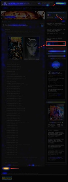
Over the past year, we’ve been analyzing where readers click on the site and, as you can see, items like PlayStation Store update posts and recent stories light up like a Christmas tree. If you only decorate your tree with white lights, that is. When we coupled this info with traffic patterns, Google searches, and other data, it was pretty clear what types of things Blog readers like yourself are looking for when you visit. This redesign addresses these needs.
So we’ve added prominent, permanent links to PlayStation Plus and PlayStation Home content. We’ve overhauled the search box with autocomplete. Our biggest recent releases now “live” at the top right of the site. And huge news won’t get pushed down the page nearly as quickly as it used to.
Conversely, with the old design many things weren’t as easy to find as they should have been. You’ll now find it easier to give feedback on posts via Twitter and Facebook (both of which had a fraction of their current userbase when we first launched the site). Related content will appear at the bottom of a post, and a string of features can be found in a scrolling “red box” belt right in the middle of the homepage.
We also know that the average reader owns a wider, higher-resolution monitor than when we first launched in 2007, and so we’re taking advantage of that additional real estate, and you can expect more and better takeovers of the site, like we did with UNCHARTED 3’s launch.
Now, we realize that this new design will take some getting used to, and some of you will probably hate it outright – at least at first. Many of you said as much when we inverted the color palette from black to white last year, though those complaints died out very quickly as we all adjusted.
Still, for those who really loved the old site, if you look closely, you’ll notice the things that *didn’t* change. The font, colors, and sizes are all the same. Comment replies remain an attention-grabbing red. Of course, the PlayStation news content you visit us to view will all still be here – you just won’t have to look as hard.
Over the course of the redesign process, we began to compare the new site to [lady with the hat]. Even if you don’t care for the flashy new hat, the old girl you know and love is still underneath.
Please let us know what you think. As always, we’ll be reading.
Sincerely,
Jeff, Sid, and Rey
Your PlayStation.Blog team
Very nice…congrats on this upgrade and new wave of showing what the heck playstation is all about. With PSN, PSP, PS3 and Now NGP…what more could you want from Playstation? This is awesome way of showing what’s new and better for your fans. I look forward to whatever more changes are coming up for my die-hard playstation blood. Thanks.
You guys should make an app virsion that is as cool as this site :)
The blog looks awesome and I think it is much better than the old looking one. Just a question though, does the share blog not function properly? I’ve posted 4 ideas within the past 2 weeks and not one of them has been put up. There are no duplicates and neither of them are similar to any of the other ideas on the share blog so I don’t understand why they haven’t been put up yet.
thought it was Playstation.Blog.EU i like it but it doesn’t feel rite
8^(____________)
…OMG NICE…
Looks more like a PlayStation Blog site now :)
Was the previous setup just too easy on the eyes and too easy to navigate content? I really don’t see an upside? It is a mess. Maybe now you can bury posts from fine smaller companies like XSEED, Atlus, etc by not giving them as much prominent screen real-estate?
Further illuminating priorities: Never taking seconds to remove the ~30px whitespace from the old blog; it takes one line of code that a commenter posted the day of/after that redesign. In a redesign before that, PS Blog staff claiming studies proved that black text on a white background (new design) is either easier to read/induces less eyestrain than the white text and black background of the old design.
I think it looks Great! Love the red!
wow great new design , looks more modern and better than the old one goob job sony !
primarily i’m still reading off the RSS feed so it’s not a big deal to me. but for the record this looks fine to me. I”m alittle worried about how it’ll look on my old as **** desktop that still rocks a 1024×768 resolution but I understand that’s no longer the target demo.
The new site seems just way too busy. And the same stories show up several times. Too many graphic elements, they drown out the text and even the headlines. Starting with a much less busy background would help a ton.
I really like the design its really nice looking but I think its kind of confusing to navigate the page. I mean the old was pretty simple and easy to use but like I said I still love the design of the page.
I do not care for the redesign of the blog whatsoever. the page is now extremely cluttered and more difficult to follow. I much preferred the previous layout listing posts chronological top to bottom. the previous layout made it very simple to scroll down the page and find posts I desired to read.
Way to much crap on there now, should include an option to use the old one imo, nothing wrong with basic.
looks awesome!!!
cool, now wheres the podcast?
It’s definitely an eyeful. But I at least like that there’s more color and style present.
My God! YES! It’s awesome, I wholeheartedly approve this new design. It’s totally fantastic. I already got used to it :)
Where is this classic view i hear about, can’t find any link to it.
Simple, quick, easy to use. Wish the official PS site was like this.
love the new layout, looks much more modern than the old one. i don’t know if my browser isn’t supported or something but it would be nice if when you click on the red link with the number of replies to a post you get redirected to only the comments that have replies.
Very snazzy and chic! Love it.
Looks the same on my iPhone but I’ll see on my PC later on but I’ll say that it’s for the best…
nicely done!!! huge improvement to the site !!! I LIKE IT !!!
been along time coming….finally, a page to call home
I like it. It’ll be harder to miss stories now which is good. Nice job guys! Looking forward to the mentioned Smartphone apps and the future.
oooh NICE !!!! I must admit … when i first got here my first impression was “jumbled and disorganized ” , but given how generic and plain the other design was .. this is actually quite nice once one get’s accustomed . and works well with the ps3 browser and looks EXCELLENT on a 52 inch tv . HD Graphics ??? seems like it . great job .
Love the look!
Positive: Its inovative.
Negative: I think there should’ve been an announcment about it, with a video walk through of how to navigate it. Good example is how when there’s a new addition to the Playstation Network or an update that includes say maybe a new interface, or addition to the XMB, there’s always a video to come along with it. I do feel as though the blog needed it due to the appreciation from its visitors.
Overall: A-
How does the blog look? Well just like #36 said “Duh…Winning!”.
No but all and all it looks great way better then the old blog, better the new then the old.
New design looks awesome! I have no complaints whatsoever :)
All I have to say is this: eat that EUROS :) jk Anyway, I like the new design.
It looks good. I approve, Finally you guys updated the site. yeah
I did enjoy the previous version of the blog, but this one is much more sleeker and better looking compared to the original. Great job to everyone that made this happen. :D
Not bad. Pretty nice site update. To me it wasnt needed but its nice. I think the site got a bit faster too (was fast previously on my M11x). Gotta do some speed tests.
Heres a feedback: Put the “LEAVE A COMMENT” on the top of the comments than the bottom…
it does feel very cluttered. maybe if the side margins weren’t so big, it wouldn’t feel that way. just seems like the space isn’t that well optimized. then again, i don’t have a graphics design background
I like the new layout. now just give us the option to send psn messages to our psn friends on ps3. not having an internet connection that works for my ps3 is killing me and i would like to tell some friends that i wont be on for awhile.
Few UI notes
1) Drop the Horizontal slider. It effectively chops the site in half and automatically gives the posts below the horizontal slider less importance in the eyes of the viewer. Also removing it unifies the page. Just delete it out in firebug and see how much nicer the site reads. Those links could find a home in the right hand column after the changes in #2.
2) Social Icons are way too big. At 48px they fit for visual importance with the vertical slider. Drop those down to 24px and consolidate the subscribe icons. Just a simple row of Facebook, Twitter, RSS, & Email.
3) Playstion.Blog & PS.Blog.Share “break-in” links that appear on top of the the featured posts are just plain bad. No other words for it. When you look at the featured post you eye is immediately drawn to the 2 links breaking into the image (sorry just bad design and pet-peeve of mine). The Playstation.Blog link is redundant considering the logo and text next to logo goes back to the homepage already. The PS.Blog.Share link could either go at the top with the EU link or in the right hand column with the Plus & Home links (actually looks really good there).
Overall a good job and very refreshing.
The new look is terrible. I mean I like the color of it but it looks too cluttered. It’s like they tried to give it a Playstation.com feeling but at the same time it looks as if everything is jumbled together. I hate how there are 2 blog posts beside each other rather than below each other. I would suggest having an option where you can choose to have the posts to go under each other like the old blog while still keeping the layout of the new blog. Who knows if this message will actually go through because on the old blog my messages would never show up. I’m going to assume it’s the same for this new layout as well.
I LOVE IT, I LOVE IT, I LOVE IT, I LOVE IT…………………….I LOVE IT *sigh*, thank you so much for the refresh. :)
I do like the new look but I think it’s a little bit too cluttered at the top. Everything else is nice tho
I agree with HWarrior. Drop the horizontal slider.
Well this is refreshing no doubt. As a web designer (with much to learn,) I love the new design as well. Looks in sync with the EU site and the normal PS.com site. Like most commenters thought, the top feels a bit cluttered, but that usually happens at the beginning. Man wish I could work for this blog!
PS: I’ve followed this blog since the beginning and I think this is my second comment ever, so I think I rarely like the design :P
I really like the new site, but have one issue I would like addressed. The mobile version of the website – not an app for any specific smartphone – doesn’t display responses to blog comments. I would like the mobile site to add the red replies found in the full version.
love the new look.
I kind of wish that us PS+ users would get a special “+” on our blog avatars a lot like we do on the XMB.
Looks very “boxy” but doesn’t mean it looks bad! I like those changes once in a while.
I really like the new layout… a tiny bit of getting used to navigate the new site comfortably but overall I’m impressed!
I like it alot. Its easier to manuever around the site. Keep up the good work guys.
Awful redesign. Almost as bad as the PS forum redesign. Too busy, big blocks everywhere, looks like a page of ads.
Looks pretty cool. I could get used to it.