

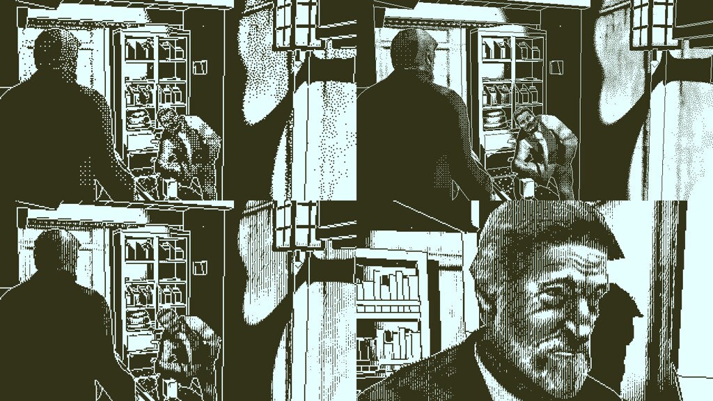
Solve a murder on a ghost ship in the acclaimed mystery from the Papers Please creator
One bit per pixel. Two colours. 800×450 pixels of high resolution 3D rendering. Finally, a game that unleashes the full power of the Playstation 4.
Now that Obra Dinn is coming to your favourite system, I thought it’d be interesting to look back at how the game’s visual style came about and how it evolved over the years of development.
1987 called

The original motivation for Obra Dinn was simple: I wanted to make a modern 3D game that looked like the old 1-bit games I played on my family’s Macintosh Plus while growing up.
That system had a tiny but crisp 9″ black and white monitor with 512×342 square pixels. I always loved how games on this Mac looked, and after finishing Papers Please in 2014 my first thought was to throw things back to 1987 and experiment with 3D in 1-bit.

Using Unity, things came together quickly in the beginning. The title screen was first, where I got a loose handle on using dithering techniques to make the high-contrast black & white pixels look like more gradual shades of gray.
For the 3D style, I decided to prioritise legibility above all else. Even though the inspiration came from the 1-bit limitation, I wanted to make a full proper game of it and do my best to keep players from thinking this limitation was just an annoying excess. Focusing on legibility basically meant two things: 1) outlines on geometry and 2) careful dithering.

Outlines in geometry
Clear outlines on the geometry like this make understanding the 3D space much easier. You wouldn’t want these if obscuring things was important, or if the draw distance was far enough that outlines on distant objects would clutter the view. Luckily neither of those were issues with the overall theme of the game, or the environmental spaces on the Obra Dinn.
Careful dithering
Dithering 1-bit images to make them appear to have more shades is a well-known technique, but I stumbled onto a few important nuances early on.
First, different dither patterns are good for different things. Grid-like Bayer patterns reproduce a range more accurately, and random-like Blue Noise patterns feel more organic.
The most important thing I realised though is that the game’s low resolution (originally 640×360), when stretched to fullscreen, conflicted badly with the mechanisms that make dithering work. The size of each individual pixel was so physically large that my eyes had trouble combining the dithered patterns of black and white back into shades of gray. Ultimately, the most important part of using dithering was to use it as little as possible.
And so I carried on developing the game with these points in mind.

Fast forward
Four years later, in 2018, I’d built most of the content for the game and it looked like the thing might be finished soon. After working on non-graphical stuff for so long, I took a moment to reflect on what I had with the visuals.
It wasn’t great.
In a small window, the visuals worked well. But stretched to a full 27″ screen two feet from my face, it was exactly what I feared: a solid case for never making a full-length low-resolution 1-bit game. The huge pixels, high-contrast colors, and dithering effects were just too uncomfortable for long periods of play. If you’ve ever played a slightly-off VR game then you’ll know the feeling.
At that point, the content and design side of the game was too far along to give up on the whole thing so instead I focused my efforts on solving this fullscreen problem. The first try was to experiment with more stylized dithering patterns.
This looked pretty cool but diverged from the original vision of the game so much that I felt there must be a better way. After more experimentation, I settled on a new dithering technique that attempted to unify the 3D camera with the game’s 2D dither patterns, making the output less flickery without affecting the style.

Coupled with a slight resolution increase to 800×450, the game finally felt good enough to ship. A couple months later that’s exactly what happened and the game was released on desktops.

And now, one year later, it’s on PlayStation 4. Credit for getting it onto the system goes to the talented team at Warp Digital Entertainment, who did all the technical work of porting the game, and of course to Unity Technologies for their fantastic multi-platform engine.
If you do check out the game, I hope you enjoy it. Yes, it has a Platinum Trophy.


Join the Conversation
Add a CommentBut don't be a jerk!
13 Comments
Loading More Comments