
It's time to announce the results of our recent community art competition
A couple of weeks ahead of Shadow of the Colossus triumphant PS4 launch in February, we announced a really cool community art competition.
The premise was simple: you posted your SotC-inspired art on Twitter using the #ColossusArt hashtag, then our judge, celebrated digital artist Matt Taylor, would pick his 50 favourites to feature in a special hardback artbook. Said tome would be an extremely limited edition – so limited in fact, that the only way to get hold of a copy was to be one of the artists featured in its pages. It won’t be made commercially available anywhere.
And the time has now come to reveal the winners. It’s fair to say we were blown away by both the volume and quantity of entries – there was some truly staggering work submitted and it was a pleasure to watch them flow in every day.
You can see all 50 winners in the Flickr gallery here, and read on for 15 of our favourites, with commentary from Matt.
If you’re among the winners, take a bow. Your book will be with you soon.
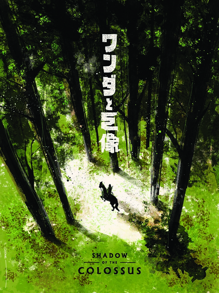
1. Samuel Cooke (@_samuelcooke)
Sam says: “My poster was inspired by the quiet, desolate landscapes and monochromatic colour palettes throughout the game, with the image of Wander and Agro walking through the forest standing out to me in particular. The shadow cast by the pair is a direct reference to the game’s title, and hopefully makes for an interesting visual.”
Judge’s comments: “The best one by a mile – lovely composition, good use of type and colour, I really like the subtle colossus shadow falling from Wander”
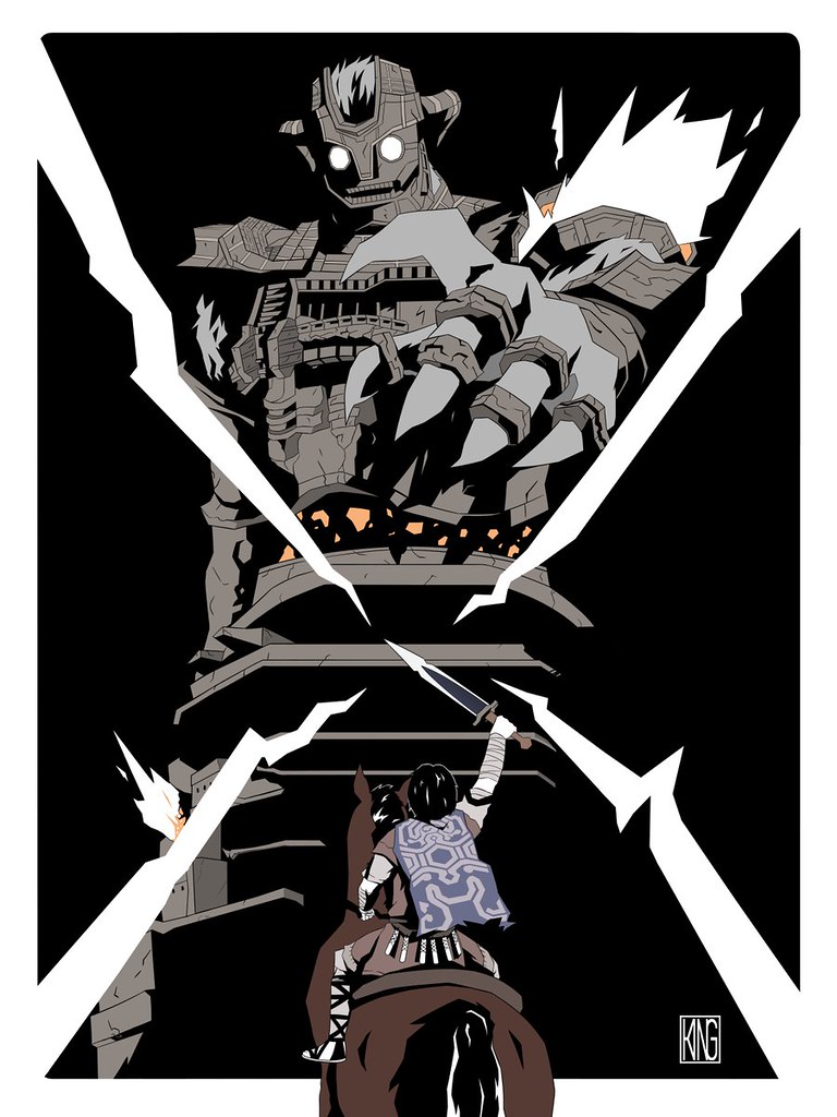
2. Stuart King (@100_rings)
Stuart says: “My piece of art was inspired by the final Colossus in the game. All of the Colossi feature architecture as a distinctive part of their design, but this one is the logical extreme, becoming more architecture than creature. By this stage of the game the sky has darkened and the finale seemed more ominous than victorious.
Wander, Agro and the light from the Ancient Sword were all iconic visuals from the game that had to be included to capture the feeling of approaching a new Colossus for the first time.”
Judge’s comments: “Really strong use of shadows and the negative space on the ‘cross’ draws the attention to the centre of the image.”
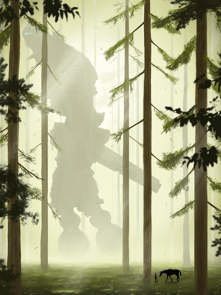
3. Bel Turnbell (@belturnbull)
Bel says: “I could tell a lot of love went into recreating a world that already existed on the PS2. While facing each of the Colossi is definitely a highlight, I felt a subtle tranquillity in the quiet moments of the game. Simply walking around the shrine or through the trees were some of the moments that stood out to me. I wanted to express this with Wander leading Agro through a sunlit forest, while Gaius looms overhead in the distance, walking the same path.
“This is a digital painting, created with the help of a collection of references and painted using a graphics tablet.”
Judge’s comments: “Really good lighting, and subtle colouring on the colossus. It feels very calm and tonally quite different from a lot of the entries.”
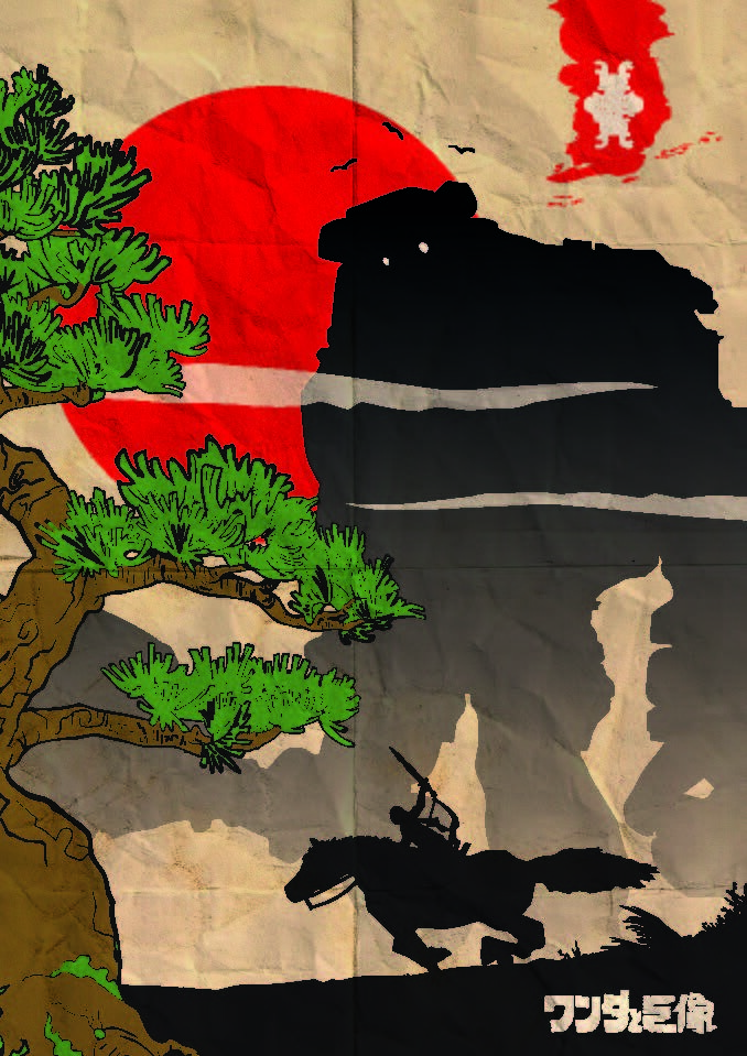
4. Chris Wykes (@ChrisAWykes)
Chris says: “Inspired by the origins of the game, I placed my Colossus in a classic Japanese scene with a big red sun, giant bonsai tree and typography. The creased paper effect adds history to the design and implies that the Colossus has been around for centuries. I was keen to add action and drama to my design, whilst maintaining a beautiful composition – something the game does perfectly.”
Judge’s comments: “Smart reference to the Japanese origin and developers of the original game, I really like the bold limited palette.”
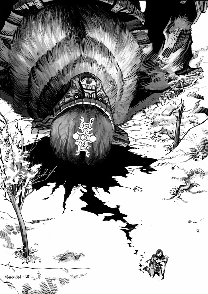
5. Eoin Marron (@eoinmarron)
Eoin says: “SOTC’s minimalist and visual approach to storytelling is super inspiring to someone like me who works primarily in comics. So I thought I’d honour that by telling a story in my own tribute piece; “First of the Fallen”, detailing the aftermath of Wander’s inaugural Colossi kill, and brief moment of respite before he experiences the pain of the piercing tendrils for the first time.
“I specifically chose a downward shot to emphasise the contrast in scale between the fallen Valus – who lies on a bed of blood and destruction – and Wander – who is only a mere, hunched figure against the now tainted earth floor.
“The piece was inked on Bristol board with a combination of brushes and pens, and a layer of grey ink wash after.”
Judge’s comments: “I like the angle of this one, and the crop really sells the size of the colossus – it also captures the brutality of the game.”
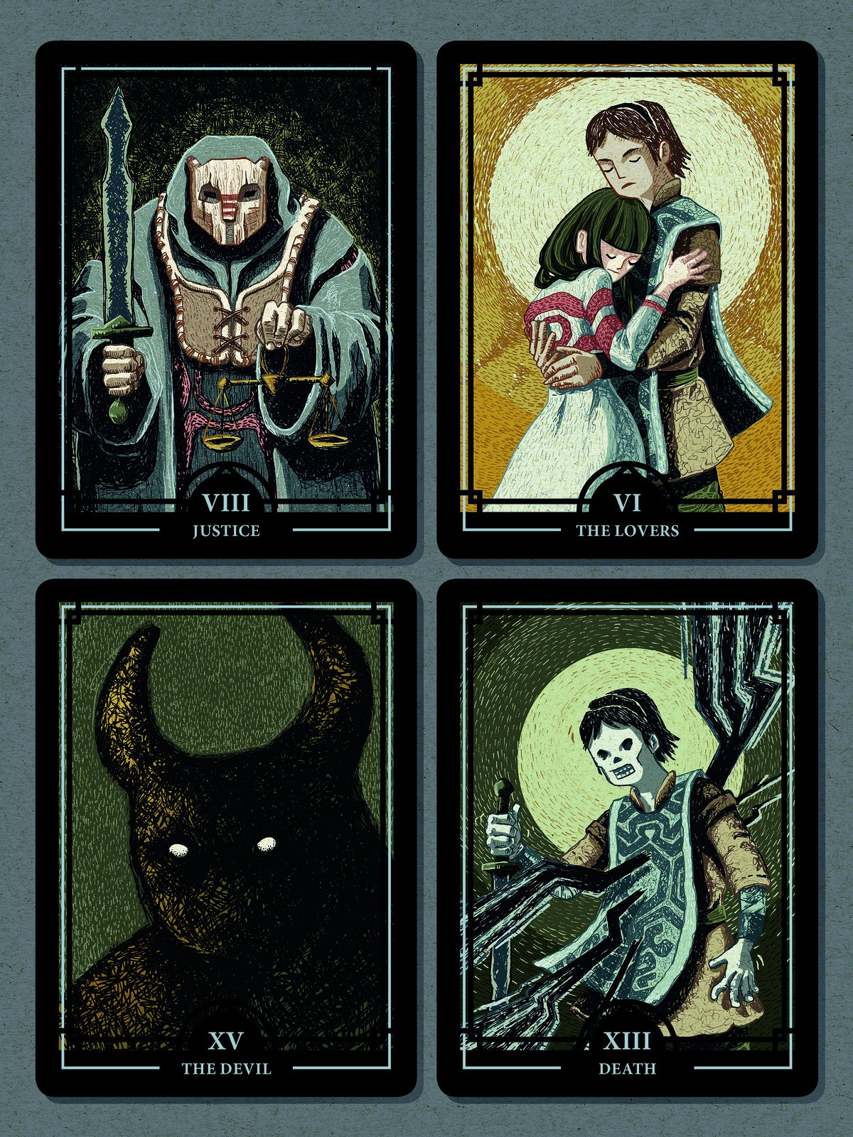
6. Jadwiga Galties (@galtocolor)
Jadwiga says: “What I immediately loved about Shadow of the Colossus was the narrative style. Despite the linear storyline, the game leaves so much room for interpretation. Every detail – as small as it may be – which one discovers by chance, ignites new theories, opens up a new perspective on characters and events. The possibilities for our own interpretations have inspired my illustration, which represent a selection of classic tarot cards.
“I like to combine classical drawing techniques with the advantages of digital image processing. I drew the pictures with a pencil, coloured them in Photoshop and afterwards finished the picture in InDesign.”
Judge’s comments: “A very different take on the brief – one of my favourites because it doesn’t show the landscape but instead really focuses on the characters.”
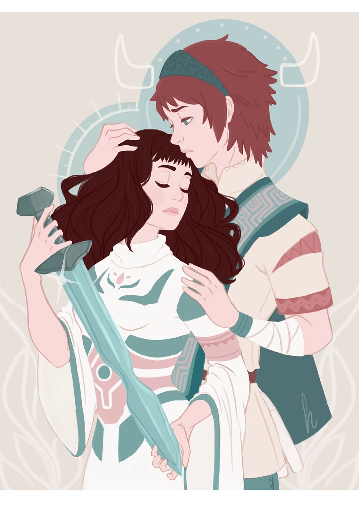
7. Helena Garcia (@HelenaMomiji)
Helena says: “From the beginning I saw Shadow of the Colossus as a story of pure love. Wander wanted to bring Mono back to life at any cost, so he fought bravely against the world in order to fulfil his wish. For this reason, I decided that my work had to be about them with a sad Wander hugging Mono while she, who looks asleep, is holding their last hope: Wander’s sword.
“This illustration was made with Adobe Photoshop from the early sketches to the final result.”
Judge’s comments: “Probably my second favourite of the whole contest. The drawing is superb, and it’s a great contrast to almost all of the other entries. A really great piece of illustration.”
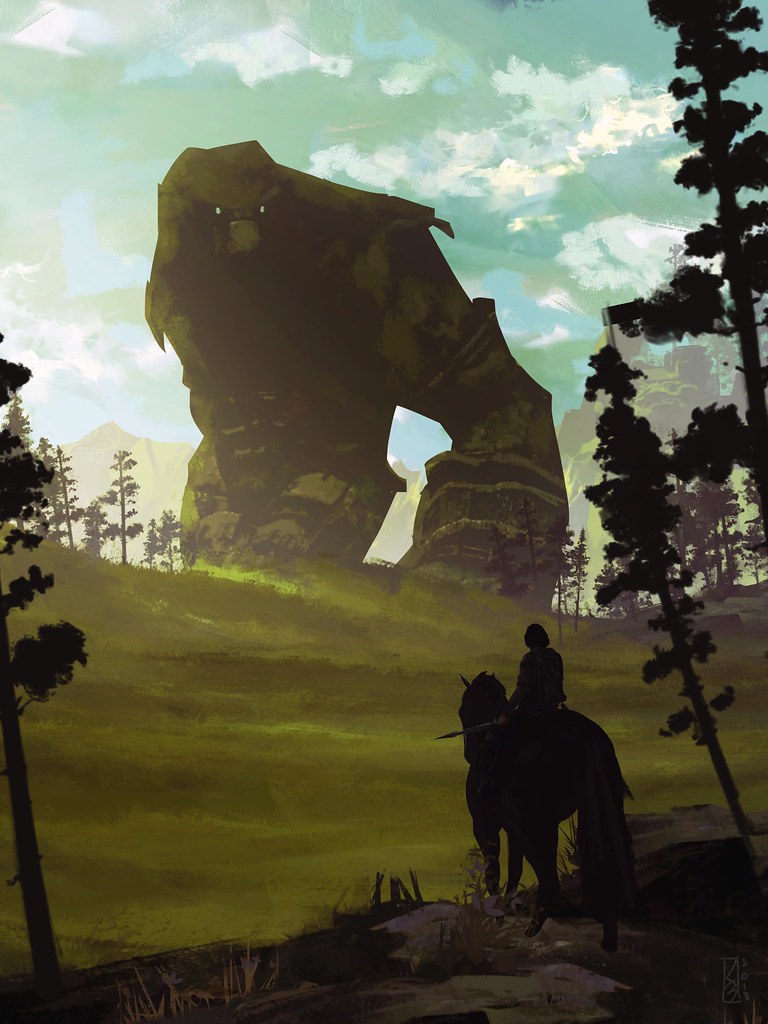
8. Kevin Baussart (@Kbaussart)
Kevin says: “When I heard about the contest, my first idea was to capture the feeling that I had many years ago when I played the game for the first time. I wanted my artwork to evoke a calm before the storm kind of feeling, but also to reflect the dark path Wander is walking. So I decided to draw him from behind, clouded in shadows and ready to kill.
“On the contrary, I wanted the Colossus to look really peaceful, as if he was just walking by. Once I had the main idea, I just drew a quick sketch and picked a few reference pictures, then started painting in Photoshop.”
Judge’s comments: “I really like the landscape in this one and the way it frames the Colossus. Good evocation of the feel of the world.”
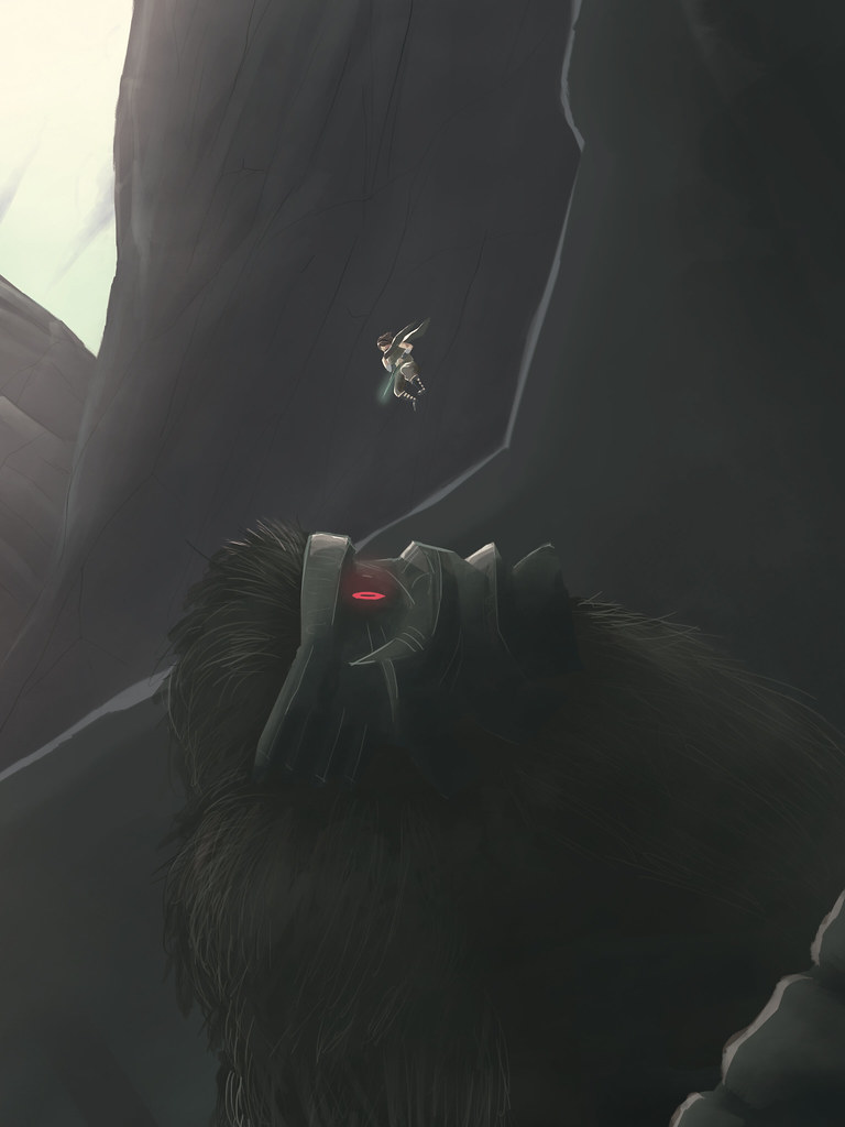
9. Loic Groshens (@LoweaKGraph)
Loic says: “For this piece, I wanted to show how big the Colossus is compared to your character in the game. Without adding many details, my work had to be easy to read, but somehow catchy. I exclusively used Adobe Photoshop for this digital work.”
Judge’s comments: “I like the way the colossus bleeds into the background and starts to dissolve into the clouds.”
10. Mike Williams (@Malchion)
Mike says: “For the illustration I originally planned to do an all-out grand composition of all the different Colossi in a dramatic arrangement, but after much thought and deliberation I decided it was taking away from the feel of isolation in the game. Instead, I moved towards the more emotive side of my memories.
“As an artist, I love working with contrasting colours as it brings so much life to any drawing, so I decided to bring the weak spot symbol into the illustration. I chose Gaius for my illustration as I originally couldn’t get past him on the PS2 version and it annoyed me immensely that I couldn’t progress in the game until I had beaten him. I learnt a lot of patience and to stay calm and felt such satisfaction after I had taken him down finally.”
Judge’s comments: “Good line work – nice comic book style drawing and colouring.”
11. Paco Martinez (@Oddewill)
Paco says: “Every Team Ico (or genDESIGN) game has strong relationship components. While playing ICO I was super impressed with how deeply engaged I got with Yorda and her safety. In Shadow of the Colossus, I felt Wander interact with three main elements: Agro, the environment and the Colossus.
“In Shadow of the Colossus,I was always in conflict with the act of killing those virtual characters. I do care about them… (even though I kill them). At the end of ICO, Yorda and Ico end up on a beach, and in Shadow of the Colossus, there’s clear elements that suggests the beach was in the Forbidden Lands. I thought about what might happen to Yorda and Ico while encountering a Colossus, and showing the relationship between these three characters with Yorda being the one who protects Ico this time.
“Artistically speaking, I was trying to combine the atmosphere of the game with the atmosphere of romantic painters, such as William Turner. I also got inspired unconsciously by some paintings my grandma has in her house when I was a kid. The illustration was made in Photoshop, using a technique called Matte Painting, which consists of composing the main image using different images from different sources. The challenge was to integrate all the elements and make the images feel natural.”
Judge’s comments: “One of my favourites – it feels like a fantasy book cover from the ’60s. I LOVE the hit of orange on the eyes.”
12. Ollie Hoff (@OllieHoff)
Ollie says: “When creating my piece based on Shadow Of the Colossus, I wanted to do something a little different. I’ve always loved the designs of the different masks in the game and knew there was an importance to each one.
“Using Illustrator, I created the basic shapes for each of the masks, trying to keep the detail as minimal as possible. Then bringing the artwork into Photoshop, I added in the texture and shading to try to bring the masks to life. I primarily used a soft green throughout the piece – not only did I think the colour represented the colour of the game, but it worked well with the earthy nature of the masks.”
Judge’s comments: “A really unique approach to the brief – stood out from the crowd.”
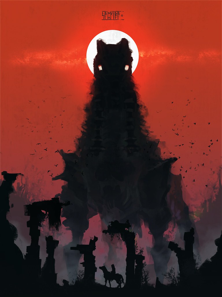
13. Chibichik Svetlana (@SapfiraChib)
Chibichik says: “I always liked to draw big monsters, majestic and divine. I’d like to work in the gaming industry as an artist. I wanted to portray something so big, the main character would seem like a grain of sand. I worked in Photoshop.”
Judge’s comments: “I love the central symmetrical composition and the use of red which helped it stand out from the pack. Nice textures coming from the colossus too.”
14. Guillermo Romo (@WilliRomo)
Guillermo says: “My inspiration for this piece relied on one concept: size. During the game, as Wander, you have to deal with the immensity of the world and the Colossi, where even Agro is way bigger than you. Everything feels wide and unconquerable, at least until you actually do conquer it. But then, when you achieve your purpose, the feeling you get isn’t greatness or fulfillment, but sadness and solitude. The colours and composition I used, I think, convey this idea to some extent.”
Judge’s comments: “Very, very bold use of a mostly dark image. I love the small area of detail against all that black.”
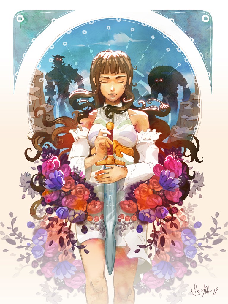
15. Sergio Melero Llamas (@Sermella)
Sergio says: “I love the dreamlike atmosphere of Shadow of The Colossus and I find the enigmatic presence of Mono particularly interesting. Undoubtedly, she was a great character that has inspired me to create this piece, combining digital techniques mainly in Adobe Photoshop, alongside watercolours made in the traditional style.”
Judge’s comments: “Just a beautiful painting. One of my favourites. I liked the fact it focused on Mono instead of Wander.”







Join the Conversation
Add a CommentBut don't be a jerk!
9 Comments
Loading More Comments