
Drinkbox Studio’s Graham Smith and Augusto Quijano talk design, art and development
Back in the summer of 2010, as they were putting the finishing touches on their first title Tales from Space: About a Blob, Graham Smith, Chris Harvey and Ryan McLean – the original founders of Toronto-based developer Drinkbox Studios – asked their entire staff to brainstorm ideas for a brand new game and pitch the concept to them in a simple, one-page design document.
Inspired by his own childhood growing up in Mexico, studio artist Augusto Quijano penned the outline for a bombastic side-scrolling beat ’em up set against the rich backdrop of Mexican mythos and culture.
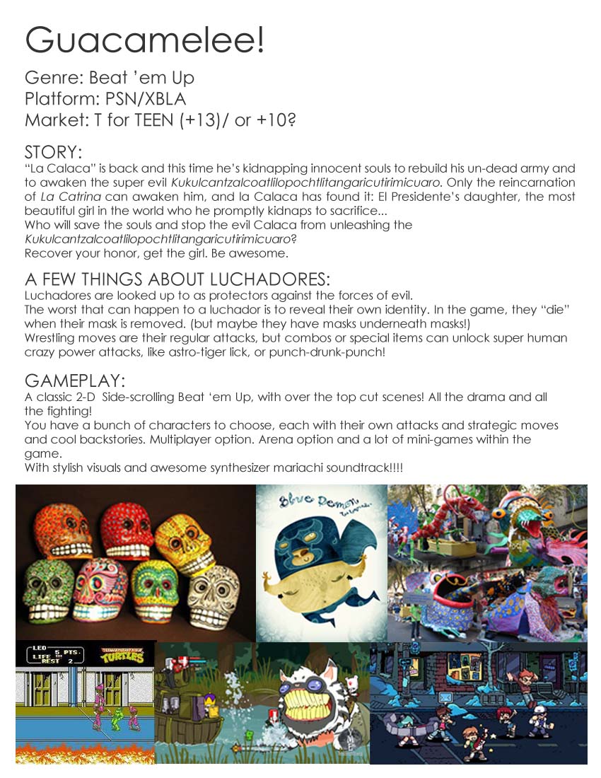
From this simple sketch, the team developed the critically-acclaimed action platformer Guacamelee! Launched initially on PS3 and PS Vita in 2013, the game has since seen a subsequent expanded re-release – Guacamelee! Super Turbo Championship Edition (2014) - and has racked up over four million downloads globally.
With a sequel now in the works, we sat down with Co-Founder and Producer Graham Smith and Concept Lead Augusto Quijano to find out how they went from a 300-word pitch to a much-loved indie hit.
Building a prototype
“Augusto’s initial pitch for Guacamelee! was more focused on the characters and the story than the actual gameplay,” Graham explains.
“We loved the charm of the idea, but we really wanted something a bit more interesting on the gameplay side; something deeper than a classic beat ’em up. With that in mind, we decided to combine his pitch with some of the ideas pitched by other team members.
“One was for a platformer with an ‘Ikaruga-like’ mechanic, where players could swap between multiple dimensions, changing environments and enemies; another was for a classic Metroid-style game. We ended up merging these to create Guacamelee! and had managed to put together a target gameplay video by early 2011.”
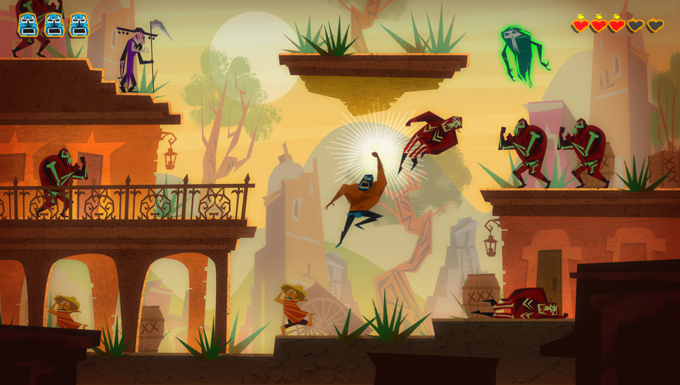
By this time lead artist Augusto already had a strong idea for what he wanted from the final look of the game. As he explains:
“I was born and raised in Mexico, so I had kind of an ‘insider’ angle that resonated with the team. In our early talks with the art director, the team were immediately drawn to the graphic, colourful patterns at the heart of Mexican folklore. Combined with our love for mid-century graphic design and the really colourful games we were already known for, we had a very clear beacon to push towards.”
Punching high
Though the team had a clear vision, both mechanically and artistically, of what they wanted from the game, there were still obstacles to navigate.
“The main challenge in getting the concept off the ground was funding,” recalls Graham. Guacamelee! had a target budget that was way higher than what we could realistically afford.
“We met with a lot of publishers in 2011, both at GDC and E3, to pitch them our idea and were actually negotiating contracts when we found out we’d been awarded the Canada Media Fund – a government initiative which loans money to promising new projects.
It meant the team could start setting targets for the finished project and working towards a finished game and it was then they began to realise the scale of the project.
Learning curves
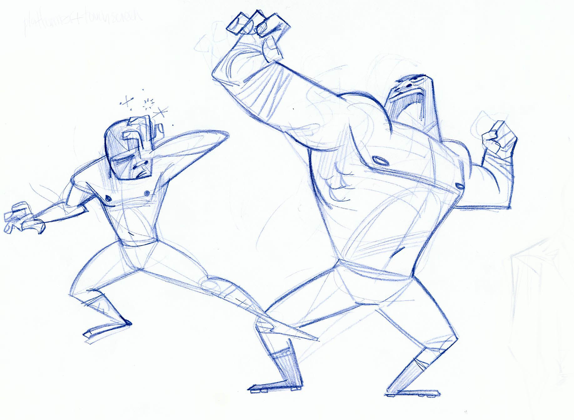
“Guacamelee! had way more characters than our first two games combined,” Augusto remembers.
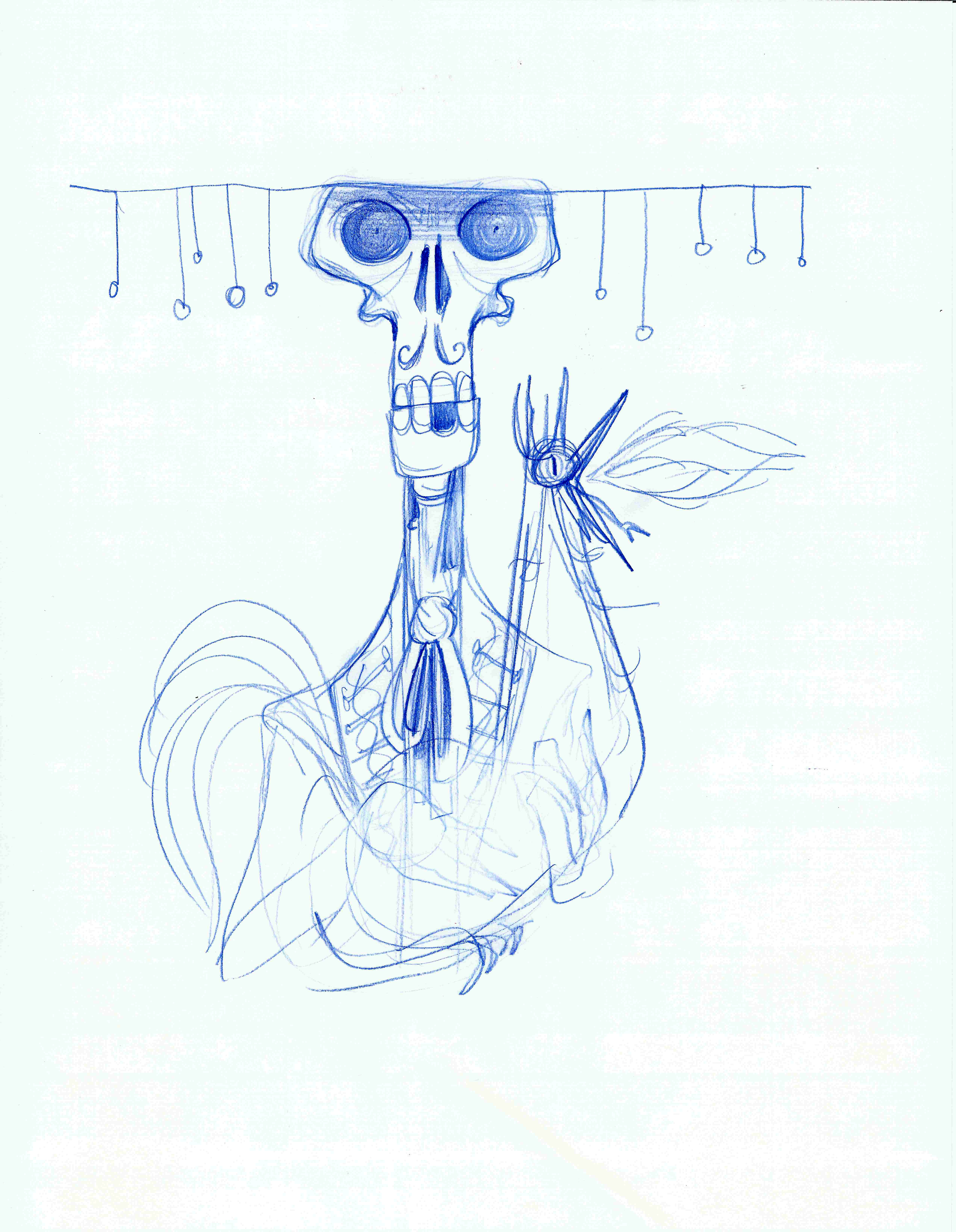
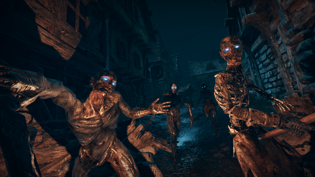
“I had never designed or animated enemies that could punch, dodge or be thrown before, so at the start of the project I often thought ‘I have no idea what I’m doing’ – just creating a basic skeleton enemy seemed like a tall order!
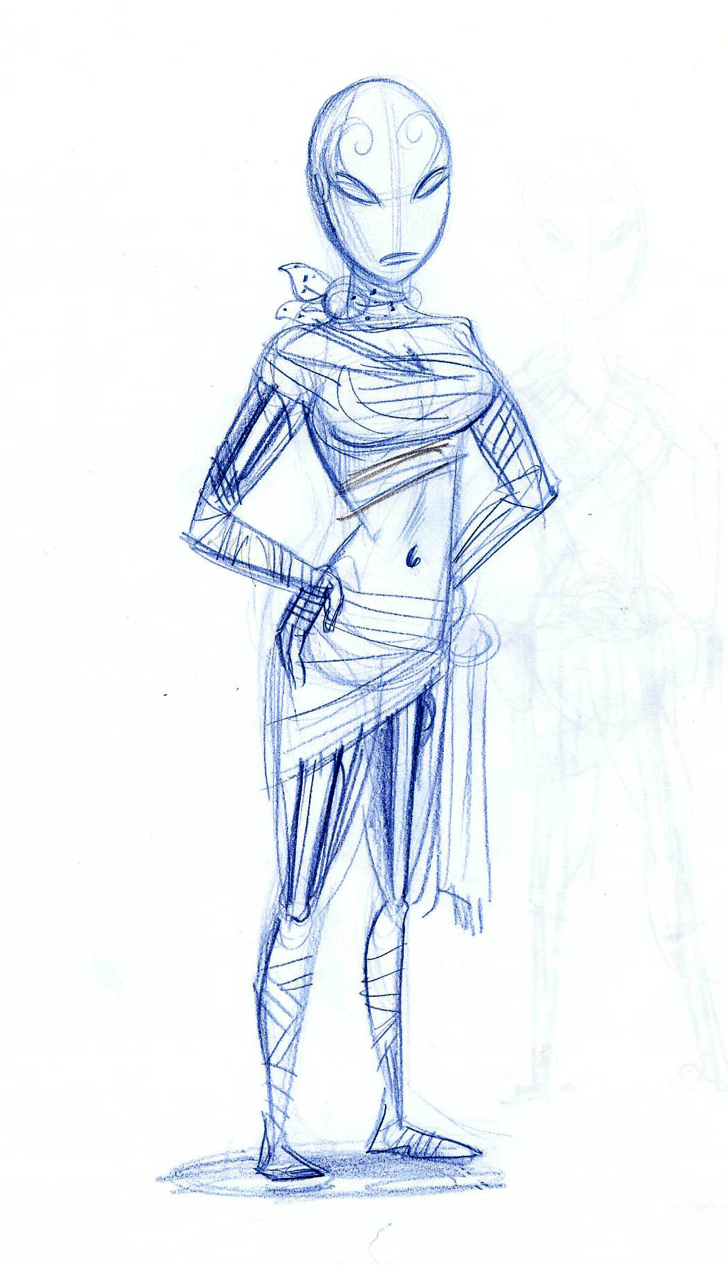
“I had to do a lot of research. For example, our main character begins the game as a ‘jimador’ (an agave farmer), so I had to learn a lot about what that entailed. Now I know more about making tequila than an average person ever should!”
As time went on the team gained confidence, but there was still massive hurdles to overcome.
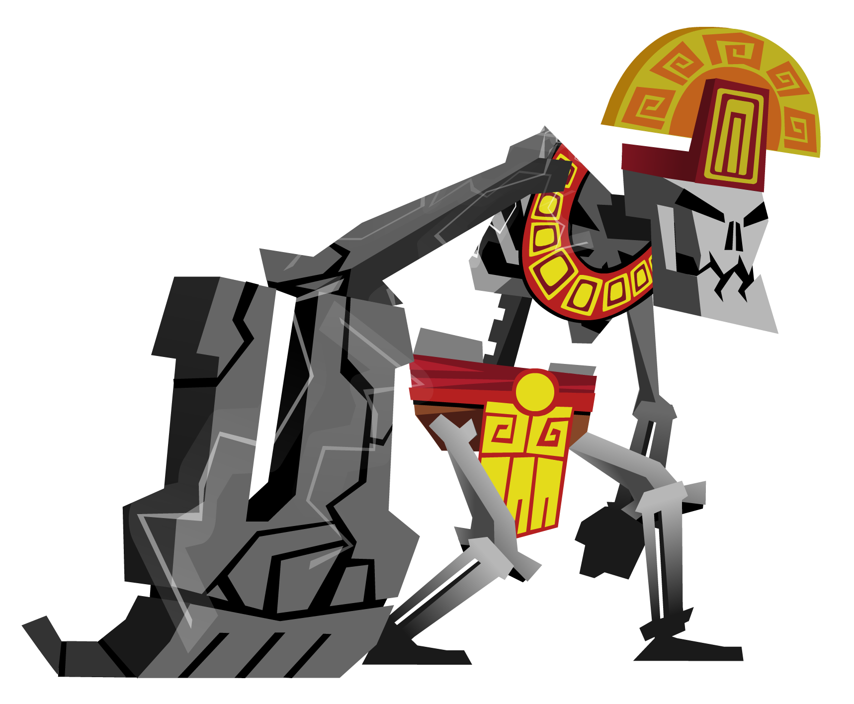
“My least favourite enemy to design was the Lightning Skeleton,” Augusto explains. “That enemy has one giant arm, flies with electric wings, and has a vertical lightning bolt which you have to dodge. It was a hugely complicated set of requirements – the design was super difficult to pull off!”
Between worlds
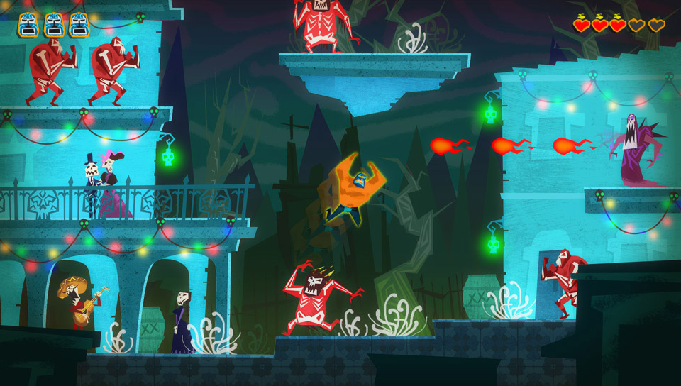
“Then there was the ‘dead world’ – it wasn’t even a part of the original idea,” Augusto continues. “It was conceived later, but fits the games’ themes perfectly.”
“It required us, however, to have two completely different colour palettes for each level, because we wanted the two worlds to feel visually very distinct from each other. However, at the same time, levels often needed to have a similar structure between their ‘living’ and ‘dead’ versions.

“We’d start by creating the ‘living world’ version, then re-colour that as our first pass of the dead world. After that, we’d replace or add additional decorations and props to create the final ‘dead world’ version.”
Ducking and diving
Between characters, environments and mechanics, the team had a hugely ambitious project on their hands. This was just on the art side, of course, over on the design side of the studio they were having their own problems.

“We wanted the levels in Guacamelee! to consist of about 50% combat and 50% platforming,” Graham elaborates, “and nailing both took a lot of iteration to get right. Even then, some abilities, like the chicken form, I don’t feel like we ever quite got that right…
“The mechanic that took the most time overall was the dodge move. Some players did not find it intuitive at all and just tried to brute force their way through the game without using it. For example, rather than dodging through enemy attacks, some players would jump or run away to avoid them.”
Wrestling with difficulty
Making all of these different areas work together to create a satisfying challenge that progresses nicely as the game unfolds is one of the areas the game is most highly praised for, but as Graham reveals, it was no mean feat.
“It’s pretty common for designers to want to create content that is fun for them to play, but designers are experts at the game, and so we’ll often find that the first draft of a level will be really difficult – fun for us to play, but way too difficult for an average player.
“To mitigate this we run playtests at every stage of development. We have a ‘TV area’ in the office and invite play-testers to come into our studio, relax and play the game at a normal pace. However, while they are playing, we ‘secretly’ stream it live to everyone in the office and discuss our observations.
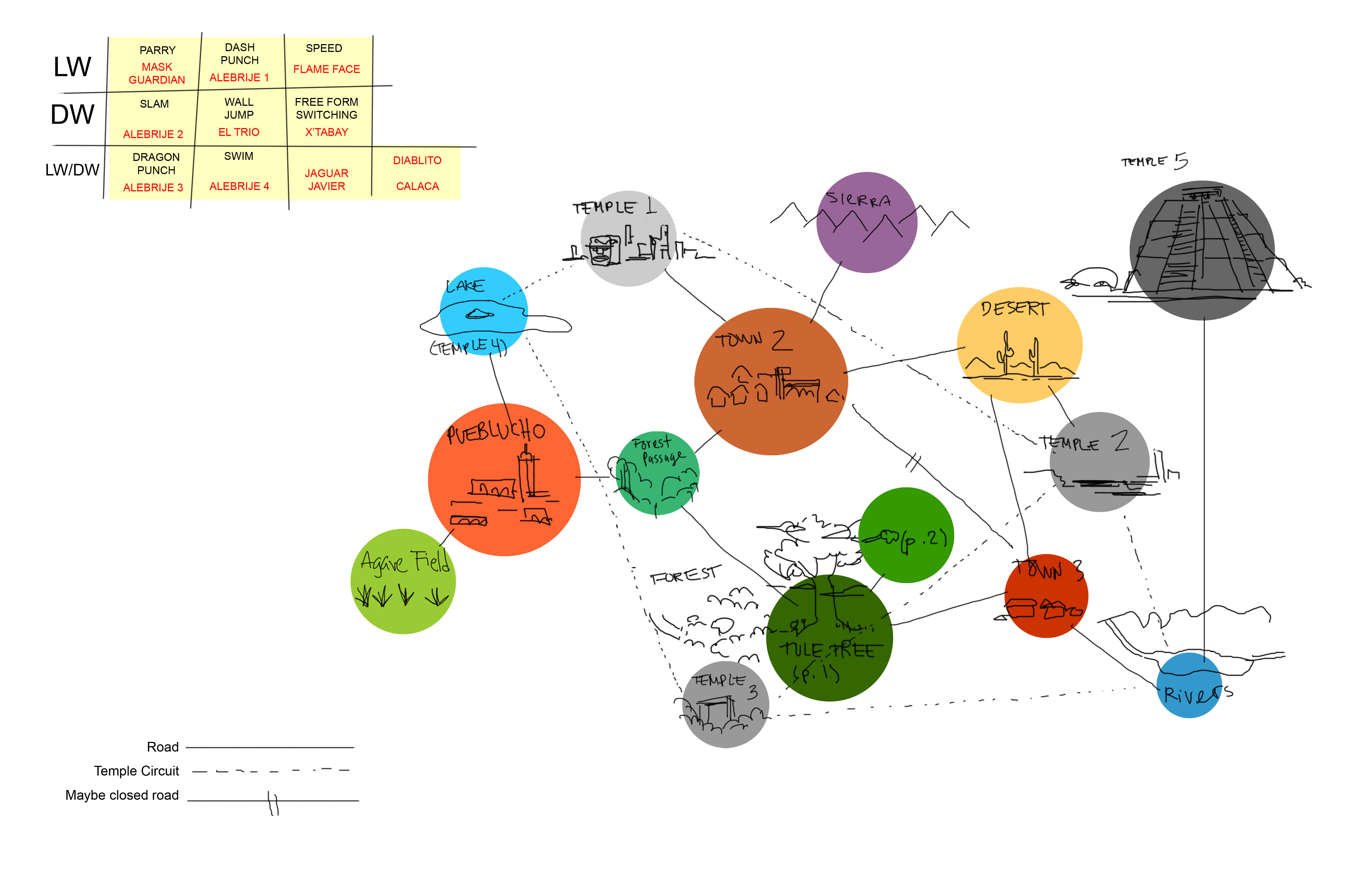
“We also keep log files of each ‘death location’ to create a heat map over the levels. This allows us to quickly identify problem areas without having to re-watch whole play-throughs and reduce difficulty where there are too many deaths and increase it in places with none.”
Looking back
It was clearly a lot of work, but as far as Graham and Augusto are concerned, the pay-offs were worthwhile.
“With Guacamelee!,” Graham explains, “I’m most proud of the way we were able to make the combat and platforming work together so seamlessly, while making both elements challenging and fun. For me, this is the element of the game that stands out.”
“For me,” Augusto adds, “it’s the little details that make the game feel authentically Mexican – those details are the first things that get overlooked from an outsider’s perspective, but they stick out so much when you’ve lived with them your whole life.”
Looking ahead
Critics seemed to agree too, with the game receiving high critical praise upon release, both for its distinct visual direction and tight, challenging design. The game has done so well in fact, that the team are now working hard on a sequel, which promises to be even more ambitious than the original.
“There were lots of cool ideas that didn’t make it into the original game,” Graham confirms. “So, when starting work on the sequel, we looked back over all of the old materials and concepts that we didn’t have time to add to the original game, and used these as a starting point for new characters and features. We’re really excited to have a chance to bring some them back!”
Guacamelee 2 is set for release in 2018 – if you missed out on Guacamelee!, you can try it now on PS4. Click here to check it out on PlayStation Store
More in the ‘Extended Play’ series:
- How Psygnosis married political sci-fi and Top Gun in PSone shooter classic Colony Wars
- Kazunori Yamauchi & Shuhei Yoshida look back at Gran Turismo’s inception
- How Final Fantasy XII‘s gambit created one of the most distinct RPGs ever
- How Tekken 3 made everybody love kung-fu fighting
- The inside story of how iconic PlayStation series WipEout was born
- How Blizzard’s larger than life hero shooter Overwatch was born
- How PaRappa The Rapper ushered in a music game revolution
- How LittleBigPlanet made everyone a game-maker






Join the Conversation
Add a CommentBut don't be a jerk!
3 Comments
Loading More Comments