Greetings, mercenaries. Our motivation for the release of Uprising 1.5 was to do whatever we felt necessary to improve the chances of new players making it past Day One of playing DUST 514. The first step was to consider what sort of players we were aiming at, and decide which teaching approach to take.
Our target audience is, for the most part, gamers who are familiar with other console first-person shooters and want to try something a little more interesting. This led us to focus primarily on teaching the differences between DUST and other FPS games, rather than trying to teach people, for example, what a gun is and how to move around.
To accomplish this, we considered two major approaches: instruction-driven and objective-driven. An instruction-driven approach ensures that players are clearly shown what to do at each point along the way. Commonly this means highlighting every interaction, locking out everything else, and ensuring that every single step is explained. An objective-driven approach, by contrast, tends towards giving players goals to complete, and telling them just enough to let them figure out how to complete it.
Ultimately, we decided to go with an objective-driven approach. With the assumption that our players are mostly familiar with the genre, we can be more confident that they’ll be able to complete the objectives.
DUST is also a fairly dense and free-form game, so people who are likely to stick with it in the long term are assumed to be more likely to find an objective-driven approach a good fit. And objective-driven tutorials are a safer long-term investment in a continually-changing game like DUST, since they’re much less sensitive to changes in UI, mechanics, etc.
With the approach decided, we discussed what we wanted to teach, and settled on three core things for this release:
Joining a battle
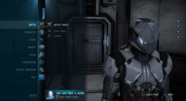
This is not rocket science, obviously, but we need to be sure that players can do this before anything else. While working out the best experience, we decided that it’s better having the Neocom open by default, rather than closed, since this makes the available options more obvious for new players and reduces button-presses for everyone. You’ll still be able to cancel into the MQ from the Neocom, but wherever we used to default to the plain MQ view, we now show the Neocom instead.
Creating a new fitting
This is one of the big things that sets DUST apart from other games, but in order to be effective it needs to be understood at an early stage. We teach the very basics: open Dropsuit Fitting, create a new fit, and make the fit valid by adding a weapon. Again, we’ve made some usability enhancements to the UI here, such as adding tips in the blank panes, to smooth out the experience.
Training a skill
Again, in DUST this is fairly different from most other games, and really needs to be understood early on. Here we’re just prompting people to open Skills, pick any skill, buy it, and train it to level 1. We didn’t find much to fix with the UI here, beyond changing the “Train” button to read “Purchase” when you don’t own the skill.
The biggest thing that we’re not teaching is how to use the Market. It’s obviously pretty important, and something we want to address in a future release, but we didn’t feel confident that we could deliver an effective tutorial for this release in the time available and with the current UI.
Beyond deciding on the specific instructions, we also needed to produce the surrounding systems to support it, and a good UI to convey it to players.
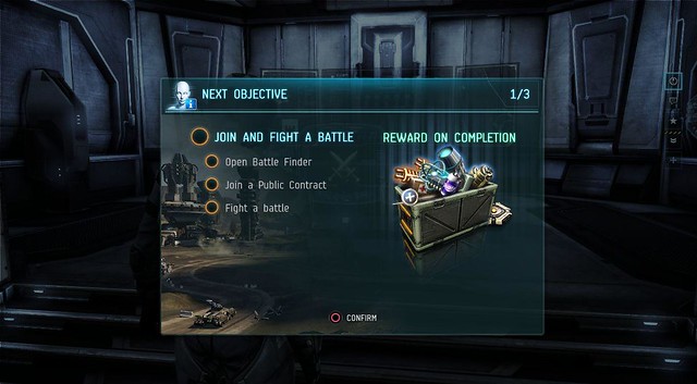
When your new character logs in for the first time (don’t worry, this won’t run on existing characters), you’ll be greeted by an introductory pop-up, and then shown the “New Objective” screen for the first task.
Here you can see pretty much what you need to know: what the goal is, what the individual suggested steps are, and what you’ll get for completing it. The rewards for this release are mostly militia gear, intended to get the players into the groove rather than give them a big power boost; the most expensive thing we’re handing out is probably the 1-day active booster in the final stage.
Once you’ve digested that, pressing “Continue” will animate the screen down to the bottom corner, where it’ll settle as an always-on-top reminder of your overall goal and your next step.
This location was picked as it has the fewest conflicts with existing UI, so it shouldn’t ever get in the way of anything. It’s persistent and on-top but it’s not restrictive in any way, so you’re free to ignore it for as long as you like.
As you follow the steps, they’ll complete, scroll off the UI, and be replaced by the next step. Steps where you’re doing something permanent (such as creating a fitting or buying a skill) are saved on the server, while steps that involve opening a UI element are not. This should ensure that anyone interrupted by accidental disconnect or the like picks up again on their next login in a sensible way.
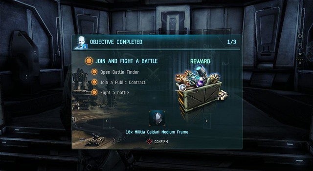
Once you complete your objective, you’ll be shown the “Objective Complete” screen at the next sensible opportunity (e.g., not in the middle of a battle). This nicely-animated screen lets you know that you’ve successfully completed your objective, and been given your reward.
Selecting “Continue” will then load the “New Objective” screen for the next objective, and so on until you’ve completed the whole tutorial. There’s one final pop-up to wrap up, and then you’re done.
That’s pretty much it. Simple and straightforward and – hopefully – comprehensible. The system is designed to be extensible (it’s actually using the same back-end system as the daily bonus), so we’re well positioned to add to it in future, but for now we’re pretty happy with what we’re shipping.
Feedback in the comments as usual!







Join the Conversation
Add a CommentBut don't be a jerk!
8 Comments
Loading More Comments