Developer 11 bit studios went back to the drawing board to make its strategy game work on console.
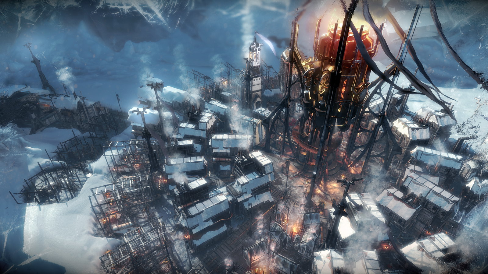
In Frostpunk, you rule the last city on Earth and lead the people on a path to survival through a never-ending winter. We mixed up a Victorian setting with steam-powered machinery, and gameplay is all about managing resources, building and expanding the city, and making thought-provoking decisions that could determine the course of civilization.
Making sure the complex inputs felt easy to use on console controllers was the driving force behind re-designing Frostpunk. From day one, we wanted to bring our frozen post-apocalyptic vision also to the PlayStation audience. We were perfectly aware that strategy and city-building games are most popular on PC and what console audience habits look like. Land on the couch in front of a big TV and just have fun with the game, right? That’s why we love the console environment as gamers. But this environment was uncharted to Frostpunk. We had to do our best to make the game feel designed for the consoles as a lead platform experience.
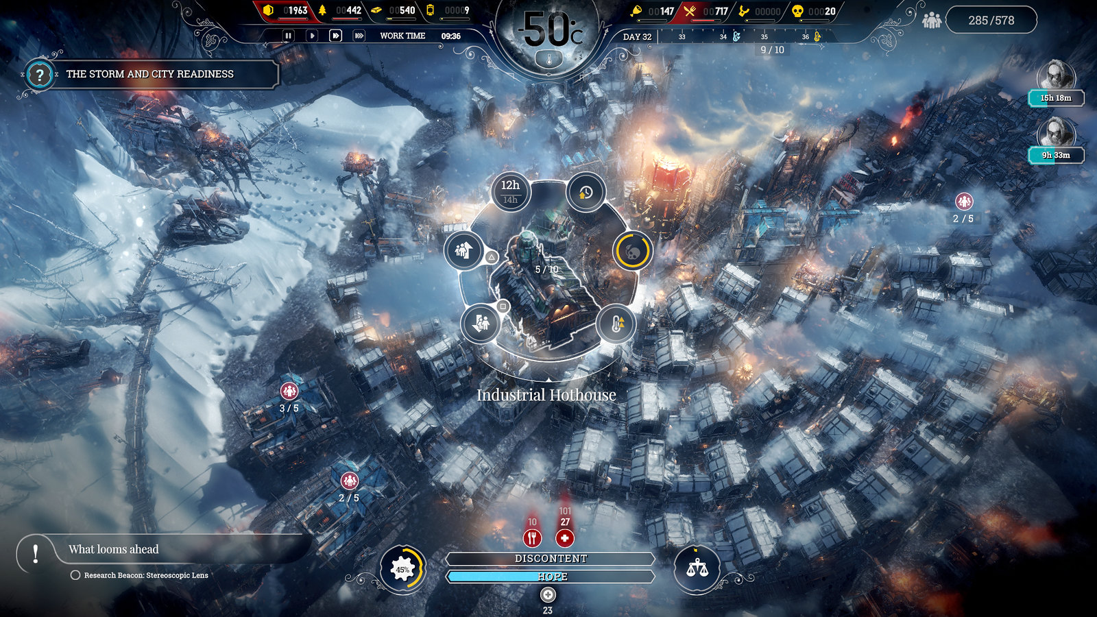
A mere port was not an option for us. Our UI guys basically went back to the drawing board. They re-designed all the menu screens and icons, put in some new HUD elements, and re-scaled those that were left. We decided to go for a radial design. Wheels of choice with further sub-menus are a pleasure to navigate using analog sticks. Also, the circular menu and icons were consistent with the core Frostpunk radial design that involved the generator at the center of a crater and players building a city around it.
The next step was addressing accessibility. Strategy games are often considered overwhelming due to the multiplicity of gameplay mechanics that players need to control. But the complexity of the gameplay is not a problem. The real issue is the way you provide those options to the players. Instead of simplifying the game, you should try to improve intuitiveness, iterate, add a ton of research and focus tests and polish it until you’re satisfied with it.
That’s what we did. For example, we have over 50 types of buildings in Frostpunk. So we sorted them into groups, such as people-related buildings with tents, child shelter or fight arena, or those used for health purposes like medical post and infirmary. Other groups are tied with the resources. We put all things used for coal gathering together; the same goes with other materials like wood or steel.
All those tabs containing the aforementioned radial sub-menus with given buildings are easy to navigate thanks to shoulder buttons. And one of my favorite accessibility tweaks is a quick menu. When you hold R2 during highlighting a building, you can easily add all needed workers to your newly constructed cookhouse or coal mine.
And you want to do that since the city must survive and without coal-running generator heat, it will be frozen to death by cruel winter. The power to inspire a society trying to last in harsh conditions and raise a steam-powered city of hope is at the tip of your thumbs. We truly feel that we succeeded in making this game smooth and enjoyable on PS4, and we can’t wait to see what you think when Frostpunk launches tomorrow.


Comments are closed.
4 Comments
Loading More Comments