


Notice anything different?
Today, we’re quite ecstatic to unveil the new look of the PlayStation.Blog. As the site marches towards its 4th anniversary in June, the patchwork, add-on look of these pages began to resemble the Weasley house. Also, we were tired of being unfavorably compared to our more attractive, cosmopolitan European sister site.
Unlike commercial sites, we didn’t redesign to serve you more ads, or because we have an in-house art staff that we have to justify. We redesigned the PlayStation.Blog with your requests in mind. How do we know what you’re looking for? You’ve been voting with your clicks.
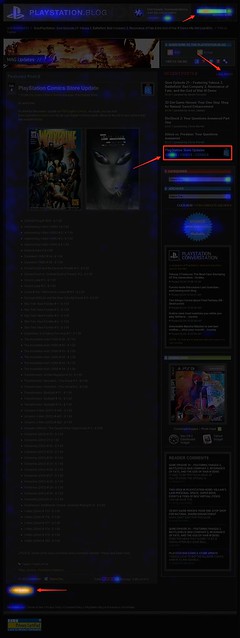
Over the past year, we’ve been analyzing where readers click on the site and, as you can see, items like PlayStation Store update posts and recent stories light up like a Christmas tree. If you only decorate your tree with white lights, that is. When we coupled this info with traffic patterns, Google searches, and other data, it was pretty clear what types of things Blog readers like yourself are looking for when you visit. This redesign addresses these needs.
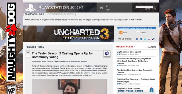
So we’ve added prominent, permanent links to PlayStation Plus and PlayStation Home content. We’ve overhauled the search box with autocomplete. Our biggest recent releases now “live” at the top right of the site. And huge news won’t get pushed down the page nearly as quickly as it used to.
Conversely, with the old design many things weren’t as easy to find as they should have been. You’ll now find it easier to give feedback on posts via Twitter and Facebook (both of which had a fraction of their current userbase when we first launched the site). Related content will appear at the bottom of a post, and a string of features can be found in a scrolling “red box” belt right in the middle of the homepage.
We also know that the average reader owns a wider, higher-resolution monitor than when we first launched in 2007, and so we’re taking advantage of that additional real estate, and you can expect more and better takeovers of the site, like we did with UNCHARTED 3’s launch.
Now, we realize that this new design will take some getting used to, and some of you will probably hate it outright – at least at first. Many of you said as much when we inverted the color palette from black to white last year, though those complaints died out very quickly as we all adjusted.
Still, for those who really loved the old site, if you look closely, you’ll notice the things that *didn’t* change. The font, colors, and sizes are all the same. Comment replies remain an attention-grabbing red. Of course, the PlayStation news content you visit us to view will all still be here – you just won’t have to look as hard.
Over the course of the redesign process, we began to compare the new site to [lady with the hat]. Even if you don’t care for the flashy new hat, the old girl you know and love is still underneath.
Please let us know what you think. As always, we’ll be reading.
Sincerely,
Jeff, Sid, and Rey
Your PlayStation.Blog team


Love It!!!, the old one was kind of simple for my taste
I’d like the new design better if when I clicked on the inFAMOUS 2 limited beta links, it would take me to that page and not this one over and over again.
I like this change very much. Was a pleasant surprise when it popped up initially. After a short while perusing the new setup I feel it flows nicely. The update on the infamous early beta was a nice way to break in the new layout. Well done!
Now I would just love an option to get the old white on black look for the text and it would be perfect.
I’m not a fan of all the red…bloody hell
looks cool but i find it much harder to navigate to things…. like c’mon I just want to read today’s news… but there seems to be so much thrown at me…its certinally much harder to navigate just like the ps forums.
This is amazing on the iPad! Great new layout, will take some time to get used to it but I think its a leap forward in the right direction.
This is awesome, thanks for a great refresh, please update rest of the site using same setup you have here, and please pretty please get us Playstation App. I got the European version and I think its great.
Looks Amazing!!
can we have an option to change it back. Like a button for your preference
I like it alot.
It need a upgrade next to work on share one
Very cool! Eye-catching for sure. There’s a ton of things to click on, but I bet we will all get familiar with it soon enough!
Looks fantastic I’m the type of person that get’s used to things quick. Love the darker colors which seem to fit with the look of the PS3.
Unlike the forums, this update is actually functionally and visually pleasing. Great job blog team.
You guys need to make this work on google chrome. Right now the site only shows up on firefox.
It’s fine. The feed still works on my Readers so … it kinda doesn’t matter for me. But, When I actually come here, I like the look. The NGP having it’s own section makes me feel like my PSP will be obsolete soon … but hey it’s not made obsolete as frequently as say … a phone.lol.
I’m a bit confused. How come some of the people’s avatars have the words “pro” and “select” under them?
I like it, the layout is much easier to move around in. Feel like I can get more information with less looking.
Regardless of what people think… You should give yourselves a pat on your backs and be proud of the work you’ve done with this (redesign) PS Blog!
I have a comment on the little scrolling story list on the inside right-hand column.
There’s a circular down arrow icon at the bottom of the list. It obscures the headline of that story. It would be better if it doesn’t. Otherwise, I think the new page is an improvement.
Also, a quirk that’s annoyed me from the old page has been carried over. There’s no drop-down menu from my PSN ID on the very top navigation bar like there is on all the other PSN web pages. Is there a reason we can’t access it (e.g. trophy lists) from the blog?
Well I am liking it a lot after I got here and looked around more and more, still no SMS register for updates yet eh? I would guess that will come with Playstation Suite then? Running a Samsung Intercept here with Android and sometimes I am not near my computer or PS3 to get the latest updates and my twitter gives me updates when it wants to on my phone ;).
Another quick note would be to add a calendar like feature that is updated with events for Home and game releases that we can glance at.
Other then that it looks great!
Looking good. Ease of navigation is great.
oohh new lay out
I <3 THE NEW BLOG! Now you need a Forums section and GAME REVIEWS/user reviews section!
It will take some getting used to but it looks very nice!
i dont like it, doesn’t look like a blog more like a adds site, and take forever to load.
The new design is quite overwhelming, major updates, like you said it will take some time getting used to, but I’m loving it!
Jeff,
It’s all right, assuming you get the busted links fixed :)
I’m sure this is a work in progress, so I won’t be to harsh, but I do miss external news feed that used to appear on the right ——>
Looks good. Great job guys.
I really like it and think that it’s a step in the right direction but I feel like there’s quite a bit of clutter on the front page. There’s both an horizontal and a vertical bar to scroll through articles… a bit overkill there? Or maybe it’s just the placement of it that’s a bit strange.
If it were me, I think I’d just get rid of the vertical bar and expand the area for the day’s main articles. To me it seems pretty useless as it’s just the same articles you already get on the front page anyway.
Looking forward to more news from you guys! Love the site and check it several times a day. Also can’t wait to check out the PS app once it hits!
This is a pretty big change, I think I like it though.
It’ll take a while to get used to it, but it seems pretty sleek.
Wow, it sure pops in your face with the colors but I love it! It gets awhile to get used to and everything is coming at you with crazy colors. But overall, its nice! WAYYYY more better than the old format! More livelier, more richness and its bursting playstation goodness. Keep it up!
But jeff, the color red with the black/white white text is brutal on the eyes….
Nevermind… I think I understand the use for the vertical bar a bit better now, haha. Good to quickly find newer articles without having to scroll down. Still I think the placement could be what I find annoying. Maybe if the “Follow PlayStation,” “Subscribe”, etc info bars on the right were placed somewhere else to make more room for the rest and more important info people come to this site for… or maybe it’ll just take some getting used to :P
So far I’m liking it. It’s got a kinda cool magazine type layout to it and I feel it gives the posts more “umph!”, shall we say? I did try to click one one article and it redirected me somewhere else but I’m sure you’ll work the kinks out.
I like the layout of this, but it seems a little more complicated. We’ll grow use to it though. :)
Wow, this looks pretty cool! The old design wasn’t’ bad, but I like this one a lot more. It’s pretty easy to navigate and all the stories are nicely spaced out.
I love the background and color scheme. I’m a sucker for black and red. :)
Good job, guys!
I absolutely LOVE this new decked out design of the blog! Sleek and bold, a perfect appeal to all gamers. XD Great job who ever decided to change it. I personally didn’t even think the blog needed changing, but I guess Surprise was a change for the better. Man, I am lovin this up! Keep it up PlayStation.
It’s a very interesting change. I was certainly use to the old style. It’ll take some to adjust to this change for sure. You know what they say, “Change is good.” But they also say, “If it ain’t broke, Don’t fix it.” We’ll see how this pans out.
Im digging the new site, but it’s a bit weird since im not used to it, but that’s common. It’s like when you buy a new house, it takes some time getting used to, but soon enough it will feel like normal again. This is definitely more stylish, Dante would be proud :P
Cool, but I loved the finding features in the old one. Like the recent post bar on the right, and the present and last month’s posts, ya know, that whole shebang. I’d like to see that, or tips to point me to it. Please reply.
loving it already!!!
LOL, Hey PlayStation.
Who ever wrote that side note next to the “Leave A Comment” box…. genius. :)
I hope you guys keep it there forever for all the trolls to read and gain some humility for themselves. Seriously, I didn’t even think of that. Keep up the great work PlayStation! This is shaping up to be a great year already XD
I like it :)
Also, I’m typing this on an iPad, and whenever I scroll up, I’m sent back to this comment. I hope this can be fixed, or I’ll have to write my awesomely witty banter and such on my full computer. Not too bad, but can this previously mentioned bug be fixed?
New look looks very nice and sleek, just like the XMB screen on my ps3!
Please fix the bug I mentioned in comment 435. It’s making me mad…
You should provide the option to still use the old site. I enjoyed the way the old site was setup and found it very efficient. I do not like this page setup, it is way to cluttered. Also, many of the sub-sections (i.e. what we read) is only updated weekly and a special section is unnecessary. As someone who checks the blog multiple times daily, I found the old system worked great. It buried old news and put new news (the only “news”) at the top. If I missed a day I simply went into archives.
This new setup is sensory overload. Too much at once. The site looks sharp but it’s just too much at once. Please give me the option to go back to the other site. This looks much more like a marketing scheme than a channel to inform fans of current events. Hope I wasn’t a jerk….. :)
Love it ^_^
WOW!!!! its about time u guys change the psn blog!!!! its look really awesome!!!!!
People don’t like change lol, I’ve got to get used to it myself.