


Notice anything different?
Today, we’re quite ecstatic to unveil the new look of the PlayStation.Blog. As the site marches towards its 4th anniversary in June, the patchwork, add-on look of these pages began to resemble the Weasley house. Also, we were tired of being unfavorably compared to our more attractive, cosmopolitan European sister site.
Unlike commercial sites, we didn’t redesign to serve you more ads, or because we have an in-house art staff that we have to justify. We redesigned the PlayStation.Blog with your requests in mind. How do we know what you’re looking for? You’ve been voting with your clicks.
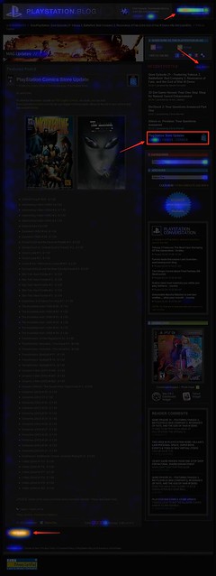
Over the past year, we’ve been analyzing where readers click on the site and, as you can see, items like PlayStation Store update posts and recent stories light up like a Christmas tree. If you only decorate your tree with white lights, that is. When we coupled this info with traffic patterns, Google searches, and other data, it was pretty clear what types of things Blog readers like yourself are looking for when you visit. This redesign addresses these needs.
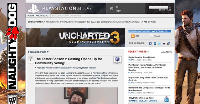
So we’ve added prominent, permanent links to PlayStation Plus and PlayStation Home content. We’ve overhauled the search box with autocomplete. Our biggest recent releases now “live” at the top right of the site. And huge news won’t get pushed down the page nearly as quickly as it used to.
Conversely, with the old design many things weren’t as easy to find as they should have been. You’ll now find it easier to give feedback on posts via Twitter and Facebook (both of which had a fraction of their current userbase when we first launched the site). Related content will appear at the bottom of a post, and a string of features can be found in a scrolling “red box” belt right in the middle of the homepage.
We also know that the average reader owns a wider, higher-resolution monitor than when we first launched in 2007, and so we’re taking advantage of that additional real estate, and you can expect more and better takeovers of the site, like we did with UNCHARTED 3’s launch.
Now, we realize that this new design will take some getting used to, and some of you will probably hate it outright – at least at first. Many of you said as much when we inverted the color palette from black to white last year, though those complaints died out very quickly as we all adjusted.
Still, for those who really loved the old site, if you look closely, you’ll notice the things that *didn’t* change. The font, colors, and sizes are all the same. Comment replies remain an attention-grabbing red. Of course, the PlayStation news content you visit us to view will all still be here – you just won’t have to look as hard.
Over the course of the redesign process, we began to compare the new site to [lady with the hat]. Even if you don’t care for the flashy new hat, the old girl you know and love is still underneath.
Please let us know what you think. As always, we’ll be reading.
Sincerely,
Jeff, Sid, and Rey
Your PlayStation.Blog team


I am so loving this, good job guys, marching forward is what you guys have always were all about anways
Well since you care so much about your sister European Site I know a great way to one up them would be making a White Knight Chronicles 2 headed to US annoucement of your own…. that woulda been a great annoucement to debut with this new look.
Now however Im having even more faint hope that it’ll see teh light of day in the US, the only thing thats keeping me hoping the that fact that Dynasty Warriors 7 was indeed annouced for EU first thenj it got an US annoucement later on and even still the US version showed up in stores FIRST…. So im hoping the same thing will Happen with White Knight Chronicles 2
And if WKC2 come sout in the Us in the same month as its scheduled too in EU (May) thast the same month as my bday… that would be a wonderful bday present for me…. Please dont disappoint me sony. youve been doing a great job so far (in my eyes at least) lets hope you can keep the track record going.
Excelent PS Blog, i Like the new design
I have a singular concern. The RED mouseover on Playstation Blog and P.S. Blog Share buttons at the top is difficult to see. Any chance that you could place a highlight behind it making it more visible when moused over. Other then that, great overall look.
I would like to see things slimmed down a bit, over all trimmed back a bit as to not have it all come at you at once, as everything seems over all a bit too cluttered. It certainly seems more alive though, but just a bit too inefficient. Also many of the boarders to various sections are black, and with a black background, it makes things more complicated to see, and separate various windows. Also it took me some time to notice the arrows for a few of the scrolling sections, I’m not sure how exactly, but they could be a bit more obvious.
Always nice to see things changed up though, can’t keep things the same for too long :P
I love it, i love the layout design. plus i love the dark look.
triangle for ps3, circle for psp etc… cool idea.
Please Jeff, tell me it will stay this way :)
Side note: any info on the android playstation app? I’m on my knees asking.
New design is awesome. You guys need to create an iPhone, Android App for the blog.
I love the new look guys!!!! don’t get why or like that PS2 is on here when it’s irrelevant and outdated and games aren’t even made for it anymore other than one EA game every year.
Hi,
Just wanted to give my 2 cents.
While I like the way the new blog looks, I miss the friendliness and usability of the old blog. Was A LOT easier just to scroll through the storys and now there is this quagmire of a 1st page.
This resembles more along the lines of a videogame website rather than an easy-to-navigate blog listing like you used to have.
My recommendation?
Roll it back, please.
Okay i hate this design. WHY WHY WHY is every story on this page at least 3 times each!??!?! There’s about 4 spots to access each story. To me that is design failure.
Wow, the new look is pretty cool. I can’t wait to explore it a little
This is how us.playstation.com should look like, I got one word amazing. Love the new design, keep up the good news and updates!
—
Chris
The top portion is just kind of a mess, I personally will just be scrolling down to where the posts are listed chronologically. I personally find it ugly and way too busy, but that’s just my personal opinion. I guess it’s cool that you can sort posts by PS+ and the Store Update, but I personally won’t ever use it cuz i usually check the blog on a daily basis.
And the best thing you guys could add would be to let users respond to each other. A lot of people leave comments and never get them answered by the person who posts the blog, but a lot of other users know the answers. So a way to let users respond to each other (a la Joystiq and Game Informer’s sites) would probably be the best thing this site could add.
Overall: 2/5
I love the new look. But i HATE the layout. I want it to be the old layout.
The layout of Euro PS blog. Its much easier to navigate/ How am I supposed to see the nest PS blog Post? go back to the home page? Very bad decision.
Ooops, forgot to say. Google is by far the best search engine because it keeps things so simple…simplicity is really key for a lot of people when it comes to websites. The new ps blog design is definitely not simple.
Between you and the Washington Post, both of my go to sites got revamped on the same day!
Nice yeah a well done upgrade PS!
yessssssssssssss
Change is good, love the new layout
Love it!
The site will obviously take some getting used to, but i’m not sure i will ever like the comment section! It looks as if it were made for blind 90 year olds! while it is fairly esthetically nicer, it could be slightly improved with some downsizing.
the rest of the site is still REALLY sleek though :D
Not only does it match the new us.playstation.com website, it also has that magazine type of feel to it. Definitely like it as it brings more color to the site. The colors really bring attention to things not noticed before.
Nice job design team!
I think this is very nice. Great job!
I was wondering why I couldn’t access older comments earlier! Loving the new look so far!
OMG HOW CAN YOU PEOPLE HATE IT?!? IT LOOKS SLICK! I mean it seems to look like these comment sections are a bit oversized, but in general, all has been greatly improved over the last blog! :)
This is a horrible update. The old site as easy to read, clearly conveyed information, and was elegant. The other sites you think you were being ‘unfavorable compared to’ were garish and worthless. The one good thing, let me repeat the one good thing, Playstation.blog had going for it unlike the rest of the PlayStation.com site was it was readable and easy to understand. The entire PlayStation.com site needed to become like the old blog site. You have ruined this area of the website! I cannot believe any rational human being would think you have improved anything.
I like the color, but it looks way to cluttered now at the top and bottom. I do like that more stories are shown on the front page, but the boxes in the top half are a couple too many.
Looks MUCH better than its previous iteration and its European counterpart. Nice and compact, but clear and easily readable. And I love the color scheme. Can’t wait to see what the takeovers look like on this layout. Wonderful job, guys.
Now if you could just spruce up those PSN IDs to look like something more than just an image with trophy count that was whipped up in about 8 minutes, then we can call things square. :DDD
I love it !
I think the new look is horrible. It reminds me of Kotaku’s horrible redesign. So much clutter.
I’m liking it so far, even though at first glance it does appear a bit cluttered. It will get some taking used to, but everything seems to be in place for a reason, and not too difficult to find. I must say it’s a lot better redesign that what Gawker/Kotaku did. *shivers in disgust*
LOVE IT!!!!
This design is terrible, it’s complete garbage. It’s way too cluttered and unorganized. Anyway I can view the site in the old design? It’s so much easier to actually SEE WHAT HAS BEEN POSTED in the old design!!!!!!!!!!!!!
I feel like I have to search for a needle in a haystack just to see what has been posted on the blog with this design. The old one everything was nicely listed and all I had to do was scroll down.
It seems a lot better than Gawker’s crappy redesign! I’m just glad there aren’t ads everywhere!
Many people are afraid of change… Sometimes people like it @ first glance, some just tend to hate… For me, change and new appearances are always good and welcomed… Its is too soon for me to decide whats awesome, good, not so or just plain bad… For now all I can say is that I’m lost and I like it!! KUDOS to the BLOG team!!! Thk u so much for this new look and everything you guys do!!
Eh, I’m not particularly fond with it, but we’ll see how it evolves when the kinks get ironed out. While I see where you’re going by trying to have more information on the front page, it also makes things really busy and hard to shuffle through.
Good job. I like changes…
Okay, to be honest the European PlayStation Blog looks way better than this in every way.
too much cluttered together. You guys shouldnt have chaanged it! plastations board forums sucked after change. dont even pay attetion to it anymore and it lost many people. lets see how this goes
This is sooo cool!!! omg I love this…You guys have the best web designer like seriously!!!
Change is good. I like it. Thanks Jeff Rubenstein.
I like it. Keep up the good work.
The best improvement on the home page is the main window that shows the top story and has tabs to news for current games. I think it’s a fairly accepted practice to scroll down a page to find older stories, so the scrollable column of older stories to right of that main area is unnecessary and takes up space that could be used to expand the main window and allow for more tabs to encompass an entire day’s worth (or two) of blog posts in an easily accessible area that requires no scrolling at all.
The top of the page seems a bit disheveled. The square PS logo, account options, language selector and search box should be in better alignment. Also, the link “Playstation Blog” below the PS logo right next to the giant “PlayStation Blog” link is redundant and should be removed. That would allow the area for the “Share” link to be smaller.
Once I’m in a post, I find the rating meter to be in a weird position. It should be located right at the bottom of the post so you can rate it once you’ve read it, not before you read it or partway through it. Scrolling up to rate a post you’ve read is a bit silly.
I kind of like the old style better, this one seems a bit too dark. and the layout a bit too clluttered.
Maybe you guys could set up a classic view for those like me who’d prefer somethign simpler?
I like it!!! Bigger Better!!!
Taking a little to get use to but I like the over the top feel.
Great job, one of few sites i hit everyday many times lol
It would also be helpful if the red “Replies” link only showed posts with an official response, rather than just navigating to the first one.
I do like the permanent links for PlayStation Store updates and information, as well as the links to platform-specific news.
the quick links for the ps store, psn plus, videos, etc disappear when you click on one of those topics, so if i look at ps plus content on the blog, but then want to go look at store updates, i have to go back and then click… this menu should be available all the time!
Pretty damn sweet.
@340: i agree offer an alternative view!
This looks really good, now that your capable of doing this please I beg of you to redesign the XMB itself. Its so boring… and cluttered… I want a sleek glossy interface with high quality. Please consider this Sony. – Bionicle123