
Media Molecule's papercraft adventure exits the PS Plus lineup soon! Here's an insider look at the creation of this heartfelt experience.
With PS4’s papercraft-inspired adventure Tearaway Unfolded available on PS Plus this month, we asked Media Molecule to talk us through some unseen concepts behind the game’s creation. Here, designer Rex Crowle pinpoints key design junctures in Tearway’s development, illustrated through exclusive images from the game’s early days.
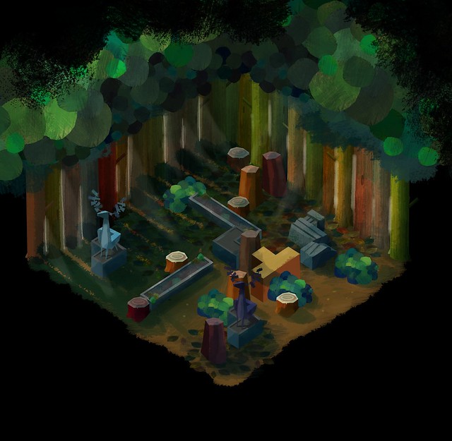
1. A colorful dungeon crawler?
“This is a very early concept from Tearaway. The game went through many changes, and switched genres a few times while we worked out the best way to use the paper-world setting. At this stage it was more like a colorful dungeon-crawler.
“As we’d only just finished making LittleBigPlanet games, you can probably see a more LBP-style look here, with lots of color and pop-culture items combined together.”
2. A collage look perhaps?
“Another very early concept from me. I feel I was starting to put LittleBigPlanet behind me more by this point. The colorful collage look has transformed into something more atmospheric, and closer to the more magical and mysterious world that we finally ended up with.
“At this stage it’s not really very papery, it’s more like someone has cut up sheets of painted paper and made this collage. I was actually quite inspired by the art of Eric Carle. You’ll probably know him as the creator of The Very Hungry Caterpillar and many other children’s picture-books.”
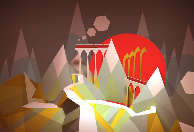
3. What about pop-up books?
“In those early concepts you could quite easily miss that it’s supposed to be a game made out of paper, it just wasn’t bold enough. If we were going to make a game entirely out of paper, it needed to be instantly recognisable as a paper-world, with paper-characters, that look and sound papery, as that would inspire us to make uniquely papery-gameplay.
“So we met paper craft designers and learnt about how pop-up books are designed and made. This concept by Men Lu was from a period when we tore everything up, and established a much stronger style – using the bold colors of construction paper and removing all other texture. So that the world was much closer to how it might look if you tried to make it in real-life. A very different type of photo-realism for a game!
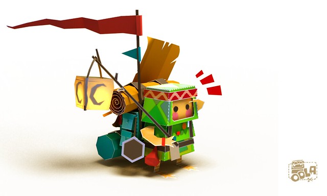
4. Meet Oola
“Any adventure needs an explorer willing to go on the journey. Originally our explorer was this little character called Oola, shown here in a concept by Men Lu. It’s a very sweet character, and I always loved the little bird-like feet that he had given to the design, especially as it ran around the world, possibly in search of some shoes.
“Unfortunately we found it hard to create the more expressive animations for the character, as a lot of their body was hidden away. So after a series of redesigns and brainstorms from the whole art-team, we created iota – the paper messenger, and then soon afterwards, atoi.”
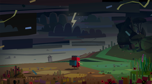
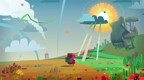
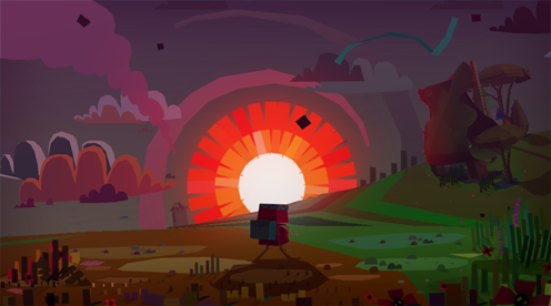
5. How does weather work in a paper world?
“When you’re making a world from one single material, it creates all kinds of interesting questions that you have to try and answer. Does fire hurt you if it’s made out of paper? Does paper-rain make you wet? We had a lot of fun arguing about things like this.
“These concepts I put together for our genius engine-coder Mark, as we were figuring out how papery-weather would be represented in the world. I still really wish we’d been able to add those papery rays seen radiating out of the clouds, especially if you could have climbed up them!”
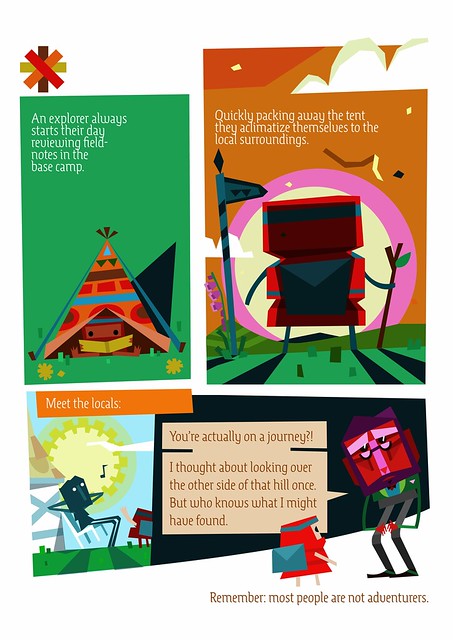
6. A comic book design bible
“When making a game full of ideas that everyone on the team are contributing to, it’s really important to make sure everyone is still making the same game together! The traditional way to do that is to have a design-doc, which collates everything together and contains every feature of the game in perfect detail. Obviously that makes it incredibly tedious and nobody reads it, which kind of makes it obsolete!
“That’s definitely what I learnt in the early days of making Tearaway, and I soon switched to making little comic-books (like this example page) or videos, to explain quickly the overall atmosphere of what we were trying to achieve, and then everyone on the team could work on their own elements to get us there.”
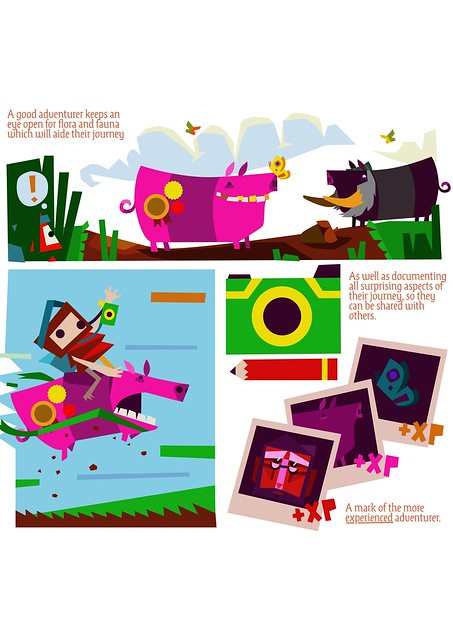
7. Getting the camera right
“Another page from one of my ‘design-doc’ comic-books. This is taken from a longer-section about using the camera in Tearaway to reward players for exploring and recording what they find.
“This feature was something that David ‘Dave Smith’ Smith really championed, and I loved how much it made you want to engage more with the world, as well as show other players what you’d found.
“This camera feature was added long before we added all the other ways of customising your character and the world around them, and became such an important feature for sharing their own personal journeys.”




Comments are closed.
8 Comments
Loading More Comments