
Concept art and behind-the-scenes-info highlight this deep dive into the Bloodstained sequel.
When it came time for a blog post about Bloodstained: Curse of the Moon 2, I knew exactly who I was going to ask to help out. Mr. Hiroki Miyazawa, the director of this game and the first Curse of the Moon, knows the ins and outs of this series better than anyone. If you saw our last post here about Dragon Marked for Death, you may remember his name! He’s the person the director turned to in order to take the gameplay from the old build of the game and make it more fun and engaging. Needless to say, he delivered then, and I firmly believe the Curse of the Moon games feel as satisfying as they do due to, in no small part, Miyazawa-san’s awesome design sense.
The latest update releases today and adds a brand new difficulty mode with the “Legend” setting. But hey, absolutely NO shame in playing on Casual or Veteran! Those demons get crushed either way!
Now let’s hear what Miyazawa-san has to say about the creation of Curse of the Moon 2, its characters, gameplay, story, and more!
Good day and good evening, everyone. This is Bloodstained: Curse of the Moon 2’s director Hiroki Miyazawa.
Creating Brand-New Playable Characters
Before development had fully begun, I told myself that I had to “make something fans will love.” In order to best achieve that, I wanted to both bring back the characters from the first game as well as introduce a new cast. Since all the characters would be available, the new characters had to stand out in their own way compared to the old ones, so things got started by examining the strengths of the previous cast.
The first character we decided on was Robert, whose role was to be an “ultra long-distance sniper.” Initially, he was a weapon specialist with a long range normal attack and a wide variety of sub-weapons. He ended up being the sort of character who could complete the game on his own without any real need for synergy with the other characters.
In order to give him some way to interact with the rest of the team, we gave him the wall cling and wall jump abilities. His massive attack range made him a damage-dealing specialist, so we drastically lowered his health to make sure he wasn’t over-powered. I thought it was a bit weird that a soldier would have such low health, so in the story we decided it was because he was “just a normal human with no experience fighting demons.” But, you know, I’ve never heard of any “normal humans” who can grab onto solid walls and jump off them… needless to say, I was relieved when nobody on the team pointed that out.
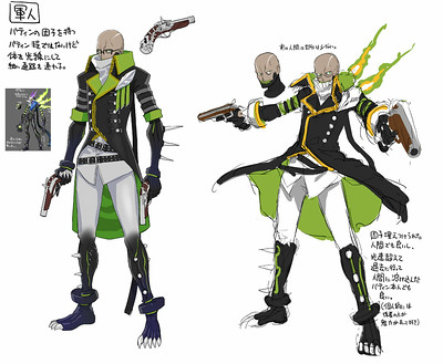
When designing Robert there were a few other ideas that we left on the cutting room floor, such as “a demon has corrupted his body,” and “the human form of the boss Bathin from the previous game.”
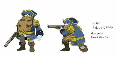
But as I mentioned above, we needed a reason for him to have such low health, so we set aside all those ideas and went with “a normal human soldier.” The wall jumping ability was a remnant of those other ideas. There was also another design that had him as a short, stocky soldier — completely different from the final design.
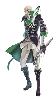
We already had a design on the comical side of things with Hachi though, so we decided to make him look cool in the end.
Robert Final Design:
A New Mascot: Hachi
The first idea we had for Hachi’s design was to make the Ride Armor from Mega Man X into a playable character. You know, that robot suit you would ride in then throw away when you’re done with it. Normally in action games where you have characters that can switch on the fly, I feel like the big bruiser characters are often hard to use. So for Hachi, we wanted to design a character that would help people realize “Wow, big characters are really strong!” even if it should be obvious.
I don’t think it’s necessary for every character to be equally powerful, though. Of course, it’s necessary for every character to have something they excel at, but I think that as long as some characters are strong, it’s fine for others to be a bit on the weaker side. It can be a real shock when your strong character dies, but there’s something special about struggling through with your weaker characters after that. It often becomes a good (albeit painful) memory, doesn’t it? What I believe is important is not how a strong character is, but how much charm they have.
When we began development on Hachi, the character played completely different from the final version. Early on, the suit was invincible at all times, but would constantly heat up. It consumed weapon points as you used Hachi and when they ran out, the suit would overheat and explode. We eventually decided that in a game with 7 playable characters, it wasn’t good to have just one that operated on a different set of rules, and Hachi ended up with the comparatively simple playstyle in the final game. Hachi’s favorite food, shaved ice, harkens back to that overheating design.
There was also an early design of a woman trapped inside a large fish-tank-like monster.
However, the magic armor design looked more powerful, plus, you know, dogs are cute, so the Hachi design won out in the end. The initial design for Hachi looked like this, with a cockpit that Hachi could look out of.
As you can clearly see, this was just way too cute. To avoid making the design overly cute, we made the final illustration hide the dog completely. Now, you must be wondering how Hachi controls the robot, right? Does it use its brainwaves or maybe a Mobile Tracing System? We may never know, but personally, I like to imagine Hachi moving it around with just a pair of joysticks.
Also, thanks to this cute early design, we drew the in-game Hachi as an energetic little pup. When you see Hachi’s sprite, instead of an artificial leg, maybe you see it all wrapped up like a furoshiki (a cloth used for wrapping up things like gifts, lunchboxes, etc.) ? There’s no official illustration of Hachi in the final design, so feel free to interpret the pixel art as you see fit.
Here’s another earlier design, before IGA pointed out that it was lacking a “gothic touch.”
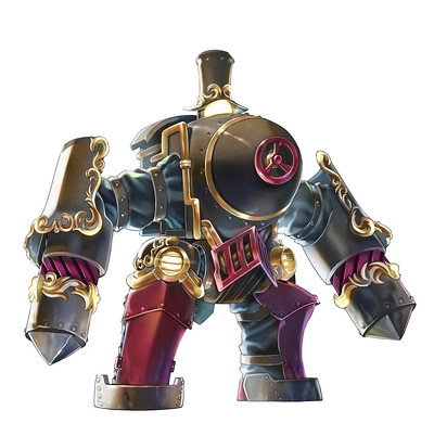
This one’s a bit rustic and not very showy. When I requested a new design from the designer, Yuji Natsume, I mentioned that this one was more “steampunk” than “gothic.” He quipped back with “What even is a gothic touch?!” and got stuck on the design for a while, but managed to make a cool design with a gothic touch in the end.
Hachi Final Design:
A New Character from Ritual of the Night
We decided to add three new characters, but for all three to be brand-new would feel lacking in familiar faces for players. So for the last character, we wanted someone from Bloodstained: Ritual of the Night who wouldn’t overlap with any of the current characters’ identities. We landed on Dominique, but only if we would be allowed to tweak her design a bit.
We had to be careful when implementing Dominique’s signature action, her pogo strike. It’s the sort of attack that can trivialize a boss or allow players to just ignore tough enemies. I paid careful attention to bosses’ movements to make sure they made big side-to-side movements so that it wouldn’t be easy just to pogo them to death. Even so, if you do it just right, you can still hop on them with reckless abandon…
Later on, we added her Resurrection Anthem to revive teammates and her healing plant, both of which were a challenge to balance. I wanted players to think of Dominique as a reliable ally and gave her these abilities to make this very clear. However, when we began development on her, these two abilities were so strong you wouldn’t even dream of destroying a blue lantern with her to get a different sub-weapon.
On top of her capabilities, Dominique has a variety of useful offensive sub-weapons. One of the most important ones would have to be her Impact Lance, mainly because it can be used as a high jump. It’s crucial for reaching shortcuts, so for anyone out there getting ready to play the game, be sure to use Dominique to destroy those blue lanterns. The final game has been thoroughly tuned so that in any area where you might need a certain sub-weapon, a nearby blue lantern will drop said weapon. We want players to change sub-weapons often and try them all.
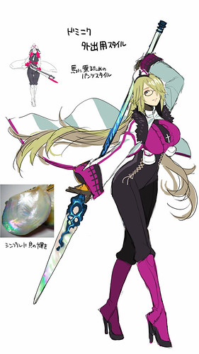
As for her design, just like Hachi before her, the initial design was lacking in gothic style, as she was wearing clothes that wouldn’t look out of place today. It looked something like this:
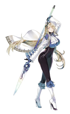
For her main colors, we made both a blue and a pink version so that it wouldn’t overlap with any of the other characters. Pink didn’t really fit with the setting though, so Dominique ended up with a blue color scheme.
Dominique Final Design:
Character Action with Individuality and Choice
One thing we always had to be careful about when making an action game with seven playable characters was to never make any one character too necessary. We didn’t want people to be in a position where if that character died the difficulty would get too harsh. To alleviate this, we tried to give multiple characters the ability to overcome these situations.
For example, Hachi can attack enemies hanging beneath the floor without spending weapon points. If Hachi is no longer usable, other characters have sub-weapons that can tackle the same problem by spending weapon points. In this way, the hurdle raises a bit, but never too much. Also, I’m not sure if people realized this, but even Zangetsu can attack enemies below the floor with his upgraded magic charms.
Designing Brand-New Bosses
For the previous game, we used bosses that were present in Ritual of the Night, so the designs were already created and ready to go. We used the look of the bosses to decide what sorts of attacks and movements they should have, but for Curse of the Moon 2 we didn’t have that luxury. We needed to make all-new bosses. (There were some RotN bosses that hadn’t appeared in CotM, but we felt most of them were too difficult to render in 8-bit style. Vepar is the only one who made the cut.)
I gave instructions to the designers based on how I wanted the boss fights to play out, especially in ways that differed from the previous game, and told them to make designs based on these ideas. Just as with the new playable characters, the designs were made to suit the gameplay plans.
For example, “a boss that appears in a volcano and is only vulnerable momentarily, and best defeated with single high-powered attacks” and “a boss with a second weak spot where Robert with his low-power, high-reach attacks can shine but other characters can’t reach” were design concepts we used to put gameplay at the forefront. The team, from the veterans to the rookies, got to design freely based on these ideas and came up with some really interesting combinations.
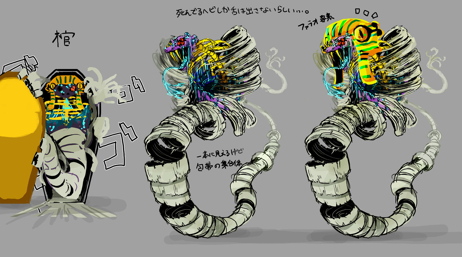
One example of this was this design based on the idea of “an Egyptian-themed boss with a weak point in a high place that moves far to the left and right.”
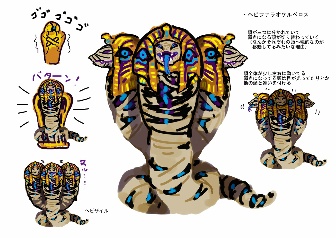
This design is for a snake where its head sways back and forth. I also received a design for this boss where it had multiple bodies and the weak point would move around.
I received so many vastly different ideas for the same idea just like this. Choosing the final boss designs may have been the most fun part of this game’s development for me.
When designing original monsters, one thing I wanted to be careful of is taking monsters of legend and designing them exactly as the legend goes. I don’t think it’s very interesting to face off about a fearsome boss that makes you feel like you’ve seen it before. To avoid that pitfall, we decided to add unique elements of gothic horror to the designs. We held a meeting on the theme of “What makes a design scary?”, and had some memorable one-liners like “Fire-breathing dragons are cool, but they’re not very scary,” and “Wouldn’t it be unsettling if when it opens its mouth, there’s a person inside?” We considered many other things as well, such as combinations of gross-looking parts, and what makes designs scary and shocking.
I wanted the boss fights to include an element of storytelling as well, such as the impression a boss gives when it first appears and is defeated, how its body changes in battle, and if its true form is revealed after it dies. In my opinion, something that appears beautiful at first but is actually grotesque underneath is one of the essential thrills of horror.
Curse of the Moon 2’s Story
I won’t talk about the latter half of the game to avoid spoilers, but I will say that we had the game’s ending in mind from the start. The path to the ending was going to be pretty wild, and we were afraid that we might make IGA upset when we sent our ideas over to him. It was all for nothing though, because we got the OK for the main story with hardly any changes requested.
Personally, when I’m making an action game, I prioritize the gameplay above all else and can sometimes totally lose sight of the setting, story, and characters. But the fans who played CotM and RotN really came to love the characters, so I was determined to treat them with the care they deserved. I did everything I could to make a game where players would come to love each and every character.
However, when I get attached to a character, I have a tendency to go a bit overboard. I infused Zangetsu with too much humor and got denied by IGA, who ended up editing a bunch of the script himself. At the end of the day though, I think we ended up with the story in a good place.
Now, I want all of you out there to go forth, take control of my beloved characters, and crush those demons!








Comments are closed.
2 Comments
Loading More Comments