
How the dev team incorporated feedback to change the game for the better.
With the release of Moving Out just a day away (you can grab the demo to play now if you can’t wait) I thought we’d talk about our approach to playtesting. It might seem like a simple part of the development process but by starting early and making it a focus it helped shape Moving Out in many ways for the better.
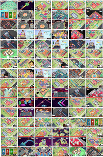
Throughout all of 2019 we conducted over 150 different playtest sessions of Moving Out with friends, neighbors and fans, that’s over 120hrs of recorded playtests. Not including the 1,000+ hands on sessions at various gaming events like PAX.
Click to enlarge
What started out as a casual way to share the tests between the various studios in Melbourne, Sydney, DevM in Sweden and Team17 in the UK, turned into a major part of the game’s QA and level design feedback loop. It also led to the decision to include an “Assist Mode” in the game which is a major element to the game’s accessibility.
How did we find enough playtesters?
This was the biggest challenge. Finding “fresh” players but then later on finding players who could come back for repeat playtests to conquer the more challenging levels. We set up regular playtest sessions using Calendly and tried to fill 2-4 sessions a week. We kept this Tuesdays and Thursdays to allow time to update the game based on feedback from the previous session.
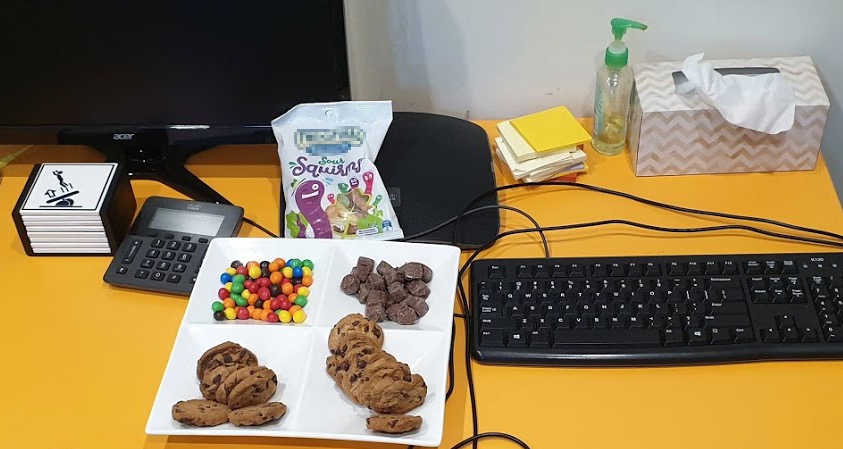
We hounded the local game schools and then Facebook groups for the various platforms. With the offer of playing an unreleased game and candy we were able to find enough willing participants. I think we went through probably 200 bags of candy. So if you want to do this make sure you have a candy budget :)
Below is a typical “spread” for the testers. Leftovers were consumed by the team.
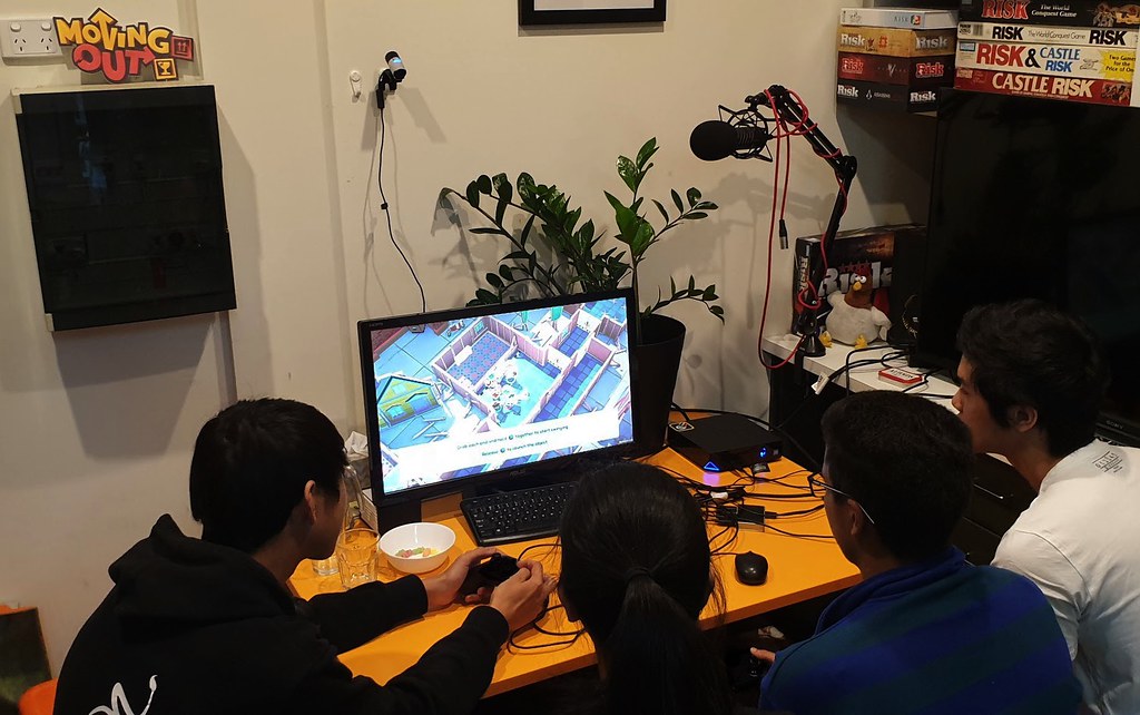
Here’s my kid watching over some playtesters on the weekend. During the later stages of testing we needed groups of four who could come in multiple times. This group we recruited from a Facebook group could only do weekends.
In addition, we also have Team17 providing their own user testing from their internal design team, various departments and local “fresh meat” testers.
Keeping it “simple”
The process was: P.L.A.Y ( Playtest -> Learn -> Action -> verifY ) I just made that up for this blog post but I like it so we can just pretend we’ve had this patented system all along.
We captured the gameplay and recorded players via a webcam using XSplit. That way we could see and hear what they were saying and reacting while playing.
One big tip was to have visible build numbers on the game. So any footage captured and screenshots could be directly tied to a specific build!
We’d then upload these videos to Youtube and share with the wider team. With development split between the main development team in Melbourne, Jan from DevM in Sweden, Team17 in the UK and myself in Sydney, Youtube was the fastest way to share the files.
We’d then do multiple passes through each play test. So that one video might get viewed several times across the studio.
For QA it was easier to spot an issue, timestamp it and log a support ticket. That ticket would have a video of the bug in action or a screenshot from the video. For our first game Death Squared, we’d sit in the sessions and try to spot a bug and then have to quickly take notes. When we did capture game footage we didn’t capture the players. This made it much harder to understand if a player was having problems based purely on gameplay.
I’d personally watch the videos back at 1.5x speed which saved me many hours vs sitting in the room. This led to a weird feeling that when I watched it back at 1x speed everyone seemed to be talking slowly. I did this so much that I can’t watch Youtube at normal speed now :/
For the level designers they could see and hear how players approached each level. Were they doing what we expected? Did they approach the level in new ways we didn’t expect. We’d notice trends between the various playtests on how players approached things.
A simple example is in an early version of the dialogue the “boss” says: “The client said to not break their things.” Which was written as an ironic line as of course they don’t want you to break their things. The problem we found is players take this seriously. So we added the line “Just kidding! They paid for moving insurance. Smash all you want!” It’s subtle but it sets the tone for the game. We want players to embrace the chaos and have fun breaking things. We almost negated that with a throwaway line of dialogue.
Recording players also allowed us to see if the jokes were landing and having the audio of people laughing and yelling at each other over your game is really uplifting in a weird way. So if anything that’s worth the effort alone.
Navigating the grey area of game design
For anything that wasn’t a clear bug we’d describe it in a Google Doc and then do weekly reviews as a team. We’d then create a ticket if it needed to be actioned or ignore it. Game design is a process where many times there is no right or wrong answer. So discussing, sometimes very granular user experience things, with everyone having video to refer to made this process pretty smooth.
Impact on Level Designs
Passing over to Dave and Brodie who lead the level design for the game:
Having people play the game in front of you allowed for some really quick iteration and validation of ideas. These could be as simple as ‘did players navigate levels in the way we expected?’ or ‘did they try any unintended/unexpected routes?’. This allowed us to feel more confident about our ideas and have less assumptions.
One of the standout game mechanics that was born through user testing was the co-throw. In one of the playtests, the players tried to chuck a photocopier over the side of a balcony. At this stage, we’d only really let users throw smaller objects, but these testers opened us up to the idea that we could try a cooperative throw! By working together to swing big ticket items and releasing at just the right moment, we could allow players to throw hefty objects over balconies, pools and into fully-loaded trucks. This simple idea changed the game so quickly!

The Tutorial: we wanted to be hands off with the testers and allow for consistent testing across multiple offices which led to the development of the tutorial early on in the testing process. This meant every tester had the same introductory experience and we could then compare sessions to make better informed decisions.
And now over to John, the producer on the game:
Impact on Production
At times the flood of user data was overwhelming. We were iterating on mechanics we hadn’t finished yet or were put into the game that morning and not fully realised yet by the designers. It was challenging to maintain focus and priorities throughout the process. As an example our archived feedback document which listed discussion points or issues in bullet point form sits at over 260 pages!
User testing reiterated we were on the right path and that the game was at its most fun when played with two or more players. Seeing users working together, communicating and laughing was so encouraging. It also highlighted that single player needed more work and we pushed forward to add some functionality you see in assist mode like ‘Lighter 2P items’ and also a new way of playing called ‘Dual Move Mode’ in which a single player can control 2 movers on the one controller. Bring your ambidexterity and hemispheric dominance in equal measure!
As a developer you are always confronted with bugs and issues that need fixing. The most time consuming of these are the ones that are not reproducible. Lucky for us we had mountains of user test footage. One such issue we encountered was players not being able to finish a level because a box movable had seemingly disappeared. It wasn’t in the truck, nor was it in the level. As it turned out re-watching the video showed that the box had failed to respawn after being thrown into the water because another physics object had been placed in the box’s initial spawn position. This led to us creating a more involved respawning system including a ui prompt when something is blocking something from spawning into the game world.
As a result user testing allowed us to keep the game stable, playable and devoid of serious bugs throughout development not only because it highlighted the issues in the game but there was always another build needed for the next lot of users coming to play the game in the next day or so.
Impact on Art?
Jon, Moving Out’s art director says “One of the immense benefits of broad user testing is that we were able to see where particular elements of the visual communication were not optimised for players to read quickly and at a range of distances. In a game where the camera frame can zoom significantly far out to encapsulate the positioning of up to four characters — making sure the player is able to cut through visual noise and understand the gameplay space underneath is of primary importance.
One valuable thing we learned as a direct result of user testing was that adding a uniform colour tint to both the wall and floor treatment of a room, made it not only easier to identify as a distinct zone due to the added cohesion — but also built on the vocabulary players could use to coordinate with each other. The spaces overall felt more unified and players were able to call out that they were clearing out the ‘purple room’ for instance, leading to a better toolkit for cooperation.”
Overall impact on the game
The biggest impact on the game outside of the tightly designed gameplay is the game’s “Assist Mode.”
We were at a crossroads with how difficult it was to make the game. Do we tune the game to be easier or do we remove some of the obstacles that players were getting stuck on regularly? With the playtesting sessions you could see people getting stuck but also still having fun. Places where players regularly failed, they learned and on the second or third try succeeded. But some players were also frustrated. These were fully abled players who just got stuck and you could see their frustration. What about players with less ability or less patience?
We wanted Moving Out to be tuned for FUN not Frustration.
The solution was the Assist Mode. We were able to offer a variety of game functionality to allow players to tune the game to suit their needs. With the Assist Mode you can extend the levels time, remove danger, make items lighter, remove them as they are added to the truck and just skip a level if you fail it. The extensive playtesting not only informed us what functionality we should allow tweaking for but also that it was a valid idea. It’s become more of an accessibility focus for us lately as we realize this can help more people enjoy the game.
Now the game is finished it’s quite interesting to look back on how far the game has progressed since the first playtest session.
If you’re a game developer we encourage you to record as many playtests as you can. It’s cost effective and the time it takes to set up is saved many times over. And if you’re a player, reach out to your local indie developers and see if they need someone to help them playtest their game and eat their candy.
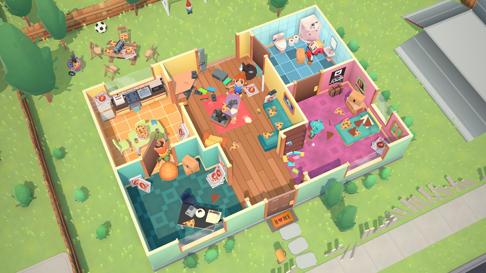
We hope the hundreds of playtest sessions have paid off and everyone enjoys the game. We have a free demo to try with a small sample of the 50 levels available in the game.









Comments are closed.
5 Comments
Loading More Comments