
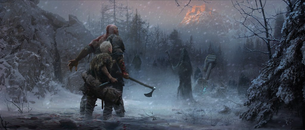
It all started with one piece of concept art.
As we journey towards early 2018, we want to bring you behind-the-curtain of God of War’s development with stories you may not hear anywhere else. This is a new beginning, and a deeply personal quest for the franchise and Santa Monica Studio. We’re very excited to bring you into the heart and soul of our process. Follow us @SonySantaMonica to always stay informed.
A freezing blizzard roars while shadows of wolves can be seen in the distance. A seemingly mysterious mountain looms in the distance while a broken, gigantic statue sits in the middle of a quiet lake guarded by a large creature lingering beneath. These embers of our new Norse universe describe the rich, visual areas Kratos and Atreus will experience in God of War. How was the visual look and feel of our take on Norse mythology defined? It all centers around one defining piece of concept art from acclaimed artist, Jose Peña.
The Visual Foundation
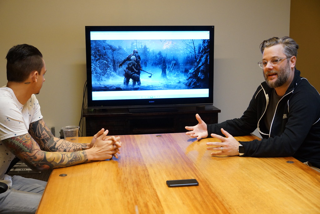
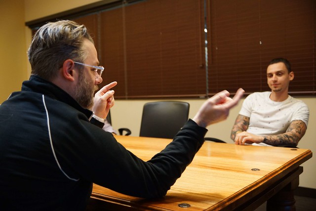
Jose worked as a concept artist here at our studio at the outset of the new vision for God of War. Excited and wide-eyed at the opportunity, he and our Creative Director, Cory Barlog, immediately connected on the new direction, but leaving quite a bit to Jose’s imagination initially.. Unbeknownst to Jose was the immense challenge that would be set before him: create an original defining piece of artwork to set the visual tone of the new direction for God of War. Cory remembered clearly how their first conversation went, “The inception of this very first concept art was from a one paragraph write-up and a phone call with Jose, talking about the mood and the tone. I think I threw a bunch of stuff at him with buzzwords like more grounded; the fact that his son is not a burden; the fact that Kratos and Atreus are together battling a very hostile world. And he was just smiling at the other end of the Skype call, and because of the new direction, we weren’t able to provide him with exact ideas.”
The call ended, and Jose took a deep breath. He immediately started working and delivered several key concept art pieces to the team within the span of a few weeks. Jose made sure to center his first concept art piece on a familiar but older Kratos and his son, Atreus. Little did Jose know this concept art piece would be one of the most valuable and foundational pieces for the new visual direction of God of War.
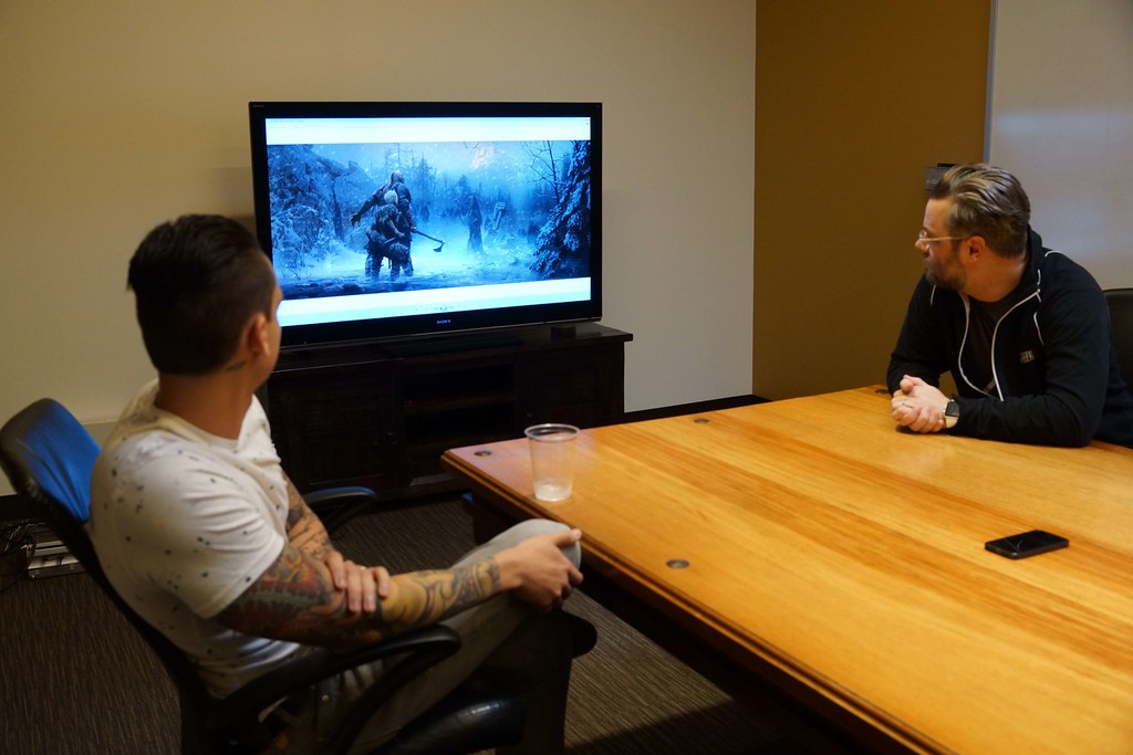
Cory remembered how amazed he was when he saw the art piece for the first time. He remarked, “The way Jose was able to capture exactly what we were looking for was astounding. He has a grounding in historical illustrations and a desire to dig deep and understand the most about each individual piece. There was so much humanity on top of the mythology and to capture it the first time out was ridiculous.” There was a consensus amongst our small team at the time, Jose had struck gold. Cory said, “This artwork truly became the beacon and lit the path for us. Everything we did – we referred back to this piece.”
Principal Character Artist, Rafael Grassetti was also there the day Jose’s artwork was shared amongst our studio – he was stunned. “This art piece was definitely what everyone had in mind,” Raf commented. “It was a big inspiration for everyone who joined the project and saw this. Jose was the first one to get what we were doing and what we were making. Even on the final color correction, we kept coming back to what Jose was doing here and integrating every single part of this to try and get it closer to what he did.”
Decoding the Artistic Details
Take a second look at Jose’s concept art: what stands out most to you? There are so many layers of intrigue and detail all over the piece to decode. For our team, one central theme immediate to us was defining the relationship between Kratos and his son. Raf explained his perspective on the importance of seeing these two characters framed in Jose’s art, “The first time you see Kratos and Atreus’ relationship, you get it. This artwork sells the connection. You see many other elements, but it’s not the main focus. This is more of a piece between the father and the son.”
Cory, nodding his head in agreement, pointed to the significance in the characters’ positioning and stances. “You look at this piece, and you see the idea of Kratos protecting the kid,” he said. “Kratos puts himself in between harm and the son as he wants to take the brunt of the first blows. Atreus needs his father, but he also looks capable. You show the son connecting and holding onto Kratos’ arm, but you also see the kid with his knife out. It’s the idea of this parental yet distant relationship.”
The change in landscape and adversaries also presented unique challenges Kratos and Atreus would have to face. Raf noted this particular theme as, “a fight against Kratos’ enemies and adventures.” He commented, “In the artwork, you see the challenges ahead and the goal up top. Everything you do to have to protect the son is an integral part of this adventure. Jose played with the focus of the image to have us, the viewer, understand everything going on yet still have lingering questions about the world.”
Cory looked intently at the falling snow, feeling enraptured by the visual cues that alluded to a different yet somewhat familiar journey. He commented, “The idea of this unforgiving world and the visual tone with the snow, it just makes you feel cold. And there is this adversity between you and your destination at all times. Yet there is this building of unknown origin guiding you to the top of the mountain. That is the promise of adventure in every God of War game, and it still rings true here, even in this different setting.”
Tying all of these elements together was the distinctive visual style that made for a fantastical yet grounded filter. Even though this new land may be full of strange, incredible creatures, Jose made the world feel tangible. Cory again reflected on his adoration for the style and its implementation in Jose’s concept art. He stated, “This visual style borrowed from that pre-digital era where everything was optical, like all of those awesome fantasy 80’s movies. They all had this sort of classic, storybook vibe without the super crazy over-saturated colors. There is an element of this storybook fantasy quality in the concept art that you don’t often see in video game visuals.”
From Past to Present
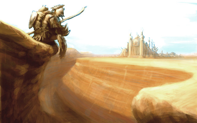
As Cory now looks at Jose’s artwork months and months later, he reflected on the original inspirational art piece of God of War 1 (pictured below). Here, a very early version of Kratos looks out into the desert landscape. Cory contemplated the differences yet also surprising similarities between the two games. He said, “Looking back on God of War 1’s original concept art piece and our current God of War concept art piece, there are these fantastic creative similarities that I think our studio inadvertently shot for but at two different angles.” Cory pointed to the first God of War concept art piece and commented, “Initially, our team wanted this very real and mature take on Greek mythology. But even in that original image, you can see a fantastic destination; a chasm seemingly uncrossable that is preventing you from getting there; and the hostile, iridescent environment against you. And then this warrior looking off into the distance.”
At the same time, Cory noted the key differences between the two art pieces: a maturation of not only the series but Kratos himself. Cory said, “Although the hero’s journey is present in both of the images, I do think there is a sense of growth when you put those images side by side. You see Kratos starting in his youth in the God of War 1 art piece, and in this current concept art, he is now moving towards his middle-aged self – the idea of Kratos taking on this responsibility of parenthood in a different way. He was perhaps too young and impulsive in his early years, which made him make bad decisions, so you see this change and transition in Jose’s art.”
The Journey From Art to Game
A fascinating aspect about game development is the evolution from concept art to gameplay… For instance, Kratos and Atreus’ clothing have been reworked multiple times before final. Raf commented, “The costuming was awesome to see in Jose’s concept art and that they lived in this universe, but when you put that in the actual game, it’s actually hard to see because of the high-paced combat in the game. We wanted to make sure we stay inspired from the piece in terms of the clothing. It was one of the biggest initial challenges we had after seeing the piece and translating the artwork to gameplay.”
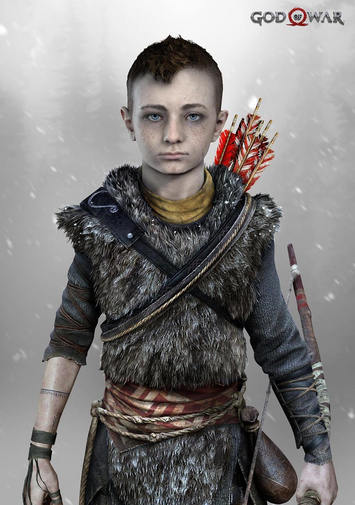
Cory pointed out another challenge – Atreus’ hair. In Jose’s art piece, Atreus’ hair is grey, which constantly fluctuated throughout the production. Cory joked about some of the different iterations they played around with since then, “At one point, we went from the grey hair to an interesting render of Atreus having no hair at all. And I was like, ‘Oh, I kind of like that. Very interesting.’ But I think people thought Atreus suddenly looked like Mini-Kratos and was too ridiculous.” These drastic changes to Atreus’ hair, however, were quickly finalized by Jose with the ‘haircut’ into what we see today.
Other aspects of the artwork evolved from the original piece, such as Atreus’ arm tattoos. Although he did not have his bow and arrows just yet, the first signs of his tattoos were shown here, and as Cory described it, “actually allows the kid to have steady aim with his future bow.” Also, Kratos’ base axe model was born from Jose’s concept art. Cory remarked, “Our approach to keep things simple at first allowed us to really hone in on what feels really cool. With the axe, for instance, we started with the straight handle before later adding a curve onto it.”
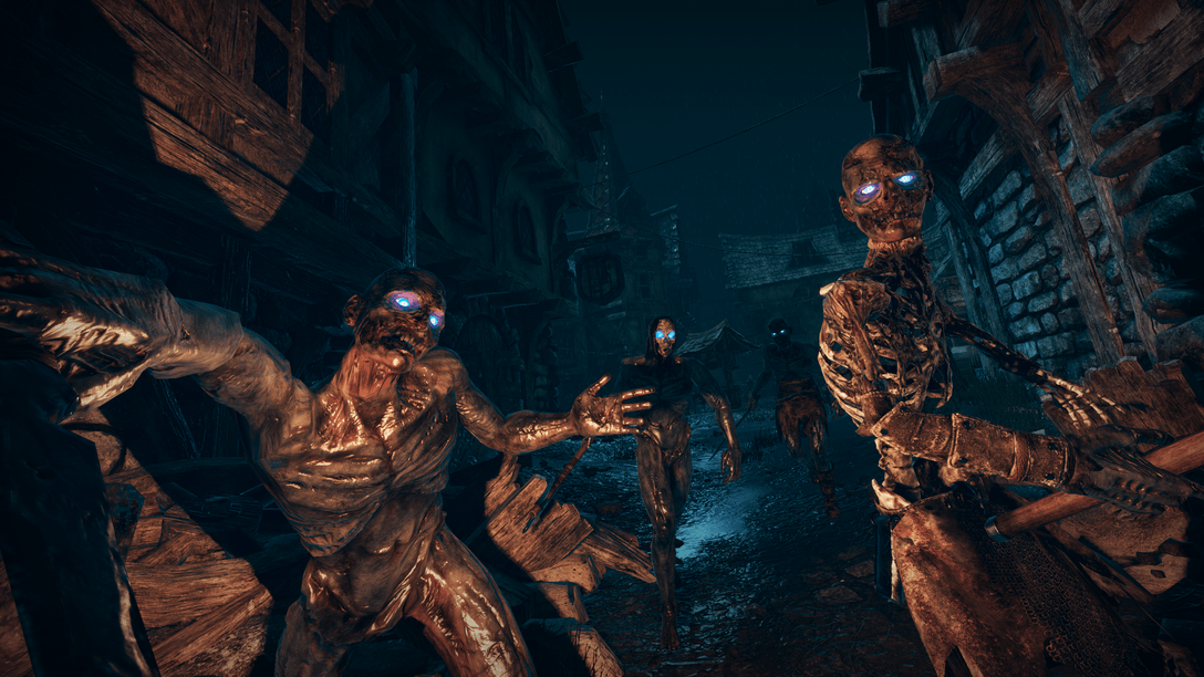
The enemies that made it into the final game were heavily inspired by Jose’s concept art as well. Raf created the Draugrs specifically for the first E3 2016 trailer and remembered how much the original artwork helped with those designs. He reminisced, “We did a lot of work on those guys, and when we finished, we went back to this particular piece and thought, how do we make it look more like this? How do we capture of what’s happening here?”
A Journey Like No Other
For Cory, Jose’s concept art reinforced a consistent theme: always strive to make quality work with some of the best creatives in the industry – a thread that has run through all of the God of War games. “If you look back towards the inception of Santa Monica Studio,” Cory said, “we have always been fortunate to have the right people at the right time, like the concept artists that have come through the studio. Each of them have made an impact on this franchise. Their styles were perfectly meshed with where we needed to be and where we needed to go at that time. We’ve had that kind of evolution throughout simply because people were constantly able to look at things a little differently.”
Cory added his sentiments about the entire studio and the leaders he has been fortunate enough to work with. He commented, “All of these guys have had such a tremendous amount of impact on the lens that we see his world through. You really can’t make anything today of this scale without having visionaries like that. So for me, the best part of this whole project is that we’ve been lucky and fortunate enough to find the right people – to find the ‘needle in the haystack’ so to speak.”





Comments are closed.
9 Comments
Loading More Comments