
Hi there! Dom here again. It’s been a whirlwind since Entwined was announced and released onstage during the PlayStation E3 2014 press conference and we’ve been overwhelmed with the amazing response to the game. If you haven’t seen Entwined yet, it’s a vibrant, abstract action/arcade game about two souls who are in love but can’t be together. These souls are represented by a bird and a fish, which you must learn to control simultaneously. Our team is as unique as the premise, so Jeff and I thought it would be great to hear straight from the rest of Pixelopus about what was involved in making Entwined.
Prototype: Eric Zhang (Engineer)
At the very beginning when Pixelopus was formed, we had a period of time for full group brainstorm sessions, where we tried to find innovative fun game ideas that were relatively small in scale yet could fit our team’s size. We took a lot of inspiration from our time in school, at Carnegie Mellon and San Jose State, where we would rapidly prototype as a part of our curriculum. An exciting factor about our small team is that everyone (designers, artists and engineers) could contribute to deciding what the game would be, and we kept this small team philosophy from brainstorming through development.
After collecting ideas from the brainstorm phase, we set off to make prototypes. Each of three engineers on the team started taking one of those ideas and implementing playable mini games. We kept the prototypes as simple as possible while hopefully clear enough to fully convey the core idea behind it through gameplay.
We started with 10 playable prototypes, then 5, then 2, and eventually Entwined won the battle.
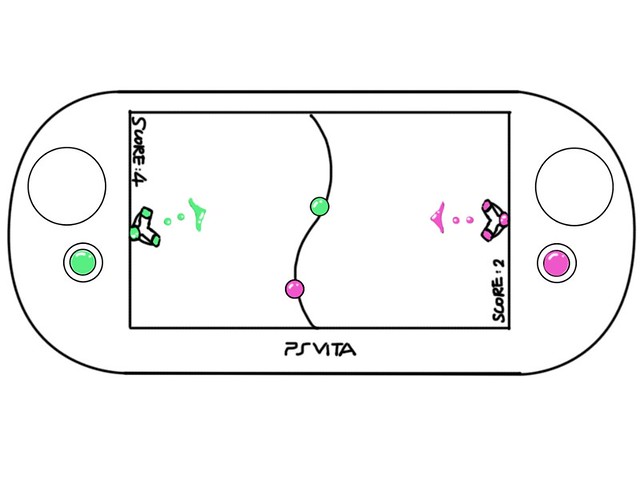
The idea of Entwined was rooted deeply in two early prototypes. One of them is a local two-player competitive prototype on PlayStation Vita, where each character was controlled by one of the analog sticks. We found out the idea itself was nice and fun, but a two-player game on Vita had a more limited audience.
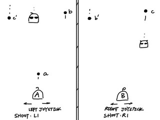
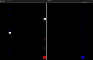
This inspired us to try the approach of one player controlling two characters at the same time. We wanted to create the feeling that one cannot focus on either side of the screen, but have to look at the whole picture and let the mind go with the flow. We made a co-op split-screen prototype in which the player controlled two characters to defeat obstacles together. It turned out to be too difficult to focus on both characters, since one of the characters might move very far away from the center.
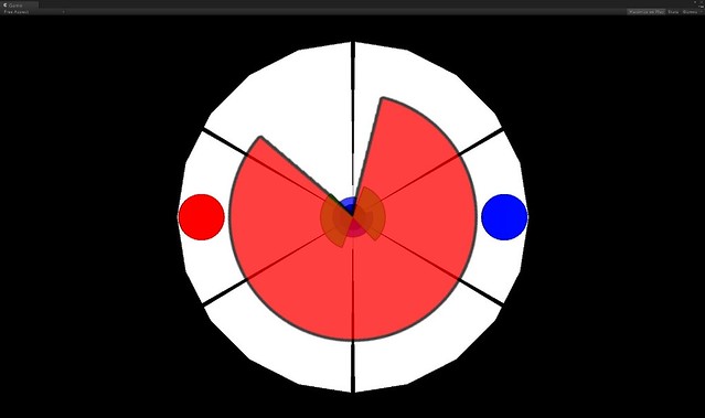
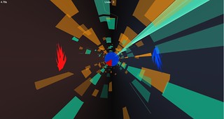
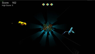
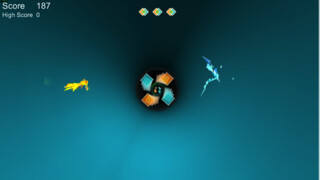
We thought if the characters were on a circular track, they would never move too far away from the center since the distance to the center was constant. So we changed the split-screen layout to the tunnel view we are using in the final product, then color-coded the characters and the obstacles into red and blue. In this prototype, both characters — the red dot and the blue dot — could move in a full circle, and pass gates reflecting their respective colors. We soon found ourselves losing track of which analog stick was controlling which character.
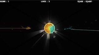
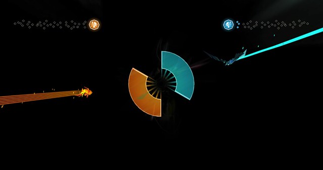
So we changed the movement range of each character into half of the circle – the red dot could only move in the left semi-circle, while the blue dot could only move in the right one. When they met in the middle of the screen, they turned into green and could pass through green obstacles together. This was the prototype that later turned into Entwined.
Story: Jing Li (Designer) and Haewon Nam (Artist)
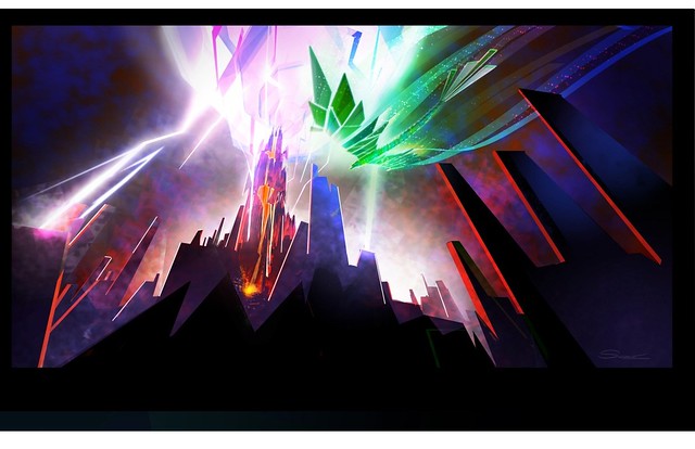
The story was inspired by our first concept art of two abstract-shaped fish swimming through colorful shapes and ripples (see below). The concept art reminded us of an ancient Chinese book Zhuangzi, there was a story about Peng, a giant bird that transforms from a Kun which is a giant fish. In conjunction with several other concepts, like reincarnation and Chinese folklore of carps turning into a dragon when leaping through the dragon gate, we came upon the story of Entwined: a fish and bird representing two souls who are in love but cannot be together. One lives in the ocean, one soars in the sky, always separated by fate, reality, and distance. Every life, they reincarnate as different forms in different worlds, carrying vague memories from the previous life, their entwined souls feeling and attracting each other. After nine lifetimes of searching and struggling, they finally defeat the obstacles of fate and combine as a soaring dragon in eternity.
First piece of Entwined concept art
Mood
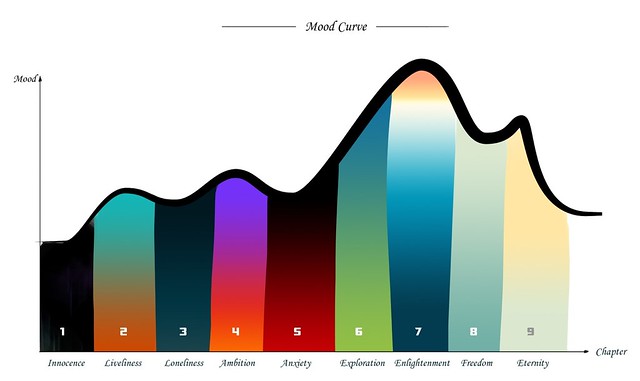
As soon as we had a story for the game, we wanted to set the interest curve throughout the whole game. The interest curve quickly shifted into a mood curve since the story is not about one specific character but the overall emotions.
“Ultimately, it’s the player’s memories that make Entwined a finished piece.”
At first, the mood curve was designed to recreate the feelings of a specific lifetime. Each chapter of the lifetime had its own short scenario and mood. For example, Chapter 6’s scenario was “you are finally brave enough to leave the environment that you are used to, and started what you always wanted to do as a kid.” Later we added the nine lifetimes of reincarnation to the story, and each section was changed to represent each of the two souls’ lifetimes.
We selected the colors for the first and built the sets around the metaphor of the mood we wanted to deliver. We believed that the rich colors and the mood could communicate ups and downs of the lifetime. For the last chapter we wanted to give a relaxed and nostalgic feeling, so we brought back little bits of every level with beautifully faded color to make it feel like memories from the past.
Negative space is very important in Asian painting. When there is good balance between positive space and negative space, a painting is “finished.” Entwined is our example of this “finished piece.” The story is left abstract so that people can fill in the negative space with their story and emotion. Some people might think of their memories with their partners, or a hard time they had to overcome and so on. Ultimately, it’s the player’s memories that make Entwined a “finished piece.”
Art Development: Haewon Nam (Artist)
After we had the prototype with red and blue dots, we made the very first concept art which was a little different from our final game (see above). It had a simple polygonal style, which we wanted to turn into a more unique and beautiful visual style. The art direction shifted to an abstract and contemporary art style with bold colors. All the visuals were designed with simplicity and a stylized silhouette. We had to plan out the colors, shapes and animations carefully to express story and mood, because we deliberately chose to have very little verbal explanation.
Each life cycle had its unique sets of tunnels and landscapes. Our engineering team built a specific art tool for the tunnel and obstacle so that artists could play around and see them in real time very easily.
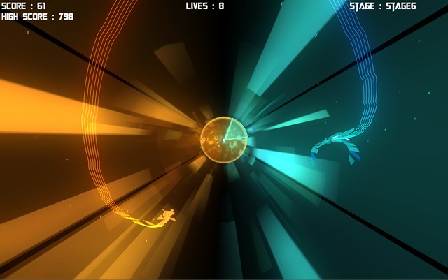
We got our inspiration from the simplicity and bold shapes of origami and other fine art. The design of the character is very shape-driven and the shapes organically form the fish and the bird. Since the level is a representation of a life cycle, we wanted the characters to grow according to how well the player does. Also, we wanted to give positive feedback directly on the characters so that players can feel rewarded when they are doing well. As the player overcomes more obstacles without mistakes, the characters get stronger shapes, bigger size, and more vivid trails.
The Intro Cinematic: Lucie & Becky Roberts (Art and Animation)
Lucie
For Entwined’s intro cinematic, we took special care to keep the imagery abstract and emotive, just like the in-game artwork; but there was a risk that in telling a backstory, we might remove some of the mystery from the game. As mentioned above, our goal was to allow the player to bring in their own experiences and extract their own meanings and conclusions.
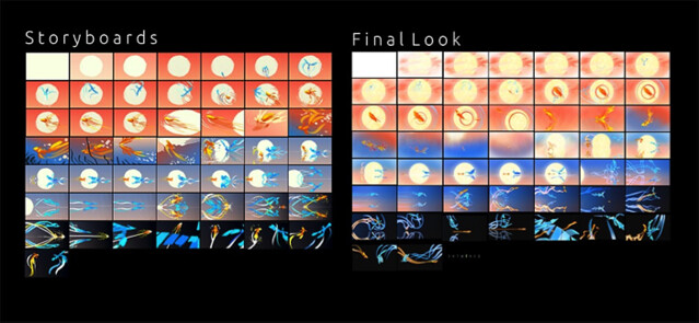
Using training from San Jose State University’s Animation/Illustration program, we began conceptualizing and storyboarding the intro. It was important that the feeling of love and bitter-sweetness come across, but we also wanted the intro to contain a sense of exhilaration that one might feel while playing the game. The lifetimes one plays through in Entwined are the visualizations of various moods and emotions, and we tried to do the same thing here.
“How does a fish act when it’s happy?”
In the storyboards, we also attempted to use visual abstraction to tell the story. Throughout Entwined, color is very important for mood as well as for symbolism. The blue of the bird and the orange of the fish inspired the complementary color-scheme of the intro, and strengthened the theme: the bird and fish are more vibrant when beside the other’s respective color. We also attempted to bring symbolism into the intro with shape: the circular outline of the sun points to the idea of wholeness as well as infinity and reincarnation. Then, when the sun sets on the horizon it rejoins its reflection on the water: this is a premonition of two halves becoming one whole. Even the ripples of the fish on the water express the idea of change and multiplicity.
Becky
Animating the bird and fish was a fun challenge, as they have no facial expressions and are made purely from polygonal shapes. It was especially tough for in-game animation since the characters face away from the player, and we had to communicate their animal locomotion at the same time as their personality. How does a fish act when it’s happy? How do we help the player feel that they’re doing well or poorly? We had to ask ourselves these questions, and relied on the team a lot to help us know if we were hitting the mark. In another sense, the limitations were a blessing because animation is so strongly rooted in pantomime; we were definitely exposed to this kind of acting in our animation/illustration courses at SJSU. Limiting ourselves to pure shape, movement, and color turned out to be very communicative as well as liberating.
From an artistic standpoint, the simplicity of the characters made them more universal as well. As visually rich as the game became, it was always built on this kind of simplicity, and we carried it over to the Cinematic. There were times when we tried to add more complexity and detail, but we’d inevitably return to the original artwork. It had a kind of purity that added to the experience of the story.
VFX and Living Paint: Ashwin Kumar (Artist)
The VFX were an interesting challenge as they assisted in spatial awareness of the bird and the fish, and they also proved to be a mode of player expression during dragon gameplay. The VFX design evolved as we went on during the development of the game. We first did concept art for all the VFX, then figured out how to achieve the look in a way that the game engine would allow.
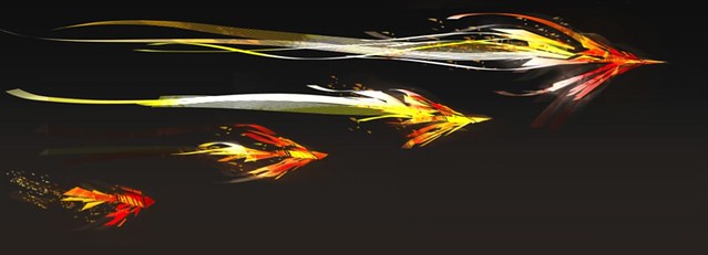
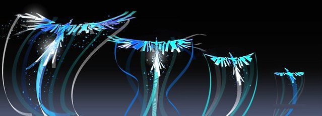
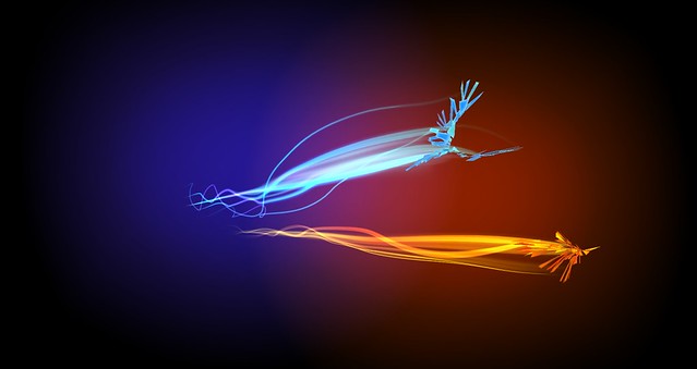
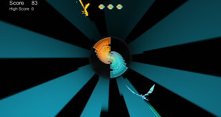
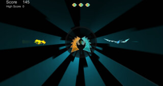
During the bird and fish gameplay sections, the VFX play a major part in telegraphing how the player is doing. With every successive disk that the player passes successfully, the trails on the bird and fish grow, eventually resutling in their physical evolution.
Trails in the fully evolved state on fish and bird
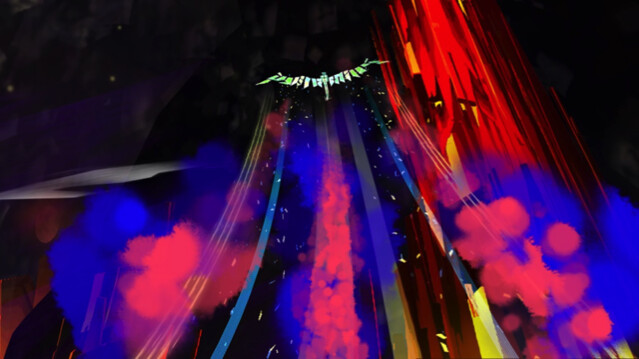
During the dragon sections, we tried to complement each of the scenic open-spaces with the appropriate trails. As a result, each of the open spaces has a signature trail to go along with it.
Original concept art for Chapter 5 paint trail
Final In game screenshot of the paint in chapter 5
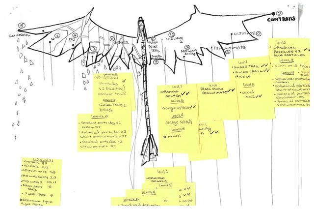
The trails were a means of self-expression for the player, but they also served the purpose of livening up the scene to a glorious conclusion. We developed the paint trail system with the anatomy of the Dragon in mind. Our objective was to create a 3D Painting experience which would be supported by Entwined’s flight mechanics and would feel intuitive. With the above objective in mind, we decided to create dragon paint points that would serve as brush-tips for painting.
Diagram for the brush-tips on dragon paint
Engineering Process and Philosophy: Arjun Harisena and Jitesh Mulchandani (Engineers)
Our tech team has always strived to make sure creativity is not deterred by technical problems and that the entire content creation pipeline is as smooth as possible. Our entire development process is a testament to that.
We deveolped a wide range of tools to ensure that artists and designers had the ability to not only change and modify content, but to view it in-game to make sure everything looked and felt correct. With this strategy we were able to make quick iterations to determine whether a particular level felt the way we wanted it to. This was especially helpful after playtests, when we had to make changes to improve gameplay and visuals.
The entire Entwined development process was completely different from what the team was previously used to (i.e. prototyping small gameplay ideas). This was the first time that we had the opportunity to work on a complete console game. It was a constantly challenging and fun experience.
Obstacle Design: Jing Li (Designer)
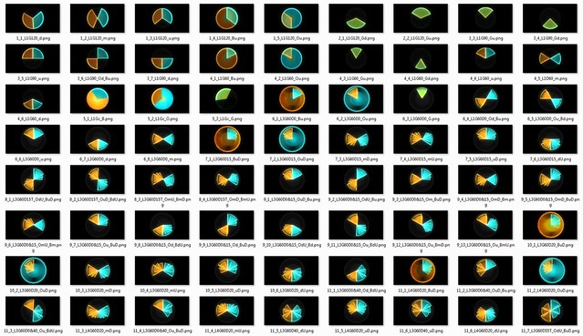
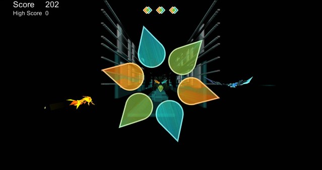
The obstacles in the game were designed to reflect the story and mood, and were made by a customized tool developed by the engineers on the team. For example, the mood of the first lifetime is Innocence, so the obstacles are simple. The mood of the fifth lifetime is Anxiety, so the obstacles have spikes and move in an irregular way. The layout of the obstacles is also a metaphor of different moments shared by the two souls. The obstacles were designed in a way that players could look at the center of the screen and feel the emotions the game tries to deliver.
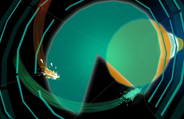
Disc shape test
Dynamic Difficulty
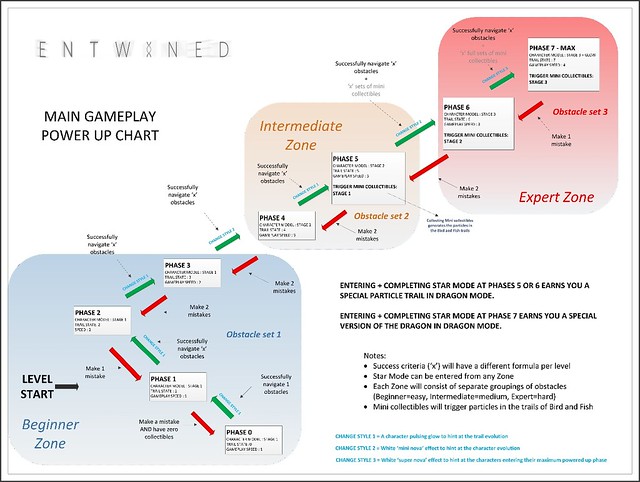
During playtesting, we found out some players had trouble passing through some obstacles when controlling two characters at the same time, and the frustration took them away from the feelings that the game wanted to deliver. The dynamic difficulty system was introduced to balance the gameplay difficulty based on player skill and their ability to improve.
Each phase in the dynamic difficulty was linked with the obstacle patterns and speeds, and represented by character models and trails. When players pass several obstacles in a row, the game enters the next phase. When players fail several obstacles in a row, the game returns to the previous phase.
We hope that the dynamic difficulty system will help make the game accessible for as many people as possible and that everyone who plays can be mesmerized by the stylized art and soothing soundtrack. When you master the simultaneous controls of the bird and fish, it helps to keep you in a Zen-like zone. This sense of flow is what allows you to think about everything else going on in Entwined, and the mood each level hopes to create.
That’s all for now folks! We hope you enjoyed a brief look into the development process of Entwined. This week we’re wrapping up the PS3 and Vita versions of Entwined — we can’t wait to get those to you in the very near future. All that remains for me to say is thank you once again for all the amazing feedback and support for the game. It makes us so happy to hear about all the gamers who have made such a strong connection with Entwined. It’s why we do what we do.
– Dom






Comments are closed.
25 Comments
Loading More Comments