


Notice anything different?
Today, we’re quite ecstatic to unveil the new look of the PlayStation.Blog. As the site marches towards its 4th anniversary in June, the patchwork, add-on look of these pages began to resemble the Weasley house. Also, we were tired of being unfavorably compared to our more attractive, cosmopolitan European sister site.
Unlike commercial sites, we didn’t redesign to serve you more ads, or because we have an in-house art staff that we have to justify. We redesigned the PlayStation.Blog with your requests in mind. How do we know what you’re looking for? You’ve been voting with your clicks.
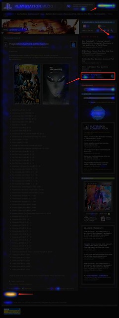
Over the past year, we’ve been analyzing where readers click on the site and, as you can see, items like PlayStation Store update posts and recent stories light up like a Christmas tree. If you only decorate your tree with white lights, that is. When we coupled this info with traffic patterns, Google searches, and other data, it was pretty clear what types of things Blog readers like yourself are looking for when you visit. This redesign addresses these needs.
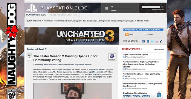
So we’ve added prominent, permanent links to PlayStation Plus and PlayStation Home content. We’ve overhauled the search box with autocomplete. Our biggest recent releases now “live” at the top right of the site. And huge news won’t get pushed down the page nearly as quickly as it used to.
Conversely, with the old design many things weren’t as easy to find as they should have been. You’ll now find it easier to give feedback on posts via Twitter and Facebook (both of which had a fraction of their current userbase when we first launched the site). Related content will appear at the bottom of a post, and a string of features can be found in a scrolling “red box” belt right in the middle of the homepage.
We also know that the average reader owns a wider, higher-resolution monitor than when we first launched in 2007, and so we’re taking advantage of that additional real estate, and you can expect more and better takeovers of the site, like we did with UNCHARTED 3’s launch.
Now, we realize that this new design will take some getting used to, and some of you will probably hate it outright – at least at first. Many of you said as much when we inverted the color palette from black to white last year, though those complaints died out very quickly as we all adjusted.
Still, for those who really loved the old site, if you look closely, you’ll notice the things that *didn’t* change. The font, colors, and sizes are all the same. Comment replies remain an attention-grabbing red. Of course, the PlayStation news content you visit us to view will all still be here – you just won’t have to look as hard.
Over the course of the redesign process, we began to compare the new site to [lady with the hat]. Even if you don’t care for the flashy new hat, the old girl you know and love is still underneath.
Please let us know what you think. As always, we’ll be reading.
Sincerely,
Jeff, Sid, and Rey
Your PlayStation.Blog team


It takes getting use to but I like it.
Finally a new look that looks better than it’s predecessor.
JEFF I LOVE THIS NEW DESIGN! Nice of you guys bringing back the dark background.
Will take a little time to get used to it visually, but I like it and it improves rather than hinders access to content, unlike what they recently did to Gizmodo, Kotaku and that network of blogs.
Any news about the “Blogcast”?
I’m really digging the sleek new design of the site!
Wait, wait, wait… I gotta say its looking fabulous!! Fantastic!!! Many ways toreach the BLOG post and its current order… The looks is so… Well, PlayStation!! I’m liking it more n more!!!
You need to add a feedback tab on the side of the page to allow users to give feedback
Why do you still have to log in multiple times between the PS Blog and the official Playstation website/forums (us.playstation.com)? Shouldn’t they all be interconnected already?
New design looks great. I wasn’t expecting such a drastic change, but like I said…it looks great. :)
This is nice but will it work on the ps3 browser and will all the video and stuff work as well? is it optimized for the psp browser? I have a couple of them. these are the questions in my mind at the moment.
There is too much going on in a relatively small space
is good to see you guys trying new things
I love the new design, but would like an option to jump to the next staff comment/replies (the red comments), if that’s even possible.
I get what you’re saying about taking advantage of the wider monitors, but typing this down here, it’s just a gray background for about 60% of the page.
simply amazing!
I like it, I do.
But it runs extremely slow on my current, old , computer.. eats a lot of ram, I liked visiting the Ps blog because of how quickly i can browse it.. now it seems cluttered.
This will probably get solved once I get a new computer but for now I have a problem.
I think this is another Kotaku change waiting to happen. I feel that the “cool factor” outweighed the practical and simplistic nature of the original format.
Okay, my take on this:
It’s overkill. You made it pretty, but you made it more work for readers to actually read the posts. The EU blog is still superior. It’s laid out the same way as the old US blog, but it has the WHOLE post listed for every entry on the page instead of two sentences when it’s not the latest entry. The way the US blog is now, we either have to open a load of tabs, or keep going back and forth from the home page to the next article. You guys should focus more on making the reading of the news more streamlined rather than trying to make it look really pretty.
Well it’s undoubtedly more attractive than the old one :D
:) I’m happy. It’s very creative, great job team!
@Stuey08
Yeah, if anything the background should follow as we scroll downwards/upwards.
What else would be cool is if the blog gets taken over with a theme (U3 for example), it gets saved as a permanent usable theme later on, so we have the choice on what the blog looks like to us when we come here :)
I see there’s a playstation app coming for iphones and androids, but what about us blackberry users? are we to be left in the dust?
Very nice, does it play any nicer with the PS3 browser and/or Android?
I like it, but the login issues aren’t fixed still. I come to the site and it says I’m logged in. Then I go to comment and it won’t let me because I’m not logged in. So I have to then go login… then usually, after a few articles it’ll log me out again. So annoying.
nice work.. I was checking it on my ipod and it works really smooth… and now on my mac and looks really cool and easy to navigate…
I forgot.. I need to check it out on my ps3 browser.. :P I hope it works.. because login on the ps3 to make a comment or something like that didn’t work in the past…
On the Heat Map there is a lot of random blue around the article. Were people just randomly clicking places? lol
And I like the redesign =P
Wow it looks great guys.
This is a AWESOME new PS blog site, much better than the old one keep it up.
Jeff, this new layout is exactly what the PlayStation.com / PlayStation Blog needed. I have everything at my finger tips. Let the PS.com and Forums management know its time to be LIKE the PSBlog.
nice update like it a lot just need to get use to it
Change the post order back please!
What I mean by that is I was INSTANTLY annoyed that blog posts are no longer chronological, this is something I won’t adjust to in time, it will always annoy me. I shouldn’t have to scroll a page and a half every time.
I understand that you want big news items to stay relevant longer, why don’t you put those on the side? Take a look at joystiq having their “breaking news” on the right side of the page. You could fit big news items with the facebook/twitter and follow us tabs you already have on the right, and just like you have killzone 3 in the huge header on the top of the page you could put big news items there.
Background choices and aesthetic layout (basically everything once you actually click on an article) is fine other than that.
I rarely comment but I always read, and I like getting my ALL my news (not just video game related) chronologically, not ADHD: “Oh look at that, I’ll read the ‘biggest’ news and I’ll be caught up with the world.” Give me the choice of what to read by presenting everything in order and highlight what you deem important in the header and right-side-tabs, NOT: READ THESE POSTS SINCE WE MADE THEM TAKE UP AN ENTIRE PAGE AND A HALF, CLUTTER CLUTTER CLUTTER. That is TOO forced. Please fix this. Thanks.
Loving the new look keep up the good work I just love how it looks easy to find thing futuristic look to it .
i want it to have all the storys on one page so i can go and click which one and not have to go back and forth just to see the next story :/
i certainly like the background better than previously.. i preferred the darker look it had in the past, but so far, it looks good… i’m sure you’ll find people who like it and those you don’t, but i’m ok with it… just have to get used to the layout a bit…
just keep bringing us the good stuff and i’ll be here every day…. cheers!!
by the way, is Playstation officially doing anything for the Japan quake help? i’d imagine so, but i would love to hear details on what they may be doing to help…. thanks…
There’s too much stuff, it’s too jam packed. I don’t like it now. Maybe I’ll get used to it.
While I don’t mind the revamp, there are still some gripes I have with the site:
1. The site could use an in-page login window, much like many other sites that use your PlayStation ID as your login ID, including the Killzone website.
2. The comments section should have the ability to reply to another comment directly, instead of having “@…” to post a reply, in which case, most never see.
3. The redesign is pretty nice, but one initial gripe is that the front page is a little more messy than the old one, I like the look, but the old page was more streamlined.
Looks about as hard to navigate as the new forums, if not more so.
I love the new look! Does anyone know when the NGP is coming out?
It looks good, but I prefer seeing all the blog posts one after the other in a vertical line rather than two side to side in descending order.
What have you done??? Now I am getting shotgunned with PlayStation content, instead of the perfect old way where I knew what was new. I have a big time sadface right now :(
Love it! The new design is very slick, modern and sexy :p
Great job!
Well this is definitely different. Give me a week to see how I like it. I’ll get back to you later. Hopefully it will be positive feedback.
Hey, this looks very nice. Good job guys! Hopefully this also means that I’m not on the “moderate first” list anymore… Pretty please with cherries on top!
BTW, one thing that still kinda bugs me is that you can’t enlarge pictures just by clicking on them but have to open them separately through flickr.
Anyway, does this mean that the fabled podcast is finally coming?
This has gone from an informative blog to a cluttered mess. I really used to love coming here and doing a quick scroll down to see what is new, what is coming out and what things we’re getting. Now I’m subjected to a barrage of boxes, scroll bars and random images that serve no purpose other than to attempt to impress me with how much you can push into a single page.
Sony, really, sometimes less is more. If I wanted to read a blog that resembles that if a space shuttle launch board, I’d go play a simulator or visit an air and space museum.
Well obviously it’s something I’ll have to live with if I wanna keep using this blog but i don’t like the update at all to be honest.
It is way too cluttered with too many different windows/panes and i DO NOT like the side by side layout of the articles at all.
It looks more like some social network site, which are completely worthless in my opinion, than a PS Blog.
Absolutely LOVE it!!! Very colorful and a lot easier on the eyes. Great job guys!!! SONY FTW!!!!
I like it. I don’t remember what the old version looked like.. so lol.. I do like the way this site is designed :)
This looks great, I think it’s even easier to get news stories quicker than on the EU sister site. And, I don’t have to keep clicking “older posts.” I love the addition of the dedicated PlayStation Store links, they were slightly hidden before, no more scrolling to get there!
It’s strange how my avatar looks larger than the login that is stuck to the top of the page. It overlaps a little and looks like it isn’t suppose to be there.
As one who reads the PlayStation blog almost every day, this design is for the better and for the future. I appreciate you guys taking last year into consideration and following our clicks.
Also, can’t wait for the iOS /Android app either! Keep up the good work, thanks for the hard work and sweet year ahead!
WHOA, i was just leisurely dropping by and looked up to see what had loaded on the screen. I nearly flew back off my chair.
Well it looks impressive and very PlayStation. Keep it up guys.. I’ll start adapting now.
I love the new design…
At first it was a bit overwhelming finding where everything was… but I think I’ll be fine.
The look though, is awesome!