Daimion Pinnock here, SCEA Producer for the WipEout franchise. As some of you may be aware, the WipEout franchise has been around for a while now, and continues to improve with each new update. We released WipEout HD last year in stunning 1080p for $19.99, and it received strong reviews. This year we have a new release for you all, which is called WipEout HD Fury!! We announced it the day before E3, and I’m sure that you’ll be very impressed with what the guys at Studio Liverpool have been able to do.
Starting off a small series of posts, I’m happy to introduce some cool exclusive information about the making of the game and the Fury add-in, coming straight from Dave Glanister, WipEout Fury Ship designer on the WipEout HD development team.
Hello everyone, my name is Dave Glanister and I’m the WipEout Fury Ship designer, here to give you a little insight into how we created the look of the ships.
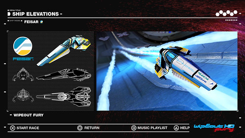
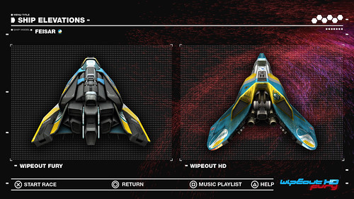
Our main aim for the new WipEout Fury ships was to modernize their visual look whilst keeping the DNA of each existing individual team. On previous WipEout games, a key feature for ship design was its dynamic straight edge and triangular silhouette. For PSone and PSP this key element was the best way to achieve a great design without using a huge amount of polygons.
Our approach for the Fury ships was to keep the dynamic straight edge design but add to it by dividing the ships body panels up into three main layers. This new addition to the ships allowed us to overlap, interlock and weave the main ship panels together to achieve a more complex look.
By taking this approach it allowed the designs to show gaps, grooves and negative windows of space that were in-turn filled with real time PS3 self shadows. This made the ships appear lighter and more hover like without reducing the ships scale or bulk.
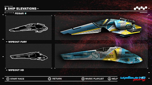
To evolve the designs further we replaced the nut and bolt element to the WipEout HD ships by building clean simplified inter-locking mechanical shapes. This suggested fewer components in the ships build. Also it gave the ships a tailor-made look and also suggested that the ships parts had been created with new and advanced material.When viewing the ship design side on, the body panels have been purposely angled forwards to help create a dynamic appearance even when stationary. As a result the ship’s profile fights against the horizontal lines of the track’s surface which helps communicate the notion of an anti-gravity spacecraft.
To help identify the Fury ships within a race we added a second layer to the cockpit. This gives the impression of extra pilot protection. Well also placed a blue emissive tint to the cockpit glass which adds energy, notion of power and focal point to the core of every ship design.
That’s it from me! Hope you enjoyed reading about what I do :) I understand that we’ll have another update for you on WipEout Fury next week by another member of the team here. In the meantime, have a great weekend.
I look forward to seeing you all online!
-Daimion


Comments are closed.
56 Comments
Loading More Comments